vauxhall Logo - History, Design, and Meaning
Company Overview
Vauxhall Motors is a British automotive manufacturing and distribution company headquartered in Luton, Bedfordshire. It is affiliated with the German Adam Opel AG and both are wholly owned subsidiaries of General Motors (GM) in the United States. Vauxhall sells passenger cars and light commercial vehicles under its own marque and has historically sold buses and trucks under the Bedford brand. It has been the second-largest-selling car brand in the UK for over two decades.
Key Information
- Founded: 1857
- Founder(s): Alexander Wilson
- Headquarters: Bedfordshire, England, United Kingdom
vauxhall Logo Meaning and History

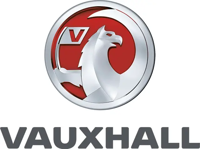
Vauxhall is one of the oldest European automaking companies, and its visual identity pays tribute to the brand's history and legacy. The first logo was created in 1857, and the main symbol is still present on the marque badge.
The mythological creature, the Griffin, was adopted by the brand at the very beginning of its existence. This symbol was taken from the ancient coat of arms of Sir Falkes de Breaute, a British soldier from the 13th century. The house he lived in was named Vauxhall, which later gave its name to the district where the automaking company was established in 1857.

The original Vauxhall logo depicted a Griffin, a creature with the head and wings of an eagle and the body of a lion, holding a black flag with the bold letter 'V' on it. The 'V' was executed in a clean sans-serif font, balancing the ornate wings and curved tail of the Griffin.

In 1983, the logo was colored white and placed inside a red square with a thick outline. The 'V' was removed from the flag, but the wordmark was added beneath the creature, executed in all-caps with a traditional serif font and ample spacing between the letters.

The redesign in 1989 brought a new shape to the Vauxhall emblem, featuring a white Griffin with the flag on a red circle, complemented by a massive black wordmark. The letter 'V' returned to the flag.

In 2003, the wordmark was removed, and the badge was made three-dimensional. The Griffin with the flag was rendered in gradient silver, appearing luxurious and powerful, while the circular badge was left flat and without framing.

The badge was updated in 2008, enlarging the Griffin so that its judge wing was no longer visible, replaced by a delicate smooth line on the right of the circle. The red background was changed to black, and the wordmark appeared again, arched on the top part of the silver frame.

For two years, the brand used the 2008 logo with a red background and a thinner outline, omitting the wordmark, resulting in a lighter and more sophisticated appearance.

In 2011, the Griffin became sharper and brighter due to a darker shade of gray and added lines to its image. The wordmark reappeared, placed under the badge in a bold and smooth sans-serif typeface in dark gray.

In 2019, Vauxhall introduced a new emblem—a flat red and white circular badge featuring a Griffin drawn without wings, with the flag and letter 'V' slightly enlarged. The wordmark is written beneath the emblem in a dark shade of blue using a new strict typeface.
The current Vauxhall wordmark is executed in a bold and masculine sans-serif typeface with straight-cut edges. Each letter is solid and confident, creating a powerful logotype. The typeface is similar to fonts such as Radiate Sans Bold Expanded and LCT Picón Extended Black.
The red and white color palette, used throughout the brand's history, represents power, passion, and courage, while the new dark blue shade adds a sense of trustworthiness and responsibility, reflecting the brand's commitment to quality and comfort.
