packard Logo - History, Design, and Meaning

Company Overview
Packard is the name of a former American company established in 1899, which merged into the Studebaker-Packard Corporation in 1954. The company specialized in the production of high-end cars and released around forty car models throughout its history.
Key Information
- Founded: 1899
- Founder(s): James Ward Packard, William Doud Packard, George Lewis Weiss
- Headquarters: Detroit, Michigan, U.S.
packard Logo Meaning and History
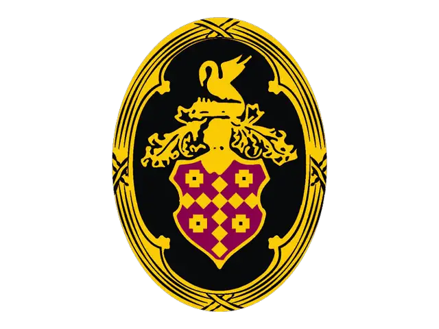
The Packard visual identity featured various presentations but was consistently based on a fancy and ornate crest in a traditional royal color palette. The crest could be placed on a vertically oval medallion with a black background and a sleek silver frame with vignettes, accompanied by a modern script wordmark underneath. The wordmark was available in either red or black.
Another version of the logo featured a burgundy and gold crest with a golden bird, set against a sky-blue background inside a circular badge with a wide red frame, where uppercase sans-serif lettering was displayed.
The rear of Packard cars was typically adorned with a stylish silver wordmark written in a custom sans-serif typeface, with only the first letter capitalized, connected by horizontal lines at the bottom.
A more modern badge used during the last years of the company's existence before its merger with Studebaker was a minimalist geometric emblem, featuring a dark red hexagon with a plain solid texture. The right part of the hexagon was shadowed, adding uniqueness and motion to the badge, which was positioned above uppercase serif lettering with slightly narrowed letters executed in thin, elegant lines, balancing the sharp and bold emblem.

The most famous Packard logotype was written in title-case using a smooth yet bold script typeface, featuring a thick arrow-like underline formed by the elongated and curved tail of the last letter 'D'. The typeface was similar to fonts like Edesron and Jamilah Italic, though with many lines modified.
The color palette of the official Packard logo was an elegant combination of burgundy and gold, evoking a sense of high quality and precision. The addition of black and silver made the badge appear professional and serious, instilling a sense of responsibility and trustworthiness in customers.


