uaz Logo - History, Design, and Meaning

Company Overview
UAZ is a Russian automaking brand established in 1941 in Ulyanovsk, the city after which the company is named. UAZ is primarily known for its military 4WD cars, pickups, and off-road vehicles, with its first models created during World War II.
Key Information
- Founded: 1941
- Founder(s): Soviet government
- Headquarters: Ulyanovsk, Russia
uaz Logo Meaning and History

UAZ was founded during the challenging times of World War II, with its initial vehicles intended for use by Russian army soldiers. There was little time or inclination to design a logo for these early cars, so the first official badge for UAZ was introduced in 1950, nine years after the brand's foundation.

The very first badge for UAZ was delicate and modest, featuring a simple metallic 'tick' that resembled an abstract geometric bird or a letter 'V' with sharp ends. The bottom part of the symbol had a flat, slightly widened line, adding stability and confidence to the overall look.
Depending on the model, the badge could be enlarged to take the full height of the grille, appearing sharp and aggressive. In this case, the 'V' symbolized 'Victory.'

The redesign in 1954 introduced a new emblem with a circular central part and two geometric wings extending from it, resulting in a friendly and dynamic look. The circular part featured an intense red background with a blue horizontal banner through its middle, and the 'UAZ' wordmark in Russian was written in thick yellow cursive over the blue banner.
From 1957 to 1959, UAZ used three different badges, one of which was a light blue and silver circular badge with a thick frame and two silver horizontal lines beneath a strict white wordmark.

The 1959 redesign brought a unified logo design featuring a geometric badge with a triangular top resembling an upward-pointing arrow. Executed in sky-blue with an extra-thick silver outline, the silver wordmark in Russian inside the badge appeared confident yet refined.

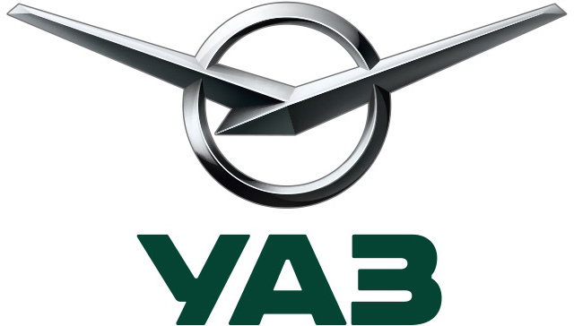
The badge seen today was created for UAZ in 1962, based on the original 'V' emblem but placed over a small circle in a thin frame, with thick and sharp bars extending outward to symbolize freedom and speed. This version had no lettering, presenting a sleek and powerful design.

In 1970, UAZ introduced another badge—a dark blue rectangle with a thin silver outline featuring a stylized silver bird. This bird resembled the iconic 'V' but had softened and slightly bent wings, adding a touch of tenderness and making the brand appear reliable and loyal.

In 2000, the brand began using its 'V' on a circle above a massive outlined inscription in Latin letters. The color palette shifted from gradient silver to military green and gray, evoking the brand's roots. This emblem is still used on some UAZ models and is the only one with the company name not in Russian.

In 2016, UAZ revived its 1962 emblem, refining its contours and adding gloss to its three-dimensional metallic composition. This time, the symbol was placed over a green wordmark in Russian, executed in a heavy sans-serif typeface that looks robust and stable.

Today, UAZ employs two different versions of its visual identity. The first, designed in 2000, features extra-bold lines and square shapes in the sans-serif letters, with softened angles, giving it a masculine and brutal appearance.

The second version has a logotype executed in lighter and thinner lines, yet it maintains confidence and masculinity. The typeface from the 2016 version is similar to well-known fonts like Integral CF Demi Bold and Body Text Large Extra Bold, characterized by clean, thick lines.
The green and metallic color palette of UAZ's visual identity represents the strength and seriousness of the brand, enhancing the emblem's appearance and adding a touch of professionalism and responsibility.
The green and metallic color palette of the UAZ visual identity represents the strength and seriousness of the brand, elevating the look of the emblem and Addis a touch of professionalism and responsibility.


