stoewer Logo - History, Design, and Meaning
Company Overview
Stoewer was a German automobile manufacturer, originally founded in 1858 as a sewing machine company by Bernhard Stoewer. Ownership of the company changed hands multiple times over its history, including state control during World War II. The company was primarily based in Stettin, Germany (now Szczecin, Poland). Specializing in both automobiles and military vehicles, Stoewer contributed significantly to Germany's automotive industry until its dissolution in the aftermath of World War II.
Key Information
- Founded: 1858
- Founder(s): Bernhard Stoewer
- Headquarters: Stettin, Germany (now Szczecin, Poland)
stoewer Logo Meaning and History

Stoewer was established in 1858 by Bernhard Stoewer in Stettin, Germany, starting as a sewing machine and later bicycle manufacturer before transitioning into the automotive sector. Over the years, the company produced a variety of vehicles including luxury cars, light utility vehicles, and even military vehicles during World War II. Notable achievements include pioneering front-wheel-drive cars like the Stoewer V5 and engaging in military contracts for specialized off-road vehicles. Unfortunately, the factory was severely damaged during World War II and ceased vehicle production afterward. Stoewer as an automobile brand does not exist anymore; its legacy is preserved through various collectors and museums.
What is Stoewer?
Stoewer was a German company originally founded in 1858, initially focusing on sewing machines before moving into automobile manufacturing. Located in Stettin, Germany, it produced various types of vehicles, including luxury cars and military vehicles. The company ceased operations after World War II.

The first logo of the historical brand looked very chic and traditional. It was a heraldic badge with a glossy white crest, decorated by a bright blue roundel with a golden griffon on it, and a blue banner on top, with a thin golden outline and a massive white wordmark written in a stylized geometric typeface.

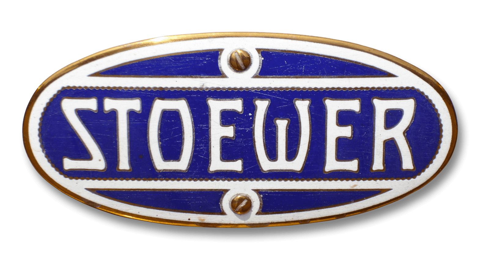
The second badge in the brand's history was based on just the lettering, with the griffon flying away from the visual identity of Stoewer. The new badge had the shape of a horizontally-stretched oval with a bright blue background and a white inscription in a fancy stylized typeface. Each character of the wordmark was outlined in gold, and the white name of the brand was enclosed between two horizontal white lines, which were also outlined in gold.
