ssc Logo - History, Design, and Meaning
Company Overview
SSC is a subsidiary of Shelby, established in 1998 in the United States. The brand is renowned globally for its high-performance vehicles, particularly the SSC Ultimate Aero, which was first released in 2004 and became the fastest car in the world.
Key Information
- Founded: 1999
- Founder(s): Jerod Shelby
- Headquarters: Richland, Washington, United States
ssc Logo Meaning and History
The visual identity of the Shelby Supercars division has featured only one logo, created in 1999, which effectively reflects the brand's purpose. It is modest in composition yet bright, memorable, and stylish.
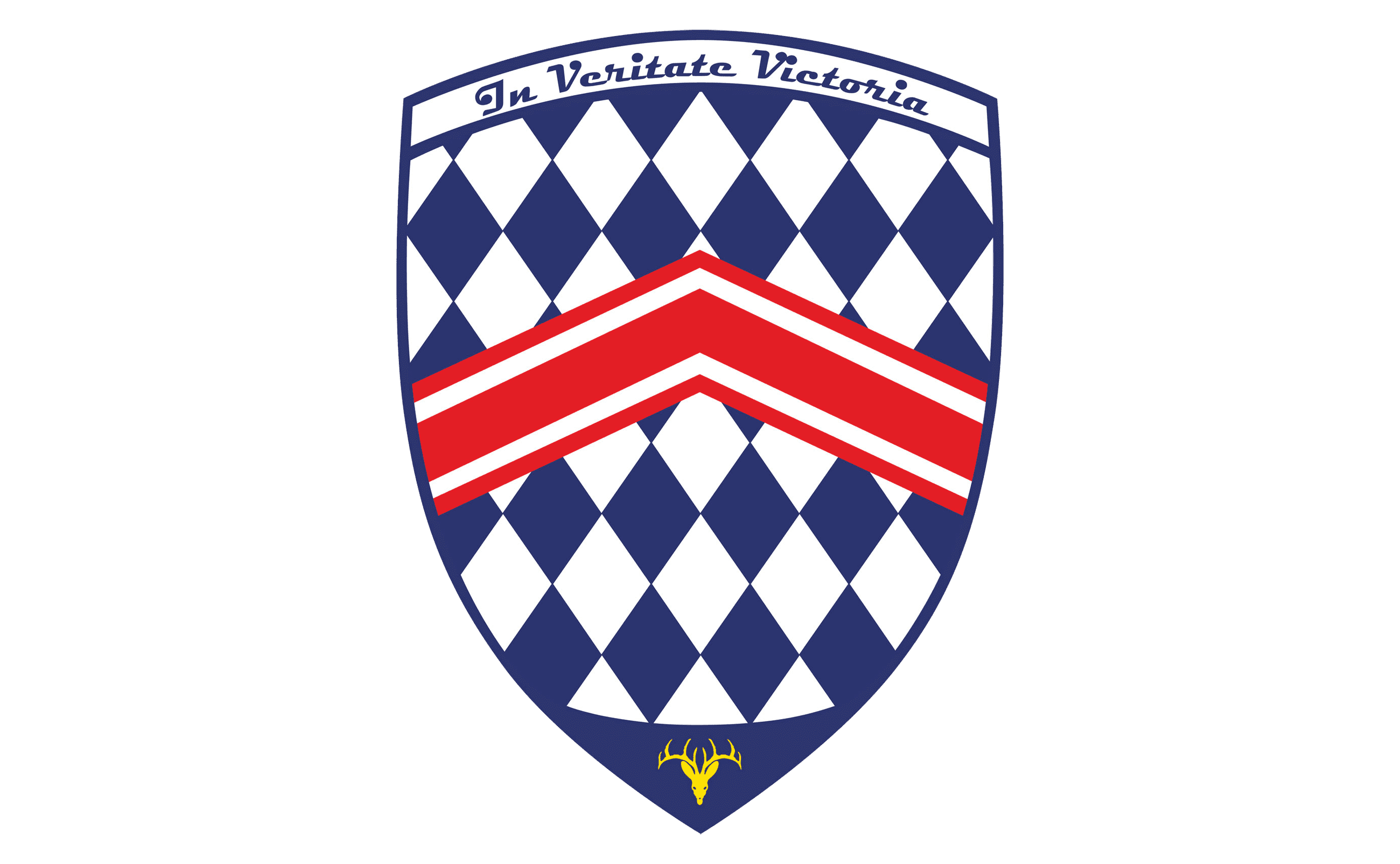
The logo features a classic crest shape adorned with a blue and white rhombus throughout its body, complemented by a solid blue triangle at the bottom. The arched upper part of the badge contains a white banner outlined in blue, bearing the motto 'In Veritate Victoria,' which translates to 'In Truth is Victory' in English. This motto is written in an elegant cursive font with thick, smooth lines and slightly curved tails on the initial letters.

In the center of the crest is a red and white chevron pointing upward, which touches the frame on both sides. The chevron symbolizes strength and growth, adding geometric balance to the checkered background and enhancing the smooth contours of the shield.
The lower part of the emblem features a delicate yellow image resembling a stylized deer head with ornate antlers. This representation of royalty and nobility adds vibrancy and memorability to the overall composition.
The simplicity of the SSC logo makes it minimalist and fresh while maintaining a classy and elegant appearance, effectively reflecting the essence and character of the brand and its luxury offerings.

The blue and white crest can stand alone or be accompanied by an 'SSC' monogram positioned to the left or beneath the emblem. The lettering is typically in blue, although a secondary color palette exists where the blue is replaced by deep green, and the lettering turns black. Occasionally, a red 'North America' tagline in all capitals, using a simple sans-serif typeface, appears beneath the 'SSC' wordmark.
The bold and futuristic 'SSC' lettering is crafted in a modern sans-serif typeface, with the uppercase 'S's slightly inclined to the right due to rounded angles at their upper parts, while the 'C' stands straight.
This stylish inscription is executed in a custom typeface with sharp edges, resembling fonts like Sfera Italic and Gauntlet LGt, though with significant modifications.

The futuristic and progressive typeface of the SSC wordmark adds modernity and style to the traditionally composed badge, which features a bright yet strict color palette. The logo's color scheme combines royal blue and white, accented with red and yellow.
The blue and white crest symbolizes confidence and luxury, while the red chevron represents power, passion, and speed. The yellow stag head signifies the brand's active position and energy, as well as the high quality of its cars.
In the secondary green color palette, the logo appears more sophisticated and subdued, evoking a sense of calm and reliability, representing the brand's commitment to protection and quality.
