renault Logo - History, Design, and Meaning
Company Overview
Renault was the eleventh biggest automaker in the world by production volume, with 50.5% of sales coming outside of Europe. The Renault–Nissan Alliance is the fourth-largest automotive group.
Key Information
- Founded: 1899
- Founder(s): Louis Renault<br>Marcel Renault<br>Fernand Renault
- Headquarters: Boulogne-Billancourt,
renault Logo Meaning and History

The company was created in 1899 under the name Societe Renault Freres, but the first car was presented in 1897 and sold to a friend of the family a year later.
The brand got its first logo in 1900, next year after it was officially established, and during more than a century of its history, the Renault logo design has undergone several significant changes.
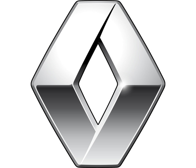
The Renault logo is instantly recognizable across the globe. It got its famous shape in the 1920s and has been modifying it until today.

The first Renault logo was a great example of its time, with its elegance and finesse. It was composed of the initials of three Renault brothers, engraved on an oval-shaped medallion with two ribbons.

The original logo was redesigned in 1906. Now the brand's logo is showing a car image enclosed in a round frame gear wheel. The logo is more masculine and industrial.

During World War I, Renault was constructing tanks, which was reflected in the new brand's logo. The round brutal emblem stayed with Renault company for 4 years.

In 1923, the emblem was redesigned, celebrating the grille, in order to be placed on the car. It is a round icon with the wordmark in the center. The logo looks more modern and confident now.

The first diamond logo was designed. The company's emblem gained angular forms and turned into a rhombus. The grille pattern remained as well as the brand's nameplate. In 1946 Renault started using yellow color for its visual identity. And since then, the color became synonymous with the brand.


In 1972, Renault hired a famous artist Victor Vasarely to redesign the logo. He created a three-dimensional emblem, which was dynamic and clean with its angular lines. The name of the brand was removed from the logo.


The brand's visual identity was redesigned again in 1992. The symbol became stronger and more decent, its 3D shape became more visible now. Renault name appeared under the emblem, executed in a bold serif sans font. The logo was a foundation of the one we see today.

The emblem was slightly modernized and the wordmark got a new typeface. The yellow square appeared on the logo as a background. The nameplate was executed in black, which gave a great contrast with a bright background and silver tone of the emblem.

The wordmark was designed by Eric de Berranger. It was powerful and elegant, combining both thick and thin lines.

The Renault logo is bolder and more modern. The wordmark in custom typeface is minimalist and stylish. The brand's visual identity today is a reflection of progress and reliability of the company. It evokes a sense of trust and expertise, while the yellow adds playfulness and warmth.


