plymouth Logo - History, Design, and Meaning
Company Overview
Plymouth was a brand of automobiles based in the United States, produced by the Chrysler Corporation and its successor Daimler Chrysler. The brand first appeared in 1928 and was discontinued in 2001.
Key Information
- Founded: 1928
- Founder(s): Walter Chrysler
- Headquarters: Auburn Hills, Michigan,
plymouth Logo Meaning and History
Plymouth is a car brand with a rich and intense visual identity history. Even though the company no longer exists, its logos are remembered and recognized worldwide. Throughout the years, the marque alternated between its own symbol, the legendary Mayflower clipper, and the emblem of its parent company, Chrysler, which featured a simple logotype and modern abstractions.
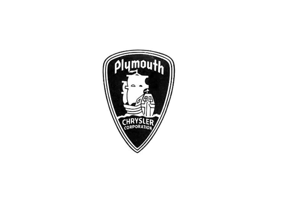
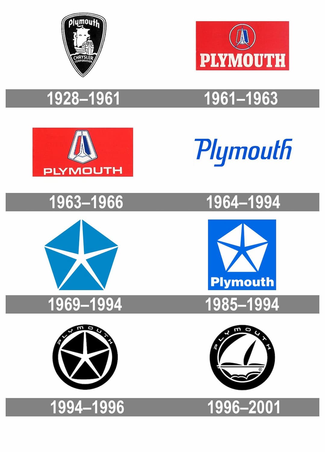
The very first logo for Plymouth, created in 1928, depicted a white clipper on a black triangular shield with a triple black and white outline. The nameplate was positioned above the ship, while the 'Chrysler Corporation' lettering was placed on the bottom part of the badge beneath stylized waves. This logo paid tribute to the Mayflower, the famous ship that brought the first colonists to the United States.
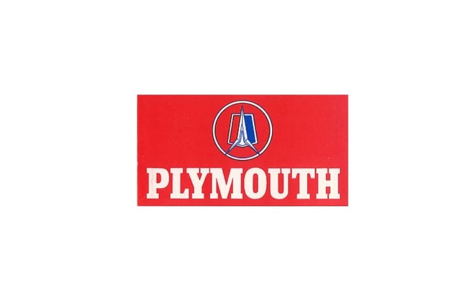
In 1961, the logo underwent a complete redesign, featuring a rounded badge on a red background above massive serif lettering. The emblem included a stylized image of a rocket positioned vertically over a pentagon, which was vertically divided into red and blue halves.
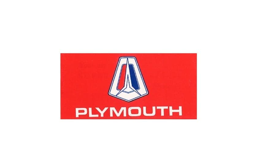
The logo was refined again in 1963, removing the rounded frame and changing the wordmark to a modern sans-serif typeface. The bold square letters looked confident and strong, complementing the sharp emblem now placed on a white pentagon.

In 1964, a text-based version was created, featuring an italicized logotype in a custom sans-serif typeface with smooth lines and straight edges. There were two color options for the wordmark: blue and black.

In 1969, Plymouth adopted the iconic Chrysler pentagram as its emblem. The thin white five-pointed star was placed inside a light blue geometric figure, visually dividing it into five equal triangles.
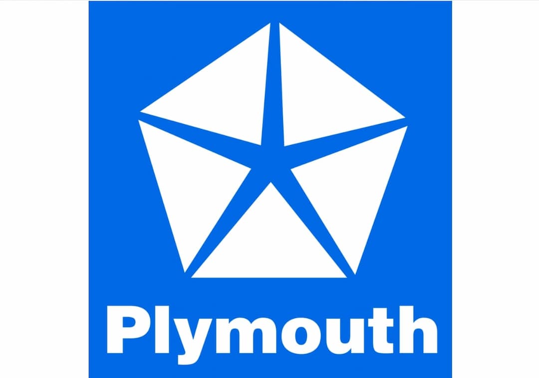
The redesign in 1985 placed the pentagon inside a bright blue square above bold sans-serif lettering in white. The symbol changed to white, while the elegant star became blue. An additional monochrome version was used for official documents.
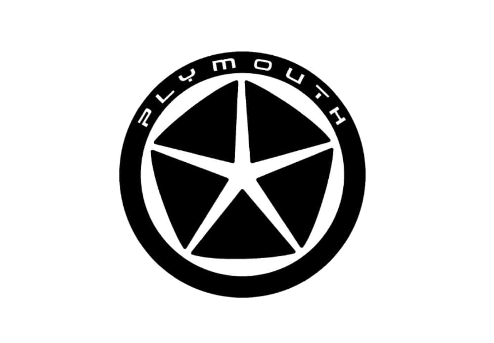
In 1994, a black pentagon with a white star was placed inside a white circle with a thick black outline. The 'Plymouth' wordmark in a custom sans-serif typeface was written along the upper part of the framing in white.
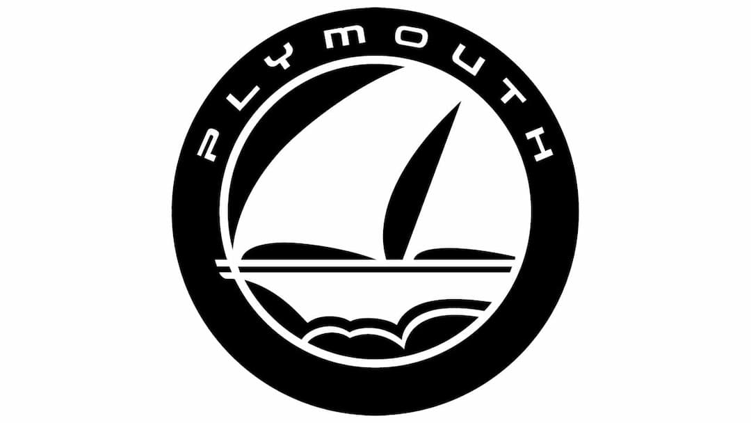
The frame and lettering remained unchanged, but the pentagon was removed in 1996, marking a return to the original emblem, the Mayflower. The stylized white clipper was drawn on a black background, moving to the left.
This was the last logo designed for Plymouth, and the decision to return to its roots in the final years of its existence is truly impressive.