perodua Logo - History, Design, and Meaning
Company Overview
Perodua is Malaysia's second national car manufacturer, established in 1993. The company mainly produces compact cars and does not compete with Proton for the same market niche.
Key Information
- Founded: 1993
- Founder(s): Malaysian government and Daihatsu
- Headquarters: Serendah, Selangor, Malaysia
perodua Logo Meaning and History

The main feature that makes the Perodua logo instantly recognizable is its color palette. The combination of green and red, complemented by delicate white or silver details, has been a part of the brand's identity since its inception, regardless of the shapes of the badge over the years.

The very first Perodua logo consisted of a simple square with a thin white outline, featuring a massive green 'P' with no space at the top, placed on a bright red background. The red was visible only in the upper right corner of the square and more prominently at the bottom. The 'P' was outlined in thin white, enhancing its visibility and creating a strong contrast between the two main colors.

The redesign in 1998 changed the style of the Perodua badge and added a logotype beneath the emblem. The new badge featured a horizontally oriented oval shape, with the stylized green 'P' separated from a drop-like red part by a thick silver line running vertically through the entire badge. In this version, the Perodua 'P' resembled a panther's profile, evoking a sense of freedom, speed, and motion.
The green and red shades on this emblem were darkened and muted compared to the original logo, yet this made the logo sleeker and more sophisticated, allowing the silver parts to gloss and shine.
The inscription beneath the elliptical badge was executed in an ExtraBold italicized sans-serif typeface with thick lines and slightly narrowed letters. The 'O' was larger and featured a horizontally striped black and white pattern resembling a car wheel. While the lettering was a bit heavy for the elegant badge, it effectively represented the brand's power and determination.

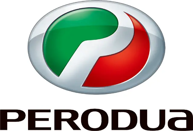
In 2007, the Perodua logo was redesigned again. The oval badge was refined to feature a gradient green and red combination within a thick silver frame. The badge appeared matte and voluminous, with softened edges. This new emblem was well-balanced in terms of thickness and colors, complemented by a delicate and modern sans-serif logotype in black placed underneath.
The new inscription was written in uppercase, with the last letter, 'A', in lowercase, adding uniqueness to the brand's visual identity. All letters featured uniform size and thickness, executed in a sleek and trendy font with smooth lines and full shapes.
The Perodua lettering looked elegant and sleek in its new sans-serif typeface, characterized by distinct contours and ends. The typeface closely resembles fonts like FF Signa around Pro Extended and Indecise Semi Expanded Medium, with some modified lines.
The red and green color palette of the Perodua logo represents balance and harmony between the passion, energy, and stability of the company. These colors reflect its progressiveness and courage in adopting innovative technologies while prioritizing customer comfort and safety.
The bright colors of the Perodua logo are complemented by matte silver and black shades, which signify professionalism, stability, and seriousness. This combination enhances the badge's elegance and timelessness when placed on Perodua cars.
