opel Logo - History, Design, and Meaning
Company Overview
Adam Opel AG is a German automobile manufacturer, not a United Kingdom company. It was founded by Adam Opel in 1862 and is known for producing a wide range of vehicles.
Key Information
- Founded: 1862
- Founder(s): Adam Opel
- Headquarters: Rüsselsheim, Hesse,
opel Logo Meaning and History

There is definitely no exaggeration in naming Opel the company with one of the most intense visual identity histories in the world. The number of its logo redesigns is more than 25, and even after finding its iconic symbol in the 1960s, Opel still kept bringing new variations of design and colors.

The company, named after its founder, Adam Opel, specialized in the production of sewing machines, and its first logo was designed in 1862. It was an elegant and traditional medallion-type insignia, where the stylized letters, 'A' and 'O', were drawn in red and gray. Smooth curves and a slightly narrow and elongated shape of the logo made it look sophisticated and sleek.


In 1886, the specialization of the company changed to bicycle production, so the logo was redesigned into a vertically located oval with sharp ornaments on both its top and bottom. Inside the framing with the wordmark, there was an image of a man riding a bicycle and an angel playing above him. It was a traditional emblem for its time, with a very detailed drawing and elegant serif lettering.

The next redesign was held in 1899 after the Opel Company started the production of cars. The first version of the new logo only stayed with the brand for a few months. It was a black and white stylized shield with a double outline and white lettering, placed diagonally on a black background. The 'Opel Motorwagenfabrik Rüsselsheim a.Main' inscription was executed in a delicate and strict serif font.

After the experimental monochrome version, Opel designed something completely different — an ornate and colorful insignia with vignettes and curved lettering. The flower-like image in coral red and cream had an arched 'Opel' inscription on it, '1899' above, and 'Fahrräder' below.

The design from 1902 was something new. A modern badge, repeating the shape of a rugby ball, executed in white with red outlines and lettering. The word 'Opel' in red capitals was placed in the middle, enclosed in a wide triple red and white outline, where the 'Motorenwagenfabrik Rüsselsheim' lettering was placed around its perimeter.

In 1906, Opel got a completely different logo, which looked sleek and fancy, resembling an art-deco panel. The emblem was executed in gold and black, with 'Opel' surrounded by elegant columns with curves and smooth lines. The logo stayed with the company for three years.

The logo from 1909 was a simple script wordmark in gold. The 'Opel' nameplate was placed slightly diagonally and had the letter 'L' tail elongated, underlining the whole word.

The rugby shapes came back to the Opel visual identity in 1910 and stayed for almost 30 years. Now the style of the emblem resembled Ancient Greece and its unique recognizable lettering. The color palette consisted of blue and light gold for the medallion and white for the inscription. The framing featured a laurel leaves pattern.

In 1921, the color scheme was changed to yellow and black, and all the small elements were removed, so the logo became cleaner and slightly brutal. The Greek mood remained the main theme of visual identity.

An alternative version was created in 1928 — a white and cold square with rounded angles, consisting of four smaller squares, where the 'Opel' letters were placed. It was cool and very stylish but didn't stay for long.

At the end of 1928, the Greek 'eye' emblem was placed inside a circle, and the color palette was switched to bright red with yellow outlines. A year later, in 1929, Opel became a part of General Motors but retained this logo until 1930.


In 1930, Opel began manufacturing its Blitz trucks and designed a special logo for them. The eye shape remained, but it now featured the 'Blitz' lettering with two lightning shapes coming out of it in two directions. The color scheme of the new emblem was black and silver.


In 1936, the Blitz logo was redrawn and simplified, replaced by a diagonally placed wordmark set in two levels and executed in white against a light gray background.


A completely new design was created in 1937, featuring a gray rocket horizontally flying out of a yellow ring, which was unusual for Opel. No wordmark was added.


In 1947, the contours and color palette of the previous logo were refined with thinner lines and a light gray and white combination, giving it a stylish and elegant appearance.

The yellow color returned to the Opel visual identity in 1950. The new logo was composed of a vertically placed oval split into two parts—white and yellow—with a thin black outline and bold 'Opel' lettering in black capitals.


The rocket returned, now with wings and executed in gold against a white background. The wordmark was added below the image, arched around the ring.


The logo received a more modern look in 1959, with a cleaned and modernized rocket image, and the wordmark was removed again, resulting in a minimalistic design that looked great on Opel cars.

The sleek and smooth rocket shape was replaced by an abstract sharp figure, reminiscent of the original concept but with a completely different mood. The logo was executed in black and silver, adding power and brutality to the image.


The iconic Opel 'blitz' emblem was created in 1964, featuring a light gray lightning bolt resembling a horizontally stretched letter 'Z,' with a thin double outline in white and gray, placed over a gray and white circle.


In 1979, the emblem was drawn in bold black lines and placed on a pale yellow background, with an elegant yet solid and strong black 'Opel' wordmark underneath, executed in a classy serif font.

The yellow became brighter in 1978, and the emblem's black outline was updated with a rounded rectangle frame. The lightning on the circle was also enclosed in this frame, and the wordmark was enlarged and written in a contemporary sans-serif typeface.

For less than a year, Opel used a super minimalist version of the emblem with outlines in black lightning and the ring around it, emphasizing simplicity and style.

The pale yellow color returned to the automaker's visual identity in 1987, remaining until the early 2000s. The blitz badge was placed on a yellow background and enclosed in a white square with a thin black outline. The inscription was executed in the same style as the 1978 logo but with larger letters.

In 1991, the whole blitz and a thin ring were placed inside a solid black circle, creating a powerful and masculine emblem that reflected the company's progress and authority.

The colors were switched, and the emblem became black while the background turned white. The 'Opel' lettering was placed under the brand's iconic symbol, written in the same traditional sans-serif font.

The emblem became three-dimensional in 2002, executed in light silver metal, accompanied by a bright yellow wordmark. This new color combination made the visual identity fresh and crisp, evoking a sense of loyalty and happiness.

In 2007, the emblem and the wordmark gained more volume, with the color scheme slightly modified. The silver badge incorporated green and purple shades, while the yellow nameplate became more intense and gradient, with delicate shadows adding dynamics to the logo.

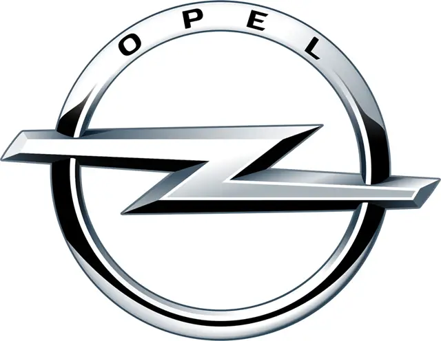
The Opel logo from 2009 was also three-dimensional but more minimalist and elegant than the previous one. It featured just the iconic 'Z' sign in a circle, executed in silver gray with some black accents, adding volume and motion. The wordmark was placed on the upper part of the circle in delicate black lines.


The next redesign occurred in 2017 after Opel was acquired by the PSA Group. The new logo featured a simple black blitz in a circle on a white background, with no additions or lettering. This simplicity reflects the company as progressive and innovative, valuing traditions while aiming to grow in new directions.

The redesign in 2020 made the elements of the Opel emblem thinner and more delicate. The uppercase sans-serif logotype was written under the emblem in a custom typeface with a diagonal cut on the 'L' horizontal bar.

The iconic Opel logo was redesigned again in 2023, creating a stronger and edgier image for the brand. The Z-like bolt was cut into two parts and outlined in a thinner circle, accentuating the central part of the badge. The lines of the lightning bolt were elongated, and the ends gained diagonal cuts, while the lettering remained mostly unchanged.
The bold uppercase lettering from the Opel logo is set in a modern sans-serif typeface with distinctive contours. The closest fonts to the one used in this insignia are likely Verbatim Wide Bold or Hanley Pro Sans Wide Extra, with some small modifications to the contours.
The official version of the Opel logo is set in monochrome, while when placed on the bonnet of the brand's cars, the emblem turns glossy silver.
