oakland Logo - History, Design, and Meaning
Company Overview
Oakland Motor Car Company was an American automaker, established in 1907 by Alanson P. Brush and Edward Murphy. The company was later acquired by General Motors (GM) in 1909. Headquartered in Pontiac, Michigan, Oakland specialized in producing mid-range automobiles. As part of GM, the Oakland brand was eventually phased out in favor of Pontiac by the 1930s.
Key Information
- Founded: 1907
- Founder(s): Edward Murphy
- Headquarters: Pontiac, Michigan, United States
oakland Logo Meaning and History

Founded in 1907 by Alanson P. Brush and Edward Murphy, Oakland Motor Car Company was an American automaker that became part of General Motors in 1909. Operating out of Pontiac, Michigan, Oakland was instrumental in introducing several automotive innovations, including the use of mono-block V8 engines. The company was known for producing affordable yet high-quality automobiles during its era. By the 1930s, the brand was phased out, and its factories and assets were redirected to form GM's Pontiac division, thereby ending Oakland's independent existence.
What is Oakland?
Oakland Motor Car Company was an American automaker founded in 1907. Acquired by General Motors in 1909, it was based in Pontiac, Michigan, and specialized in mid-range automobiles. The brand was phased out in the 1930s, leading to the formation of Pontiac.

The logo of the brand featured a luxurious and grand design, characterized by a golden ornate frame. At the top center, an oak seed was displayed, accompanied by a banner that read 'Product of General Motors' in uppercase, sans-serif letters. The frame was adorned with oak leaves, symbolically reflecting the brand's name. The name 'Oakland' was printed in the center using a serif font in black with a light purple outline, resembling the Weekenia Regular font. The white letters with a golden outline contrasted against the rich blue background, enhancing the logo's visibility.

A drastically different logo was introduced shortly after the previous design. This oval logo featured a thin silver line framing the design, contrasted by an even thinner dark blue line on the outside. The center remained dark blue, allowing a white banner with silver lines at the top and bottom to stand out. The name was rendered in dark blue, appearing as if it were cut out against the white background, with a thin silver outline to match other silver elements. The name was printed using a font similar to FoundFont Bad Postcard, with a unique feature: the letter 'a' was tilted to the left, creating a distinctive look.

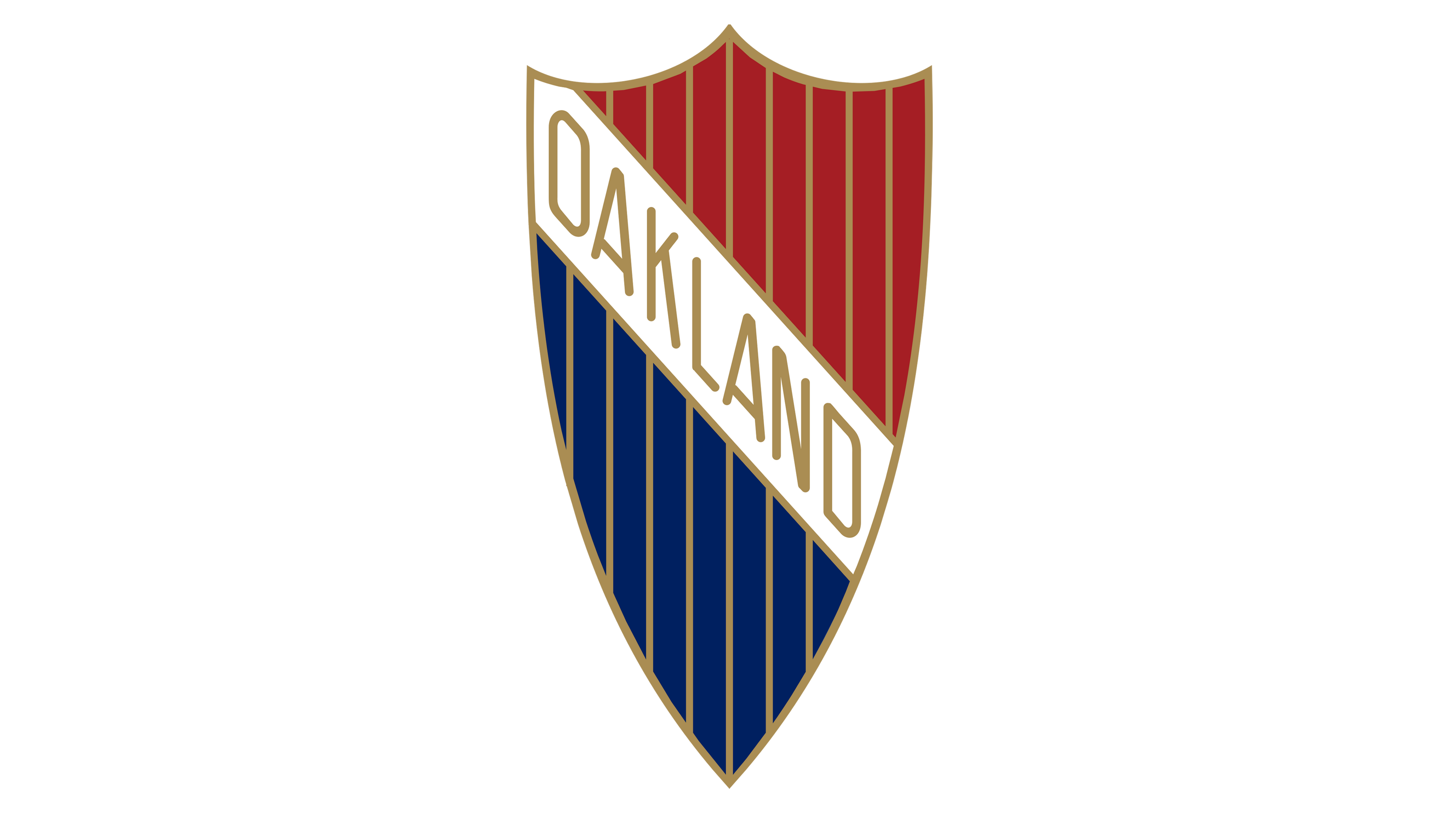
The company later adopted a crest shape for its logo, a common design among automobile brands. This logo was used until the brand transitioned into Pontiac. It featured a white banner running from the upper corner down to the center, displaying the name in golden letters. The banner separated the crest into an upper red portion and a lower dark blue section. The crest had a golden outline that matched the thin vertical lines creating a pattern. Although this version differed significantly from the original, it maintained the same sophisticated and powerful appearance.
