o s c a Logo - History, Design, and Meaning
Company Overview
O.S.C.A. is the name of a former Italian automaking company, established in Bologna in 1947, which existed for almost twenty years before ceasing operations in 1967. The brand was created by the famous Maserati family, with the aim of producing high-performance racing cars.
Key Information
- Founded: 1947
- Founder(s): Maserati brothers
- Headquarters: San Lazzaro di Savena, Italy
o s c a Logo Meaning and History
O.S.C.A. was a luxury automotive brand of its time, and the visual identity of this Maserati subsidiary reflected its values and style. Modest and elegant, the O.S.C.A. badge remains timeless with its classic shapes and contours, complemented by a noble and intense color palette.
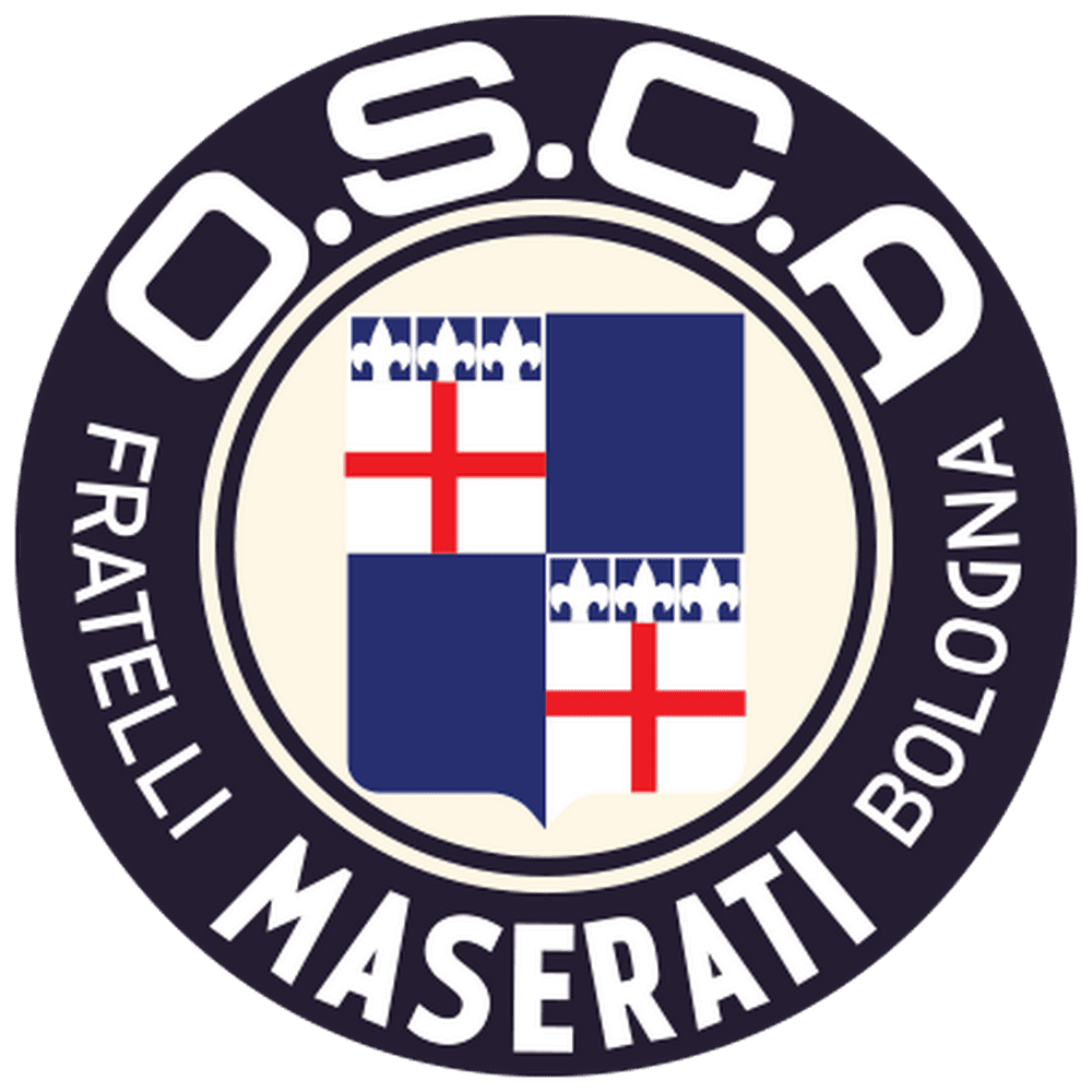
The only version of the O.S.C.A. logo was introduced in 1947 and featured a circular badge with a thick black outline and white lettering. The inner circle was light cream, adorned with a sleek heraldic crest in blue, white, and red. The crest paid tribute to Bologna, the brand's birthplace, with its colors evoking sophistication and professionalism.
The lettering on the emblem displayed 'O.S.C.A.' in the upper part of the wide framing, while the bottom part featured the inscription 'Fratelli Maserati Bologna' in all capitals. The wordmark was uniform in color but employed different typefaces for the two sections.
When placed on the car bonnet, the logo's color palette shifted to blue, silver, and red, with red used only for the two crosses on the crest at the emblem's center. The black framing became blue, while all letters and the background of the inner part of the logo were rendered in silver. The glossy surface of the logo conveyed a strong and confident identity, with elegant lines that enhanced its exquisite appearance.

Both parts of the lettering on the O.S.C.A. circular emblem were set in custom sans-serif typefaces. The main wordmark used a bold square font with extended contours and distinct, strict cuts, while the tagline employed a traditional typeface with narrower letters. The contours of the 'O.S.C.A.' part were cut at the top and bottom, giving the wordmark a unique and memorable look. The bottom line utilized a simple style, reminiscent of Helvetica, characterized by minimalist shapes and clean lines.
The blue, silver, and red color palette of the O.S.C.A. visual identity symbolizes the brand's stability, confidence, and passion, reflecting its experience and professionalism. Silver adds elegance and style, while red represents energy and progressiveness. Blue balances the two colors, embodying protection and reliability.


