monarch Logo - History, Design, and Meaning
Company Overview
Monarch is a defunct Canadian automobile brand that was part of Ford Motor Company. Established in 1946, the brand was a subsidiary designed to provide a more Canadian-focused lineup of cars. Monarch vehicles were primarily sold in Canada, but some were exported to nearby markets. Owned by Ford, Monarch aimed to offer models tailored to the needs and preferences of Canadian consumers. Operations ceased in 1976 due to various economic and market pressures.
Key Information
- Founded: 1946
- Founder(s): Ford Motor Company of Canada
- Headquarters: Oakville, Ontario, Canada
monarch Logo Meaning and History

Monarch was founded in 1946 as a subsidiary of the Ford Motor Company, specifically to cater to the Canadian automotive market. The brand was created to give Canadian consumers a range of vehicles that differed slightly from Ford's mainstream American offerings. Over its 30-year history, Monarch released a variety of models like the Monarch Lucerne and Monarch Sceptre, which were highly regarded for their comfort and durability. In terms of milestones, the brand managed to cultivate a loyal following in Canada, although it never achieved monumental success on a global scale. By the mid-1970s, facing stiff competition and changing market dynamics, Monarch ceased operations in 1976. At the time of its discontinuation, it was perceived as a brand that had served its purpose but could not adapt to the rapidly evolving automobile industry.
What is Monarch?
Monarch was a Canadian automotive brand, in operation from 1946 to 1976. A subsidiary of Ford Motor Company, it aimed to provide vehicles specifically designed for the Canadian market. The brand was discontinued in 1976 due to economic factors and changing market demands.

The first Monarch logo, designed in 1946, looked very stylish and progressive for its time. It was a bold title case lettering in a custom sans-serif typeface with slightly extended characters, written in thick solid lines with straight cuts of the ends. The capital 'M' featured an interesting shape — its left vertical bar had an elongated tail, coming out of the upper part to the left, and creating a sense of motion.

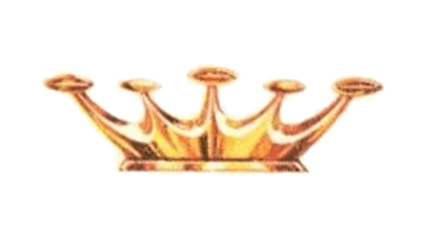
The redesign of 1961 introduced a completely different approach to the Monarch's visual identity. The new logo was based on just a graphical element, with no lettering accompanying it. It was a three-dimensional golden crown with five peaks embedded with five spheres on the ends. The crown was slightly flattened and horizontally extended.
