mini Logo - History, Design, and Meaning

Company Overview
Mini (stylized as MINI) is a British automotive brand owned by BMW since 2000, used for a range of small cars. The name Mini has been associated with car models since 1959, and in 1969, it became a standalone marque when the name 'Mini' replaced the separate 'Austin Mini' and 'Morris Mini' car model names. BMW acquired the marque in 1994 when it purchased Rover Group (formerly British Leyland), which owned Mini and other brands.
Key Information
- Founded: 1959
- Founder(s): Alec Issigonis
- Headquarters: Oxford, United Kingdom
mini Logo Meaning and History

MINI was created to provide the British public with small, economical cars at low costs. Initially, cars under the MINI trademark were produced by different manufacturers, leading to varied visual identities in its early years.
It was only after MINI was acquired by BMW in 2000 that the famous emblem became standardized and firmly associated with the brand.

The first two manufacturers of MINI cars were based in Oxford and Birmingham. The Oxford MINI was known as the Morris Mini Minor, while the Birmingham model was the Austin Seven. These models had different logos and no unified style.
The Austin Seven logo featured a cursive handwritten wordmark with a coat of arms above it, while the Morris Mini logo was a circle with two arrows extending outward. The Morris logo became the foundation for the MINI emblem we recognize today.

The company hired a new designer, John Cooper, who created the famous Mini Cooper in 1961, which led to a new logo design and wordmark.
The 1962 logo featured a silver circle with red 'Mini Cooper' lettering inside and two large squared wings on either side. This logo inspired the current emblem.


The brand was acquired by Rover Group (Leyland Motors), renamed to Mini, and a new logo was designed in 1969. This logo remained with MINI for over 30 years.
The 1969 logo featured a hexagon divided into two parts: the upper part with a black background and a white bold wordmark, and the lower part with two turquoise sections separated by a thick white vertical line.
The solid silver framing of the hexagon enhanced the color contrast, adding intensity and brightness. The emblem's symmetry added style and modernity, making it strong and memorable.

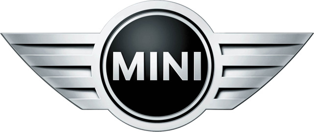
After MINI was acquired by BMW, the iconic winged logo was reintroduced and modernized. The 2001 MINI logo became a three-dimensional figure, featuring a black circle with a silver outline placed between two sharp silver wings.
The wordmark is executed in a sans-serif font with confident and neat lines. It looks simple and strict, making the logo stylish and powerful.

Following a redesign in 2018, the logo lines were refined and the color palette was switched to monochrome. The brand returned to a simple two-dimensional emblem, emphasizing the straight and bold lines of the wings.
This strong visual identity for a car brand fully reflects the spirit of the company.
The iconic MINI emblem, created in 2001, consists of a circle with two wings symbolizing freedom and speed, two key qualities of the modern world.
The wordmark is placed inside the circle, balancing the geometry of the emblem, with sharp and straight wings.
It is a stylish and simple emblem that celebrates the brand's free spirit, youthful focus on design, and looks good on cars, print, and web editions in its monochrome palette. The emblem is bold, strong, instantly recognizable, and reflects the brand's philosophy.


