microcar Logo - History, Design, and Meaning
Company Overview
A microcar is the smallest automobile classification, typically smaller than city cars. These small cars were generally referred to as cyclecars until the 1940s. More recent models are often called bubble cars due to their bubble-shaped appearance.
Key Information
- Founded: 1984
- Founder(s): Bénéteau Group
- Headquarters: Angers, France
microcar Logo Meaning and History

Microcar, a French microcar manufacturer, was founded in 1984 as a division of the Bénéteau group, a major manufacturer of sailing boats and yachts. In September 2000, production moved to a new custom-built factory. In September 2008, Microcar was acquired by Ligier Automobiles in a deal backed by the Italian private equity firm Investimenti Partners.
The merger created Europe's second-largest microcar manufacturer and the largest manufacturer of quad bikes, or vehicles that do not require a license.
What is Microcar?
Microcar is a brand of low-budget cars, produced by the French company, established in the middle of the 1980s. Originally, the company was engaged in the production of boats, but switched to manufacturing small cars in 2008, after it was acquired by Ligier.


The Microcar visual identity has undergone several redesigns, but all versions have maintained a consistent style established from the beginning.
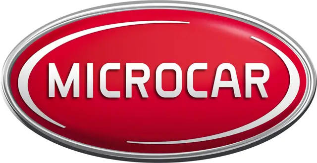
The logo of the compact-car manufacturer consists of a horizontally oriented oval with a delicate silver outline. In the center of the red oval is the 'Microcar' wordmark in all capitals, executed in a custom geometric sans-serif typeface with clean lines and interesting letter contours, adding a slightly futuristic feel to the badge.
The emblem is complemented by two curved silver lines along the oval's perimeter, resembling an orbit, which aligns with themes of the future and space. This reflects the brand's progressive approach to design and ecology.
When placed on cars, the emblem is three-dimensional, with a glossy red surface and delicate silver elements, resembling a bright candy on the bonnet of a stylish microcar.
The bold and smooth uppercase lettering from the primary Microcar badge is set in a custom sans-serif typeface with rounded angles and straight bar ends. The closest fonts to this insignia are likely Gia Black or Charles Wright 1935, with modernized letter contours.
The color palette of the Microcar visual identity is based on a combination of red and silver, featuring a glossy surface and sparkly gradients, giving the badge a candy-like appearance. The contrast between red and silver conveys an image of a confident and strong company that values customer comfort and safety.
