maz Logo - History, Design, and Meaning
Company Overview
MAZ (Minsk Automobile Plant) is a Belarusian state-owned manufacturer of heavy-duty vehicles, including trucks, buses, and trolleys. Overseen by the Belarusian government, MAZ has been operational since 1944 and is one of the largest producers of heavy vehicles in Eastern Europe. The company exports its products to over 40 countries worldwide, including Russia, Africa, and Asia. MAZ is actively involved in collaborative projects with international companies to modernize its production lines and diversify its offerings.
Key Information
- Founded: 1944
- Founder(s): Soviet government
- Headquarters: Minsk, Belarus
maz Logo Meaning and History

MAZ was founded in 1944 in Minsk, Belarus, initially to meet the needs of the Soviet Union during World War II. Over the years, the company has achieved several milestones, including the launch of the MAZ-200, a crucial truck series for the USSR. In the late 1950s, MAZ introduced the MAZ-500, a key model in Soviet logistics and transport. Renowned for its innovation and quality, MAZ has received numerous awards. Owned by the Belarusian government, it remains a vital part of Belarus's industrial sector. As of 2021, MAZ has a wide international presence, exporting vehicles globally and engaging in international collaborations to stay competitive.
What is MAZ?
MAZ, or Minsk Automobile Plant, is a Belarusian manufacturer specializing in heavy-duty vehicles like trucks, buses, and trolleys. Founded in 1944, it is a state-owned enterprise and is among the largest manufacturers of its kind in Eastern Europe. As of 2021, MAZ exports its products to over 40 countries worldwide.

A powerful and determined bull was the brand's symbol for 25 years, representing the heavy, large, and strong vehicles produced by MAZ. The original logo featured a simple drawing of a bull facing right and an emblem in the form of an inverted triangle. This triangle had lines creating a symmetrical pattern and contained a dark pentagon shape with the company's name printed in Russian in bold characters.

The updated logo had a more refined, three-dimensional appearance in dark gray shades, resembling metal. The bull remained above the name, depicted in a more determined stance. The pentagon shape with the name was largely unchanged, but wing-like extensions were added on either side, casting shadows and creating a realistic look. This logo conveyed strength and determination, reflecting the robust vehicles developed by MAZ.

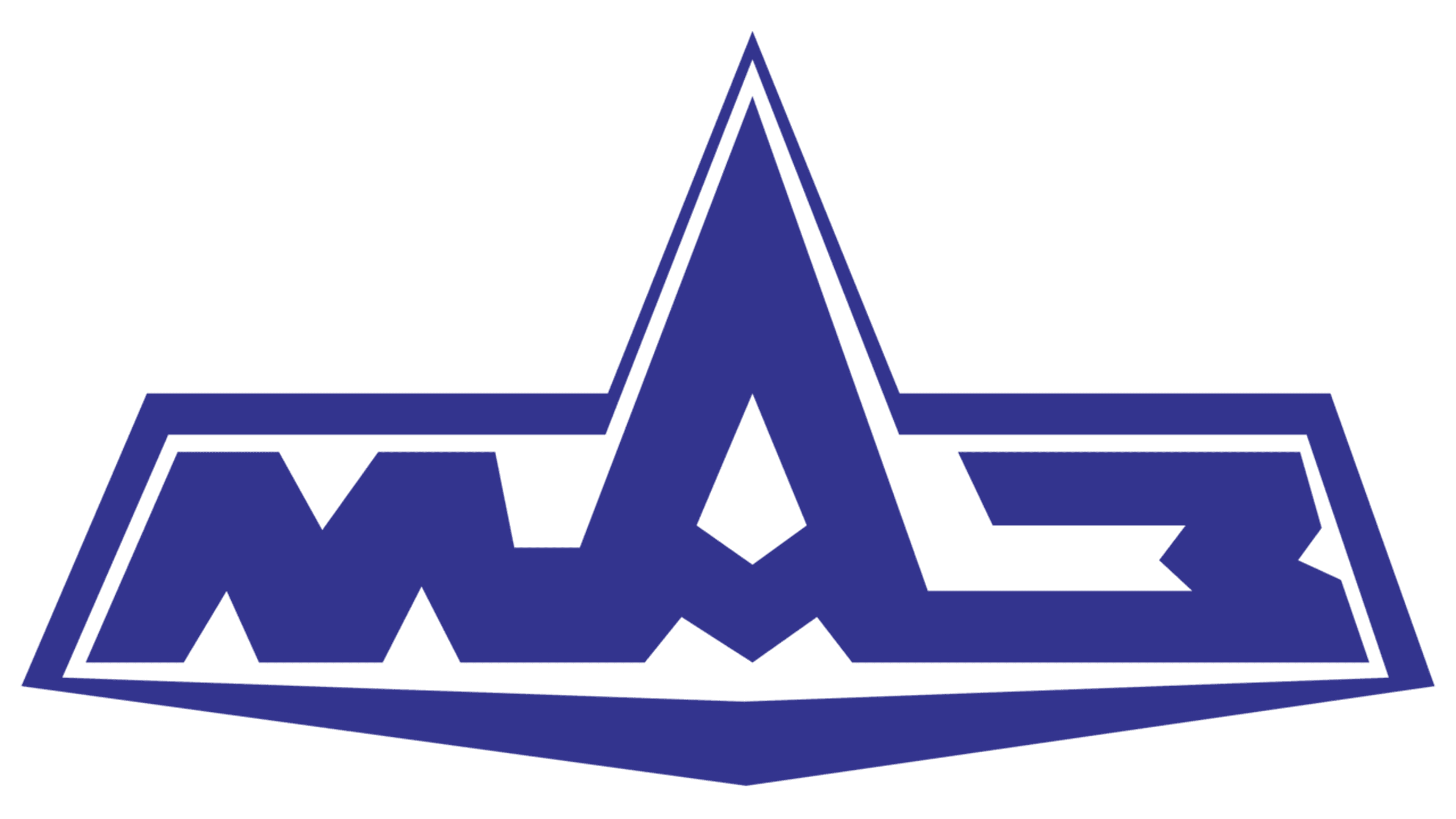
The latest logo differed significantly from earlier versions, with the iconic bull removed. The color changed to dark blue with a white base, giving it a minimalistic and modern look. The blue color maintained the impression of a reliable and trustworthy brand. This was supported by the geometric font choice, featuring bold, clean strokes and an exaggerated middle letter 'A' that extended beyond the height of other characters, resembling a grand mountain. The name had a thin border following its shape. Notably, the company did not introduce an English version of its name, indicating a focus on its original market and adherence to its roots.
