mastretta Logo - History, Design, and Meaning
Company Overview
Mastretta Cars is a Mexican car manufacturer and design studio founded by industrial designer Daniel Mastretta in Mexico City in 1987. In the 1990s, Mastretta developed a limited number of kit cars under the Tecnoidea and Unediseño brands. The 2010 MXT was the first vehicle they developed to achieve international commercial availability. While often mistakenly thought to be the first Mexican mass-production car maker, other Mexican automotive companies like Dina, Ramirez Industrial Group, VAM, and D.M. Nacional had been producing vehicles on a smaller national scale since the 1950s.
Key Information
- Founded: 1987
- Founder(s): Daniel Mastretta
- Headquarters: Mexico City, Mexico
mastretta Logo Meaning and History

Mastretta was founded in 1987 by Daniel and Carlos Mastretta in Mexico. Initially concentrating on bus and transportation design, the company later moved into sports cars, gaining fame with the release of the Mastretta MXT in 2011. This lightweight sports car was praised for its agility and performance, establishing Mastretta as a competitor in the global sports car market. The company achieved international media attention and participated in auto shows worldwide, enhancing the reputation of the Mexican automotive industry. Although the company remained active in automotive design, details on its latest projects were limited.
What is Mastretta?
Mastretta is a Mexican automotive design and manufacturing company. Founded by Daniel and Carlos Mastretta, it gained international fame for its high-performance sports car, the Mastretta MXT. The company focuses on creating lightweight, robust vehicles designed for an exhilarating driving experience.

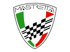
The Mastretta logo uses colors that reflect its Mexican origins, featuring a triangular crest with an arched top and pointed bottom. The left side has a green vertical stripe, the right side a red stripe, and the center a wider white stripe. The name is displayed at the top in a sans-serif font with thin strokes and tall characters, above a checker pattern that emphasizes the brand's focus on high-performance sports cars.

The logo has seen minimal changes, with the most notable update being the way the brand name is printed. It now stretches fully across the top of the shield and features a new font with a triangular-shaped 'A' that complements the checker pattern. The checker pattern now has only four thicker lines on each side, creating a more balanced image. The emblem's border was also widened to create a more solid brand image.
