marcos Logo - History, Design, and Meaning
Company Overview
Marcos Engineering was a British sports car manufacturer. The name Marcos is derived from the surnames of its founders, Jem Marsh and Frank Costin. On 9 October 2007, it was announced that Marcos would cease production and enter voluntary liquidation.
Key Information
- Founded: 1959
- Founder(s): Jem Marsh<br>Frank Costin
- Headquarters: Kenilworth, England,
marcos Logo Meaning and History
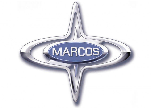
The name Marcos comes from the founders' surnames, Marsh and Costin. This name is prominently featured on the Marcos badge, which has undergone few redesigns over the years. The primary changes have been to the badge's background, which has appeared in silver or white and red, while other elements have remained consistent.
The Marcos badge consists of a horizontally stretched oval with thin triangles extending from the top and bottom, resembling a four-pointed star. The silver outline enhances this star-like appearance. Inside the oval is a smaller one with a bright blue background and glossy silver lettering.
The Marcos name is inscribed in all capital letters, with each letter sized to follow the contour of the ellipsoid banner.
A second version of the badge features a glossy white background with a thick red diagonal stripe crossing it, behind the bright blue banner with the nameplate.

The modern Marcos lettering is in all capitals, using a custom square sans-serif typeface with rounded angles and strong, straight lines. The font resembles Pawl Square Bold but with softened and slightly altered lines.
The primary color palette for Marcos includes blue and silver, creating a modern and stylish look that conveys trustworthiness and loyalty, along with a commitment to high-quality car production using innovative technologies.
The secondary color palette adds white and red, lending elegance and a 'royal touch' to the badge, reflecting the company's passion, energy, and adaptability.
