lloyd Logo - History, Design, and Meaning

Company Overview
Norddeutsche Automobil und Motoren GmbH (North German Automobile and Engines) was a German car manufacturer founded in 1908, owned by the Norddeutscher Lloyd shipping company. The factory was located in Bremen. Many of the company's products and those of its successors were branded with the Lloyd marque. The German Lloyd marque was not related to the British Lloyd Cars Ltd, which operated from 1936 to 1951.
Key Information
- Founded: 1908
- Founder(s): Carl F. W. Borgward
- Headquarters: Bremen,
lloyd Logo Meaning and History
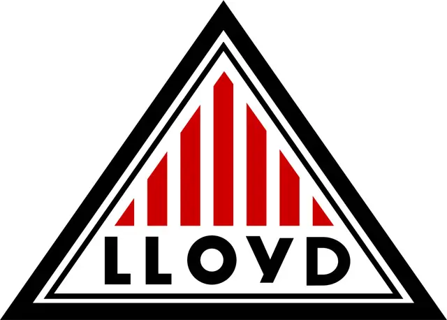
The visual identity of the Lloyd car brand has always been consistent, with its geometric shape and overall composition remaining unchanged. Only the color palette and the wordmark's typeface have been modified over time.
The Lloyd badge consists of a triangle with a double outline and a vertically striped pattern. The brand's name is placed along the base of the triangle, beneath the stripes.

The earlier version of the logo used a white, black, and red color palette, symbolizing power, passion, and loyalty. The latest redesign introduced a fresher and more modern palette of silver gray, blue, and red, making the logo three-dimensional with shadows on the stripes and letters, and a glossy, gradient gray outline.
The wordmark, in all capital letters, is written in a bold and clean sans-serif typeface that appears professional and strict in blue, matching the frame's color. The updated color scheme of the Lloyd visual identity conveys authority, expertise, energy, and reliability.


