lasalle Logo - History, Design, and Meaning
Company Overview
Automobiles under the LaSalle brand were produced and sold by General Motors' Cadillac division from 1927 to 1940. The concept behind the brand was developed by Alfred P. Sloan, who was the Chairman of the Board at General Motors at the time. Although these automobiles were manufactured by Cadillac, they were priced lower and did not display the manufacturer's brand name.
Key Information
- Founded: 1927
- Founder(s): General Motors
- Headquarters: Detroit, Michigan, United States
lasalle Logo Meaning and History
The LaSalle logo appeared in at least three forms: the monogram, the emblem, and the full wordmark. Each was executed in a distinct style and color palette.
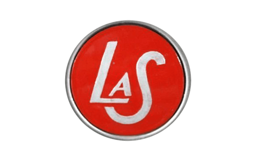
Perhaps the most popular version featured the 'LaS' lettering inside a red circle.

The glyphs varied in size. The 'A' was the smallest, despite being capitalized. The 'L' was significantly larger, while the 'S' was the largest glyph. The line thickness varied in the 'A' and 'L,' but the 'S' maintained consistent thickness throughout. The overall effect was stylish and elegant.
The letters were positioned artistically. The 'A' stood on the horizontal bar of the 'L.' The 'S' was lower, beneath the 'L,' and shifted to the left, with its lower end right below the horizontal part of the 'L.' This compact arrangement allowed the monogram to fit into a smaller circle without losing legibility.
What is LaSalle
LaSalle automobiles fit somewhere in between Buick and Cadillac. They were introduced by Cadillac, which was the division of General Motors. In its luxury provision, LaSalle was sold for 14 years.
The letters and circle border were silver, while the filling was red, making the badge visible even at smaller sizes.
Other versions of the monogram existed. For instance, models from the late 1920s to early 1930s featured a metal badge without red filling. These glyphs had intricate shapes, resembling a signature, with intertwined letter ends. Examples can be seen on the LaSalle Series 303 Coupe (1927) and the 1930 Sedan.
The emblem included more details, seemingly inspired by medieval crests. It featured elements like a shield and a knight's head in full armor.
The highlight of the LaSalle logo was a central creature, difficult to classify as either a horse or a dog. The head resembled a horse's, while the body was more dog-like, with a unique tail. It might have represented a mythical creature.

A star above added to the creature's enigmatic impression. The emblem also included a universal symbol of speed, a pair of wings, which fortunately did not belong to the creature, avoiding further classification challenges.
The scripted wordmark was widely used in print advertising, featuring a refined script mimicking handwriting. It appeared on cars, such as the 1936 Roadster's wheels and the 1940 Series 52 Special Sedan's front grill.
The emblem and scripted wordmark were silver and black or white and black. The monogram was either silver and red or just silver. None of the LaSalle logo versions used a ready-made typeface.


