lancia Logo - History, Design, and Meaning
Company Overview
Lancia is an Italian luxury car manufacturer that became part of the Fiat Group in 1969; the current company, Lancia Automobiles S.p.A., was established in 2007.
Key Information
- Founded: 1906
- Founder(s): Vincenzo Lancia
- Headquarters: Turin,
lancia Logo Meaning and History

The history of Lancia's visual identity is a brilliant example of how the evolution and progress of the brand can be reflected in its logo and updates. All but the very first badges of the Italian marque have been based on two main symbols: a sharp cavalry weapon, which gave the name to the brand, and a steering wheel.

The very first Lancia logo was created for the automaker in 1906 and remained active until 1911, alongside another badge introduced a year later. It featured a solid black rectangular banner with a thin double black-and-white outline, displaying heavy serif lettering in white, set in uppercase, with the 'L' larger than the other letters.

However, the original Lancia logo introduced in 1906 featured a simple script wordmark with elongated lines for the first and last letters. The nameplate was executed in gold, looking sleek and elegant, representing style and sophistication.

The badge that became the basis of today's Lancia visual identity was designed in 1911 and comprised a steering wheel in thin gold lines on a white background, with a bright blue flag above it. The flag's handle was replaced by a lancia, a weapon with a sharp metal end.
The gold lettering in an elegant serif font was placed on a blue rectangle, with pointed and elongated serifs. The wordmark was written in all capitals, with the first letter enlarged.

In 1929, the steering wheel was placed inside a blue shield. The contours of the logo were refined and became bolder. The blue crest retained the same gold outline as the rounded symbol, creating a balanced and bright image.

In 1950, the Lancia logo received a brighter color palette and a flat execution. The new badge was based on the previous one, but golden details were replaced by acid-yellow, and the shade of blue was lightened. The yellow steering wheel was now set against a plain white background, and the characters in the 'Lancia' inscription also turned white, creating a strong color contrast.

A new version of the logo was designed in 1957, switching the color palette to silver and blue. All details except for the rectangular banner were silver. The steering wheel became abstract, represented only by a circle enclosed in a shield-shaped frame. The lettering on the banner was executed in the same typeface as previous versions, but the new color made it appear bolder and more confident.

In 1972, the Lancia badge was minimized to the rectangular banner, repeating the style of the original logo from 1906, but executed in a blue and white color palette. The white inscription was set over a solid blue rectangle with a thin white outline, placed on a larger white background with a thin blue frame.

In 1974, the brand returned to the blue background of the badge. The white steering wheel with blue lines and a solid blue flag was placed inside a blue shield with a delicate silver outline. The wordmark changed its typeface, with all letters featuring the same size in a simple serif font with bold straight lines.

The Lancia logo redesign in 1981 slightly altered the shade of blue while keeping the concept used since 1974 unchanged. The new color was calmer and deeper, creating a more elegant look for the badge. This logo remained in use for nearly twenty years.

In 2001, Lancia's visual identity received another redesign, with a darker blue and a glossy icon gaining gradient shades, making the badge look voluminous and sharp. The white lettering appeared more modern and confident against the dark blue background.

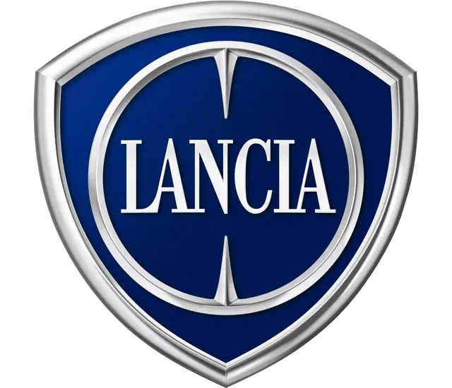
The 2007 redesign introduced a contemporary and sharp emblem featuring a stylized steering wheel with enlarged lettering in the middle. The circular symbol was placed on a royal-blue shield with a thick silver frame.
The flag with a Lancia-handle was removed from the logo, but the sharp ends of the weapon remained inside the circle of the steering wheel, pointing at the lettering.

The 2022 redesign introduced a new version of the iconic badge, with the blue crest gaining lighter and glossier shades. The steering wheel is now depicted by an extra-thin silver ring, and the flag handle became thinner, longer, and sharper. The wordmark received a completely new typeface—sleek and futuristic sans-serif with erased horizontal bars on both 'A's.
The bold white lettering of the Lancia logo is executed in a traditional elegant serif typeface, resembling fonts like Alter Headletter and Robusta Bold, but with narrowed letters. The inscription looks sleek and timeless due to its clean contours and distinct sharp serifs.
The blue and silver color palette of the emblem, complemented by the white inscription, represents quality, reliability, and loyalty. The marque values the safety and comfort of its customers, which is well reflected in their badge.
