lamborghini Logo - History, Design, and Meaning
Company Overview
Lamborghini is one of the most famous European luxury car manufacturers, established in 1963 in Italy. The company produces high-performance cars, considered among the fastest and most stylish in the world. The marque is owned by the Volkswagen Group.
Key Information
- Founded: 1963
- Founder(s): Ferruccio Lamborghini
- Headquarters: Sant'Agata Bolognese, Italy
lamborghini Logo Meaning and History

Lamborghini is a marque that values its heritage and identity. Everything about this brand revolves around legacy, quality, and exquisite style, which is reflected in its logo that has remained unchanged since the company's foundation, aside from a brief alternative version used for seven years.
Which animal is featured on the Lamborghini car logo?
The animal depicted on the iconic Lamborghini logo is a bull. The choice was made by the brand's founder, Ferrucio Lamborghini, as his zodiac was Taurus. The animal also represents strength and determination, reflecting the character of the company.

The very first Lamborghini logo was completely different from the luxury brand's emblem we recognize today. It was a simple monochrome geometric logo featuring a pyramid composed of three outlined triangles, each containing a capital letter—F, L, and C—in a straightforward sans-serif typeface.

The Lamborghini logo, introduced in 1961, evolved from the triangular badge used in 1952. It retained the three segments but featured black triangles framed in thick gray outlines. The letters were redrawn in a bolder font, with the top angle of the 'F' rounded.

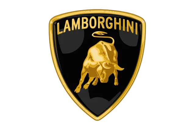
The bull, a symbol chosen by Ferruccio Lamborghini, the brand's founder, reflects his zodiac sign, Taurus, and his passion for bullfighting. The bull is depicted in a fighting position on the logo.
An additional logotype was created for the marque, featuring a custom cursive inscription in black or silver, characterized by sharp thick lines that evoke a sense of speed and strength.

With the redesign in 1972, Lamborghini introduced a prototype of the current visual identity. This logo featured a crest-like black medallion outlined in gold, with a golden bull in the center and a slightly arched gold and black banner displaying the logotype in all capitals. This version lasted only two years before being refined in 1974.

The 1974 logo featured the same crest with the bull, executed in monochrome and accompanied by a bold sans-serif wordmark below it. The wordmark used a bold italicized font with clean contours, resembling Neue Helvetica Paneuropean 83 Extended Heavy Oblique.

This version was short-lived, used for seven years when Lamborghini was owned by Chrysler. In 1994, the marque returned to its original logo with an elegant yet bold nameplate.

In 1998, the logo from the 1970s was elevated, with a wider crest and a more massive bull. The golden elements gained gradients, appearing vivid and realistic, evoking a sense of motion and energy.
The lettering was updated to uppercase in thick sans-serif on a black background, positioned above the bull and framed by the crest's golden outline.

The 2024 redesign refined the Lamborghini crest, enhancing its sophistication and sleekness. The key difference was the softer shade of gold, with the bull contoured and glossy gold elements replaced by black ones. The inscription was rewritten in a thinner sans-serif typeface, and the frame of the logo became less pronounced.

The bull symbolizes both the zodiac sign of Ferruccio Lamborghini and the image of Zeus from ancient Roman mythology, as Zeus was often depicted as a bull. This connection reflects Lamborghini's ambition to conquer the automotive market.
Throughout its history, the logo has remained largely unchanged, with the raging bull as the central element. The bull's dynamic posture deviates from classical heraldic conventions, adding a sense of innovation and energy to the brand's identity.
An amusing incident from Lamborghini's early racing days involved Ferruccio himself driving the car, stopping halfway to enjoy a glass of wine, believing his chances of winning were solid.

In the logo, the font has not always played a significant role. In some versions, it was entirely absent. However, the current version features a classical font located at the top of the shield, emphasizing simplicity to attract the brand's target audience.
The color scheme of the Lamborghini logo is straightforward, using a classic black and gold combination to underline the brand's elite character and reliability. The logo's evolution began with a black and white version, transitioned to black and white-red, and finally adopted its current look by the end of the century.
In the logo, the font does not play the most important role. Moreover, in one of version (minor changes during the decades of the company's existence took place), the font was not supposed at all. However, in the current version, the font is used. It is located in the upper part of the shield, and differs in classical execution. Refusal of font excesses, according to Ferrucci Lamborghini, was a compulsory condition of the acquisition of favorable attention of the target audience of the brand.

The colour solution of the Lamborghini logo is very simple. The combination of classical black (aristocratism, dignity, restraint and thus reliability) and gold colour has allowed to underline elite character of a brand and each car created under these brand.
In history, the logo began with a black and white version, continued as black and white-red (black and white was a bull, red - the background), and only at the end of the century acquired the current look.
