lada Logo - History, Design, and Meaning

Company Overview
LADA is a brand within the Mitsubishi Alliance. Cars manufactured by AvtoVAZ were initially marketed under the Zhiguli brand, a name suggested by designer A. M. Cherny. However, when these cars began to be exported, the Zhiguli name was deemed inappropriate for foreign markets due to pronunciation difficulties and its resemblance to the word gigolo.
Key Information
- Founded: 1966
- Founder(s): AvtoVAZ
- Headquarters: AvtoVAZ, Tolyatti, Samara Oblast, Russia
lada Logo Meaning and History

The history of the Lada logo began in the 1960s with a badge created for AutoVAZ that was never used. This prototype remained unused for nearly five years until the first official logo was introduced in 1970.

The initial trial version of the logo was designed by Russian artist Vladimir Antipin. It featured a Cyrillic inscription inside a trapezoid badge with rounded angles, resembling the iconic Fiat logo, which may have contributed to its lack of use.

A subsequent logo design was simple yet bold, featuring a stark black and white contrast. This monochromatic scheme added versatility and timelessness to the logo, symbolizing elegance, precision, and modernity, reflecting a brand that values innovation and sleek design.

Another logo iteration showcased a bold and striking design with clear color contrasts and a distinct geometric shape. The emblem featured a predominantly red shield-like figure with a white border, symbolizing energy, passion, and power, while the white line suggested purity and clarity of purpose. This design conveyed tradition and strength, indicative of a brand with rich heritage.

In another version, the logo was anchored by a shield-like badge, symbolizing strength and protection. Within this badge was a stylized graphic resembling a sail and the prow of a ship, set against a striking red background. A metallic flourish resembling a ribbon topped the shield, adding dimensionality and visual interest. Below the central graphic, 'Тольятти' was inscribed in white, acknowledging the brand's heritage and location. The design conveyed pride and durability, appealing to a market valuing tradition and resilience.

A similar logo maintained the shield shape and central graphic but opted for a darker, more muted color scheme. The red was less saturated, set against a gradient black background, suggesting a more upscale image. The metallic elements had a glossy effect, indicating high quality. The same inscription at the badge's bottom maintained the brand's roots, while the darker tones suggested sophistication and elegance.

The first official Lada logo, introduced in 1970, depicted a stylized image of a sailing boat, resembling those used by northern peoples like the Varyags and Vikings. The name 'Lada' is a Russian term for this type of boat.
The white symbol was placed on a black background, enclosed in a pentagon with a white and black frame, featuring 'Tolyatti' (the city where the brand was established) inscribed along the bottom.
When the first thirty Lada cars were released, a typo on their badges replaced the Russian letter 'Я' ('Ya' in 'Tolyatti') with the Latin 'R'.
Later that year, the lettering was removed, leaving just a white sailboat on a black background.

In 1974, the badge shape was simplified to a vertically placed rectangle, and the framing was removed, creating a minimalist and confident emblem.

In 1986, the color palette switched to blue, white, and gray, with elongated lines and contours. The badge became narrower and higher, appearing elegant. The white Lada featured delicate gray accents on its sail, standing out against a sleek blue background. The gray accents were balanced by a gray outline of the rectangular emblem with rounded angles.

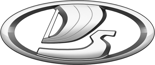
In 1993, Russian artist Vladislav Pashko completely redesigned the logo, changing the vertical rectangle to a horizontal oval and redrawing the boat in a more abstract way with smooth wide lines. The color palette was retained, but the blue shade became brighter.

In 2002, the electric blue shade was replaced with a calmer tone, giving the badge a more professional and trustworthy look, evoking confidence and reliability.
Later, a three-dimensional badge was created, maintaining the style and colors with a light gray gradient added. The matte metallic shade added a luxurious touch.

This logo exemplifies geometric minimalism, featuring a diamond-shaped figure that is both hollow and solid. The design plays with space and form, using gray shades to create depth. The simplicity, with clean lines and no decoration, speaks to a brand prioritizing clarity, precision, and modernity. The monochromatic palette reinforces the logo's contemporary appeal, while the metallic gradient adds sophistication.

Another logo presents an oval shape with a stylized representation resembling a sail or flag in motion, conveying advancement and progress. The figure is rendered in metallic silver against a rich blue background, symbolizing depth and stability. The emblem is encased within a silver border, enhancing its refined aesthetic. The gradient within the elements gives a three-dimensional feel, suggesting a dynamic and evolving brand valuing innovation.

The 2015 redesign brought significant changes to the Lada visual identity. The blue color was removed, and the sailboat was redrawn to be wider, bolder, and more square. This was the first logo created by a foreign artist, Steve Martin.

This modern and sophisticated logo features a monochromatic color scheme blending dark and light gray shades, creating harmony and continuity. The gradient shades give a three-dimensional appearance, suggesting depth and substance. The minimalistic design, with clean lines and no embellishments, implies a focus on simplicity, functionality, and the brand's essence.

The logo is characterized by a modern and minimalist design with metallic luster and sleek lines. It's an oval emblem with a symmetrical pattern of stylized triangles and parallelograms that interlock. The color palette is a gradient from silver and gray to black, creating a 3D effect suggesting sophistication and contemporary elegance. This metallic sheen and angular design are associated with precision, engineering, and the automotive industry, exuding dynamic movement and forward-thinking, reflecting the brand's focus on innovation and progress.


