ktm Logo - History, Design, and Meaning
Company Overview
The KTM X-Bow is a lightweight, street-legal car in Europe, featuring an Audi engine and a Dallara-sourced chassis. This vehicle is designed to seat two people.
Key Information
- Founded: 1934
- Founder(s): Hans Trunkenpolz
- Headquarters: Mattighofen, Austria
ktm Logo Meaning and History
The name KTM stands for the founders' names: Kronreif, Trunkenpolz, and Mattighofen. The company gained fame as the first to produce four-engine motorcycle models with an air cooling system. Today, KTM remains one of the leading European brands in its sector.
The KTM logo has been redesigned multiple times throughout its history, consistently featuring the brand's nameplate as the central element.
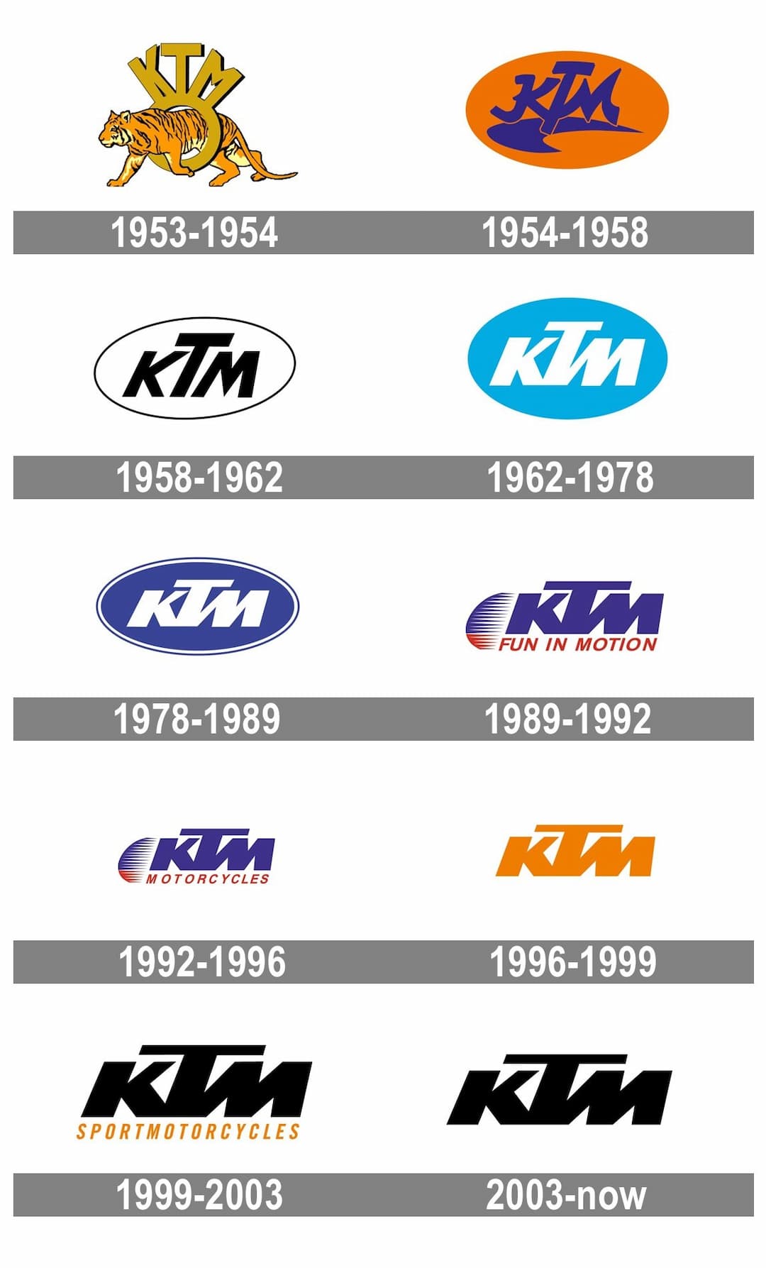
The initial KTM logo was unofficial and depicted a detailed image of a tiger walking through a ring with the 'KTM' lettering above. The orange and black color palette highlighted the brand's energy and passion.
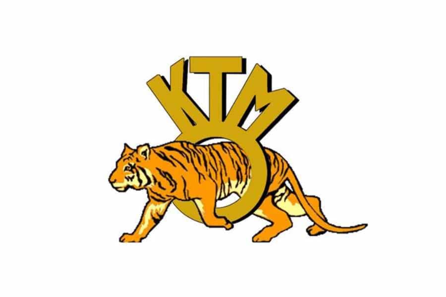
In 1954, KTM adopted an official logo featuring a bright orange oval with a blue wordmark and a swoosh symbol as an underline. The logo was eye-catching due to its color palette and lively lettering style.
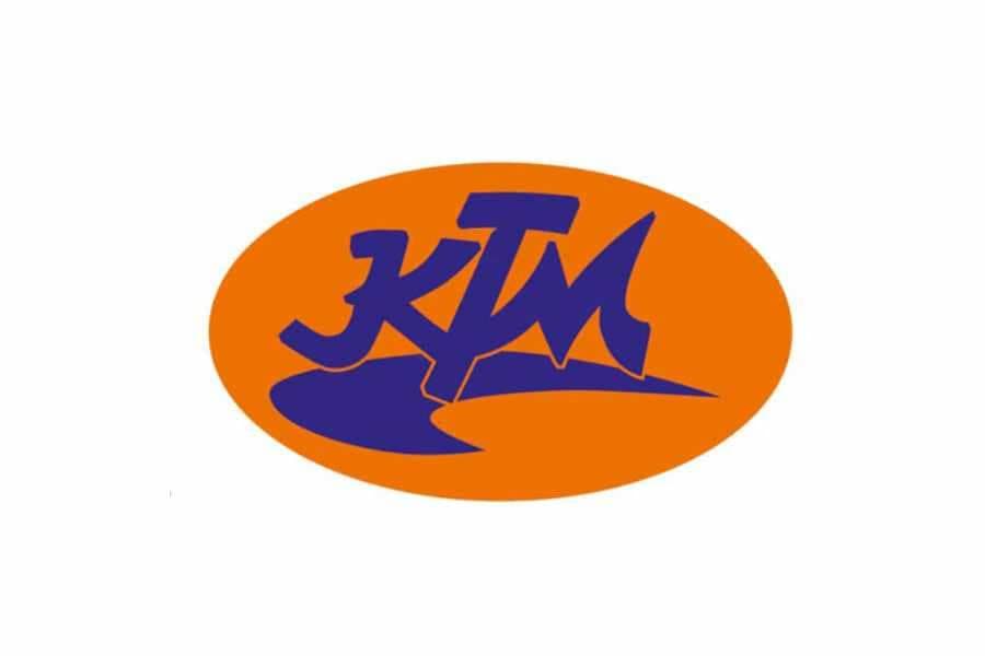
In 1958, the brand introduced a new logo concept: a minimalist monochrome emblem with strict, slightly italicized lettering. The oval's outline was black, marking the starting point for future brand identity redesigns.
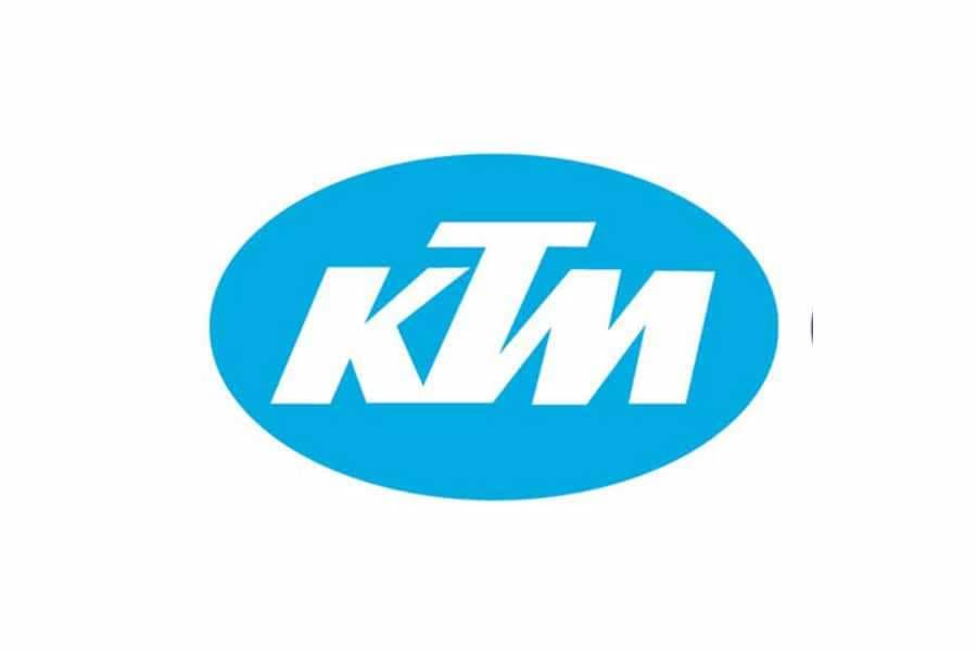
During this period, the official KTM logo featured a new color scheme: a light blue background with white lettering. This fresh and modern look balanced the new typeface, where the letters became thicker and interconnected, while maintaining the oval shape.
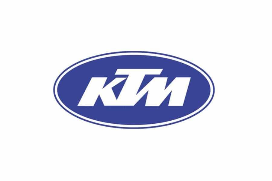
The 1978 KTM logo was a more masculine and robust version of its predecessor. The light blue color turned into a deep blue, the lettering became more balanced and strong, and the white outline of the oval gave the emblem a modern appearance.

The brand's visual identity underwent significant changes during this period. The traditional oval frame was removed, and the logo consisted of a bold blue wordmark with a red 'Fun in Motion' tagline and an abstract emblem to the left of the nameplate.
The emblem featured half of a circle cut into thin lines and used two colors—blue and red—reflecting the lettering style, with the upper part in blue and the lower part in red.
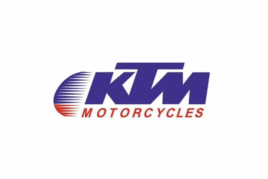
The previous logo remained, but the tagline changed to 'Motorcycles,' celebrating the company's profile and authority. This logo stayed with KTM for four years.
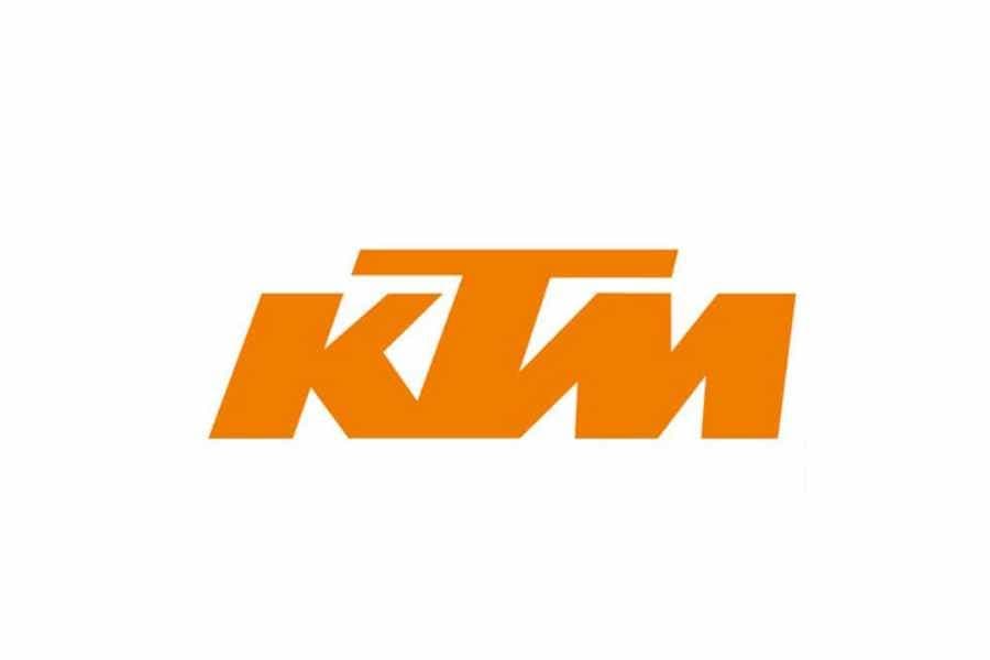
The brand returned to its original color palette—orange. The logo became a strong and sharp minimalist wordmark on a white background, perfectly reflecting the brand's energy and dynamics, evoking feelings of happiness and joy.
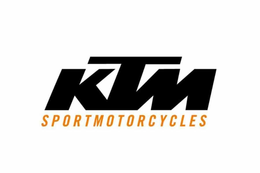
The logo's color palette changed to black and orange, with the wordmark in black. The letter 'T' was enlarged, and its horizontal bar was extended.
The logo featured an orange 'Sportmotorcycles' tagline in italicized capital letters.
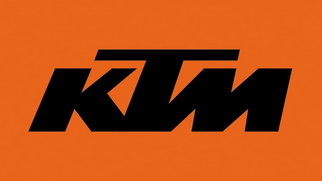
The current KTM logo is a single wordmark with strict lines and sharp angles. It is usually in monochrome but sometimes appears as a black nameplate on an orange background, adding passion and power.
The KTM emblem on the brand's motorcycles is a three-dimensional wordmark in dark gray metal, conveying a masculine and strong image that reflects the company's values of speed and quality.
The simplicity of the KTM emblem enhances the brand's luxury and expertise, portraying it as powerful and progressive.