koenigsegg Logo - History, Design, and Meaning

Company Overview
The company was founded in 1994 in Sweden by Christian von Koenigsegg, with the intention of producing a 'world-class' Saab Automobile.
Key Information
- Founded: 1994
- Founder(s): Christian von Koenigsegg
- Headquarters: Ängelholm, Scania, Sweden
koenigsegg Logo Meaning and History

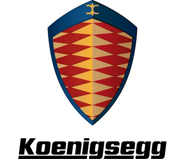
Being a young company, Koenigsegg has not undergone any dramatic changes in its visual identity yet. The brand's logo was created in 1994 and is based on the ancient coat of arms of the founder's family.
The Koenigsegg logo exemplifies geometrical heraldry, which is timeless and elegant, reflecting the brand's roots and celebrating its heritage and legacy.

The Koenigsegg logo features a wordmark and an emblem above it. The wordmark is executed in a bold and elegant typeface that is slightly italicized with rounded angles. The nameplate is underlined with a thick line that does not touch the tails of the three letters 'G.'
The Koenigsegg emblem features a three-dimensional shield in a yellow and burgundy color palette with a blue framing. The body of the shield boasts a rhombus pattern, which looks sleek and expensive.
When placed on the cars, the emblem features a gold and black palette, which adds elegance to the world's famous supercars.


