kia telluride Logo - History, Design, and Meaning
Company Overview
KIA Telluride is an automobile model in the full-size SUV category, available in front- or all-wheel drive, produced by the renowned Korean automaker KIA. This model is the largest in the KIA lineup.
Key Information
- Founded: 2019
- Founder(s): Kia
- Headquarters: Seoul, South Korea
kia telluride Logo Meaning and History
The world premiere of the KIA Telluride SUV, named after a small town in Colorado, took place in January 2019 at the North American International Auto Show. Its five-door concept was first introduced in Detroit in January 2016, and later in September 2018 at New York Fashion Week.
KIA developed this model to compete with similarly large SUVs from Hyundai, such as the Palisade. The design of the new KIA Telluride was created at the California design studio of the South Korean company.
In terms of dimensions, the KIA Telluride is a full-fledged representative of the full-size segment: it measures 5001 mm in length, 1989 mm in width, and 1750 mm in height (1760 mm with the rails). The wheelbase of the SUV stretches to 2901 mm, and its ground clearance varies between 200 and 203 mm.
Externally, the KIA Telluride commands attention not only because of its large size but also due to its attractive, deliberately brutal, imposing, and balanced appearance.
What is KIA Telluride?
KIA Telluride is not just the flagship crossover in the lineup of the KIA company, but also generally the largest model in the history of the South Korean automaker. The Telluride concept was introduced in 2016, and the first serial car of the model saw the light in 2019.
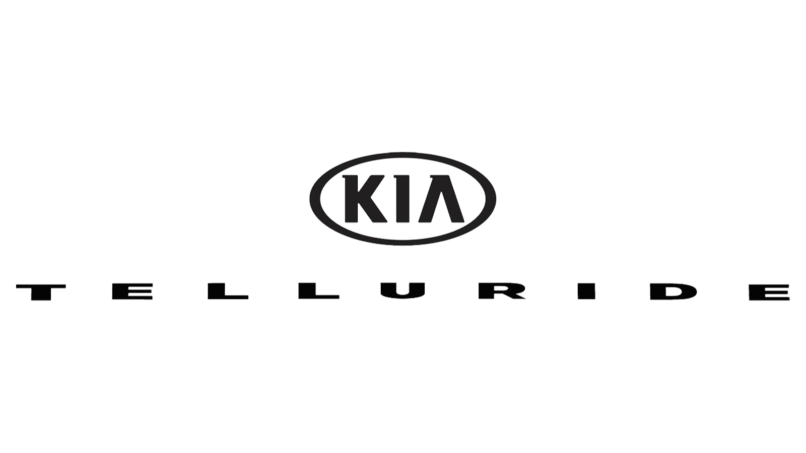
In terms of visual identity, the KIA Telluride is powerful and robust. The badge of this model is a simple logotype, but in a super heavy and stable typeface, which speaks louder than any emblems. The logotype is usually placed on the bonnet of the Telluride cars, above the iconic KIA medallion.

The KIA Telluride logo is composed of extra-bold uppercase lettering in a geometric sans-serif font, with the extended characters set in dark-gray metallic when placed on cars, and in plain flat black for printed material and marketing purposes. The logotype is usually accompanied by the oval KIA medallion, set in the same style depending on the placement. The wordmark looks very stable and robust, highlighting the masculine character of the KIA Telluride and evoking a sense of confidence and strength.

The heavy uppercase logotype on the KIA Telluride cars is set in a modern geometric sans-serif font with the letters significantly extended horizontally. The closest font to the one used in this insignia is probably Arial Bold, with the characters super-extended.
As for the color palette of the KIA Telluride visual identity, when placed on printed and digital materials, the logo is set in flat black, and on cars, it is in glossy metallic. Both schemes represent strength, confidence, and reliability.
