kenworth Logo - History, Design, and Meaning
Company Overview
The history of the Kenworth logo reflects the changes in major logo design trends while remaining loyal to its roots and heritage.
Key Information
- Founded: 1923
- Founder(s): Edgar K. Worthington and Frederick Kent
- Headquarters: Kirkland, Washington, United States
kenworth Logo Meaning and History

The brand's history began in 1912 when it was founded in Seattle, Washington, as a car and truck dealership under the name Gerlinger Motors, named after the co-founders, brothers George T. and Louis Gerlinger, Jr.
In 1914, the brothers created a truck featuring a more powerful inline six-cylinder engine, marking the start of a long history of steady growth. The name 'Kenworth' was adopted in 1923, combining the names of the new owners, 'Ken' (from Kent) and 'Worth' (from Worthington). The company has changed ownership several times since its inception.
Today, Kenworth is a subsidiary of Paccar and is recognized as a manufacturer of medium and heavy-duty Class 8 trucks.

The oldest Kenworth badge appears somewhat dated and cluttered, reflecting the design norms of its era, yet it was innovative for its time.
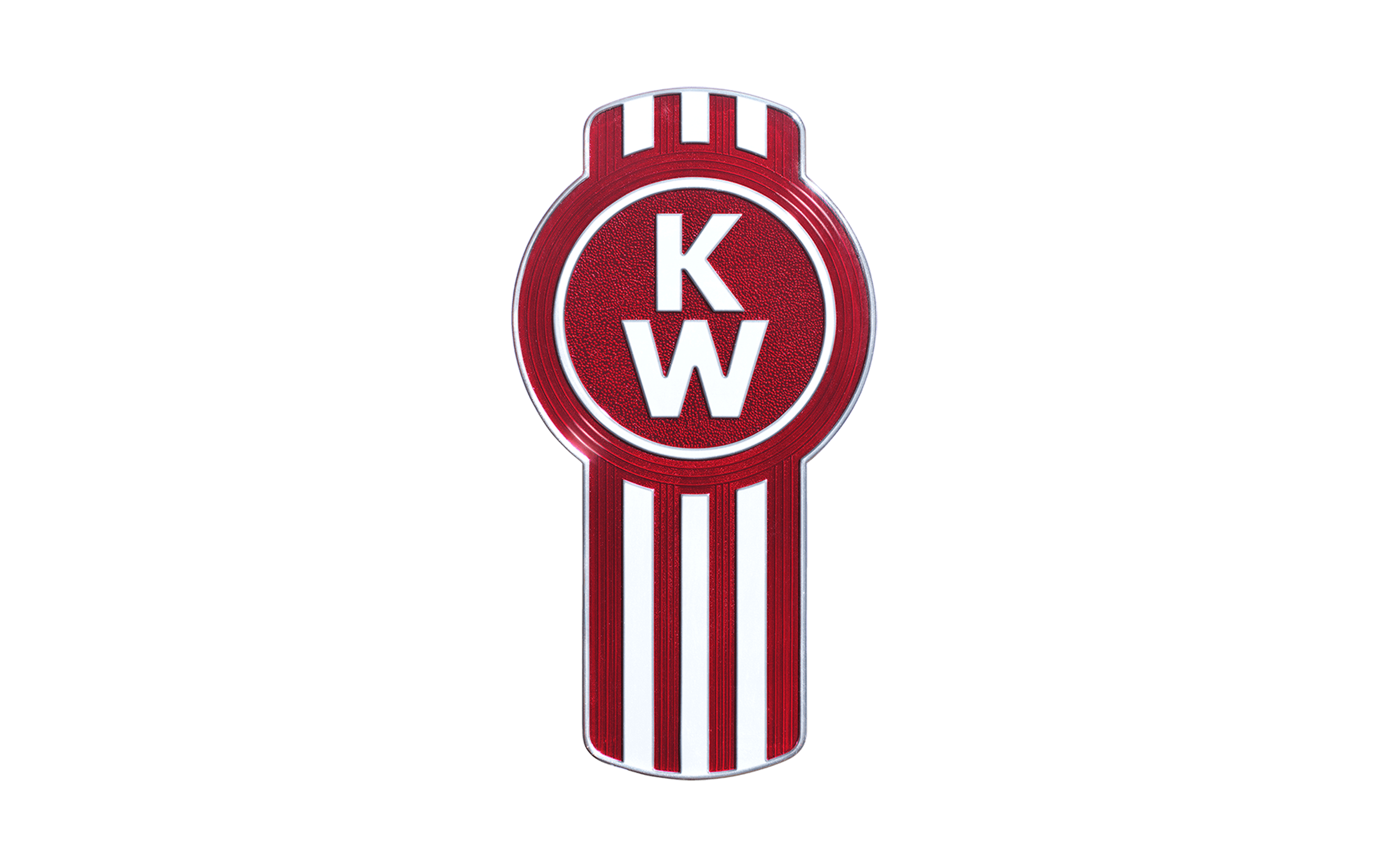
The core design features the letters 'K' and 'W' placed one above the other, with a silver plate displaying the full brand name in smaller, thinner letters. This design is encased within a silver circle filled with red and surrounded by black trim.

The two letters have maintained their central role in the logo but have evolved in style. They have lost their serifs and now feature strokes of equal width, resulting in a more minimalistic design that aligns with contemporary trends.
The logo has also eliminated the plate with the word 'Kenworth' and the black trim, contributing to a cleaner overall effect.
A new element has been introduced, featuring a combination of vertical silver and red stripes.
The word 'Kenworth' can be added below the badge, rendered in a bolder and more legible typeface than in the original logo. The type is simpler and heavier, enhancing visibility.
On the official website, there are at least two versions of the logo. The first reflects the brand's heritage, while the second (the corporate logo) establishes a connection with the parent company.
The first logo closely resembles the 1956 version, with the addition of the phrase 'Kenworth, The World's Best' in black to the right of the badge, featuring a noticeable 3D effect.
The corporate logo appears flatter, with the roundel and stripes placed inside a white square with a red outline. To the right, a red square houses the brand name in large white letters, with 'A Paccar Company' written below in black.
The Kenworth logo has consistently featured silver and red or white and red, with black added at times. The shade of red has varied, with the current main logo appearing somewhat darker than the corporate version.
