kaiser Logo - History, Design, and Meaning
Company Overview
Kaiser Motors (formerly Kaiser-Frazer) Corporation manufactured automobiles in Willow Run, Michigan, from 1945 to 1953. In 1953, Kaiser merged with Willys-Overland to form Willys Motors Incorporated, relocating its production to the Willys plant in Toledo, Ohio. The company was renamed Kaiser Jeep Corporation in 1963.
Key Information
- Founded: 1945
- Founder(s): Henry J. Kaiser
- Headquarters: Willow Run,
kaiser Logo Meaning and History

Kaiser was a brand with a relatively short lifespan, yet it made a notable impact on the history of the automotive industry. Its logo, designed in 1945, brilliantly reflected the company's fundamental approach to manufacturing and confidence in the quality of its products.
Kaiser used one primary logo, although additional badges on the cars varied from logotypes to geometric designs and Henry Kaiser signatures.

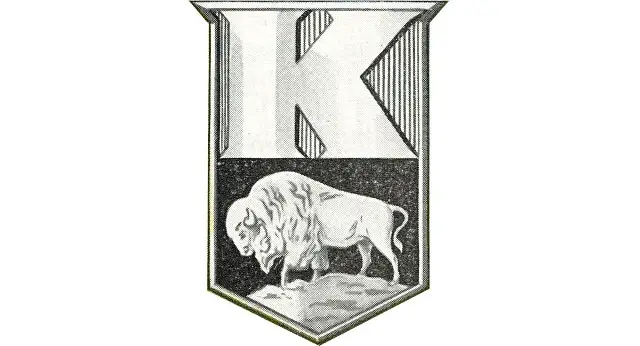
The official emblem for Kaiser, introduced in 1945, featured a strong and sharp badge in the shape of a triangular shield with a slightly elongated and pointed upper line. The badge was visually divided into two sections: a silver striped bottom with a prominent 'K' and a smaller top section with a black background displaying a silver image of a buffalo.
The sleek and bold letter 'K' was rendered in glossy silver on the brand's cars or in a slightly gradient light-gray shade for printed materials and official documents. Its clean contours included triangular shapes that added a sense of style and modernity, balancing the detailed image of the buffalo, which was executed in smooth, soft lines.
The buffalo on the Kaiser badge symbolizes power and stability, representing confidence and determination. The image of the buffalo facing left evokes a sense of reliability and protection, making customers feel secure in their decision to purchase Kaiser vehicles.

In addition to the iconic buffalo badge, the brand featured elegant smooth lettering on its cars. This included a three-dimensional cursive signature of Henry J. Kaiser, rendered in glossy silver metal. This emblem was seen on the Henry J Kaiser V6 two-door models, which typically showcased bright, vibrant colors like yellow and red. The badge closely resembled the original Henry J signature, with elongated and curved tails on most letters, adding a playful touch and enhancing the car's appeal.

With the introduction of the Kaiser Manhattan model, a new additional logo was created. This logo also featured three-dimensional silver lettering available in three variations: 'Kaiser,' 'Manhattan,' or 'Kaiser Manhattan.' The inscription was crafted in a modern bold cursive with angular letters, some of which were arched and sleek. All letters were interconnected, presenting an elegant yet sharp appearance.
For the bonnet of the Kaiser Manhattan, the brand used an emblem resembling an aviation badge. This black and silver crest was slightly elongated horizontally, featuring clean, straight sides enclosed in a thick silver frame, with the bottom triangular part enlarged and its 'wings' spread outward. The emblem appeared minimalist yet stylish and contemporary.
The Kaiser logotype was not the primary element of the automaker's visual identity; however, when a text-based logo was necessary, the company used a diagonally placed black inscription in a smooth and sophisticated cursive style.
Regarding the color palette, all Kaiser logos were executed in silver or a combination of silver and black, evoking a sense of luxury, style, and professionalism. The silver metallic finish is a common choice for car brands, as it looks bright and eye-catching against any background, whether plain black or vibrant yellow.
