k r i t motor car Logo - History, Design, and Meaning
Company Overview
K-R-I-T Motor Car was an American automobile manufacturer from the early 20th century. Founded by John B. Kelly, the company specialized in producing well-crafted vehicles and operated out of Detroit, Michigan. Renowned for its quality workmanship, K-R-I-T cars were highly esteemed during their time.
Key Information
- Founded: 1909
- Founder(s): Kenneth Crittenden
- Headquarters: Detroit, Michigan, United States
k r i t motor car Logo Meaning and History

Founded by John B. Kelly, the K-R-I-T Motor Car Company began its journey in the early 1900s in Detroit, Michigan. Throughout its existence, the company gained recognition for manufacturing automobiles of exceptional quality and durability, establishing itself as a significant competitor in the American automotive market. One of its notable achievements was the acclaim received for superior craftsmanship and innovative designs. Although the company is no longer in operation, its legacy remains a testament to early innovation and standards in the automotive industry.
What is K-R-I-T Motor Car?
K-R-I-T Motor Car was an American car manufacturer from the early 1900s based in Detroit, known for producing high-quality vehicles under the ownership of John B. Kelly.

The logo is striking due to its unique pattern and font choice featuring pointed serifs. Each character is separated by dashes and adorned with a diagonal black-and-white line pattern. Flanking the inscription, the logo features squares positioned at an angle, enclosing a round shape with a swastika symbol inside. This emblem is distinctly different from other automobile logos.

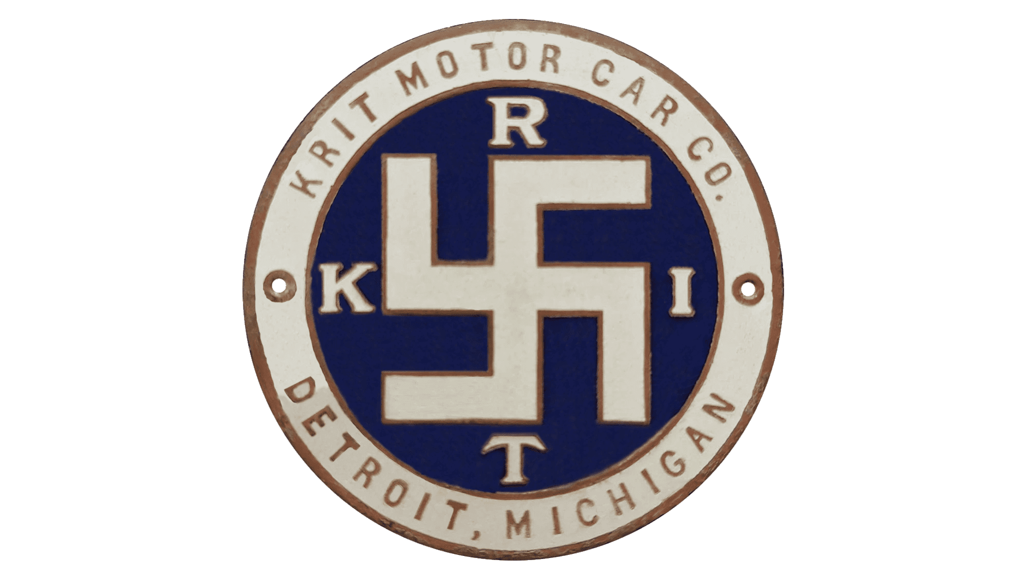
The logo consists of a dark blue circular emblem framed by light beige with thin brown lines on either side. The border displays the full company name at the top and the location at the bottom. At the center, the logo features a swastika symbol rendered in light beige with a thin brown outline to match the border. On each side of this symbol, there are beige letters that spell out the company name in a serif font similar to that used in earlier logo versions. The logo is well-designed, and the muted color palette conveys a sense of stability and confidence.
