isotta fraschini Logo - History, Design, and Meaning
Company Overview
Isotta Fraschini is an Italian luxury car manufacturer founded in 1900 by Cesare Isotta and the Fraschini brothers. Initially focused on automobile production, the company later transitioned to manufacturing aero and marine engines. Now headquartered in Milan, Isotta Fraschini has a rich history characterized by luxurious vehicles and innovative engineering.
Key Information
- Founded: 1900
- Founder(s): Cesare Isotta, Vincenzo Fraschini
- Headquarters: Milan, Italy
isotta fraschini Logo Meaning and History

Established in 1900 by Cesare Isotta and the Fraschini brothers, Isotta Fraschini quickly became synonymous with luxury and quality in the automotive industry. At its peak, the company launched the Tipo 8, the first production car equipped with a straight-eight engine. Their vehicles gained popularity among the elite. However, post-World War II pressures forced the brand to shift its focus towards aero and marine engines. Today, Isotta Fraschini, still based in Milan, remains a symbol of Italian luxury and innovation, albeit in different sectors.
What is Isotta Fraschini?
Isotta Fraschini is an Italian company established in 1900, known initially for its luxury automobiles. In later years, it transitioned to producing aero and marine engines. Based in Milan, the brand stands as an emblem of Italian elegance and engineering.

The brand's first logo is a perfect blend of strong, solid elements and more delicate inscriptions that add sophistication and elegance. The logo featured a vertical rectangle with a white background and a thin black frame with rounded corners. A smaller blue rectangle was centered within it, serving as a base for the abbreviated company name, which was rendered in a bold font with bracketed serifs. The full name was printed in a fine cursive font with graceful curves, while the word 'Motori' appeared at the bottom in black, all uppercase letters with bracketed serifs.

The most noticeable change in the logo was the color palette update. The white background was replaced with a light beige, while the black and blue elements were rendered in brown, giving the logo a more monochromatic appearance. Upon closer inspection, the emblem appeared wider, and the central rectangle transformed into a square. The full name at the top retained the same font but featured finer lines, enhancing the logo's elegance. Finally, the word 'Motori' at the bottom was replaced with the location of the headquarters—'Milano'—using the same font to maintain brand recognition.

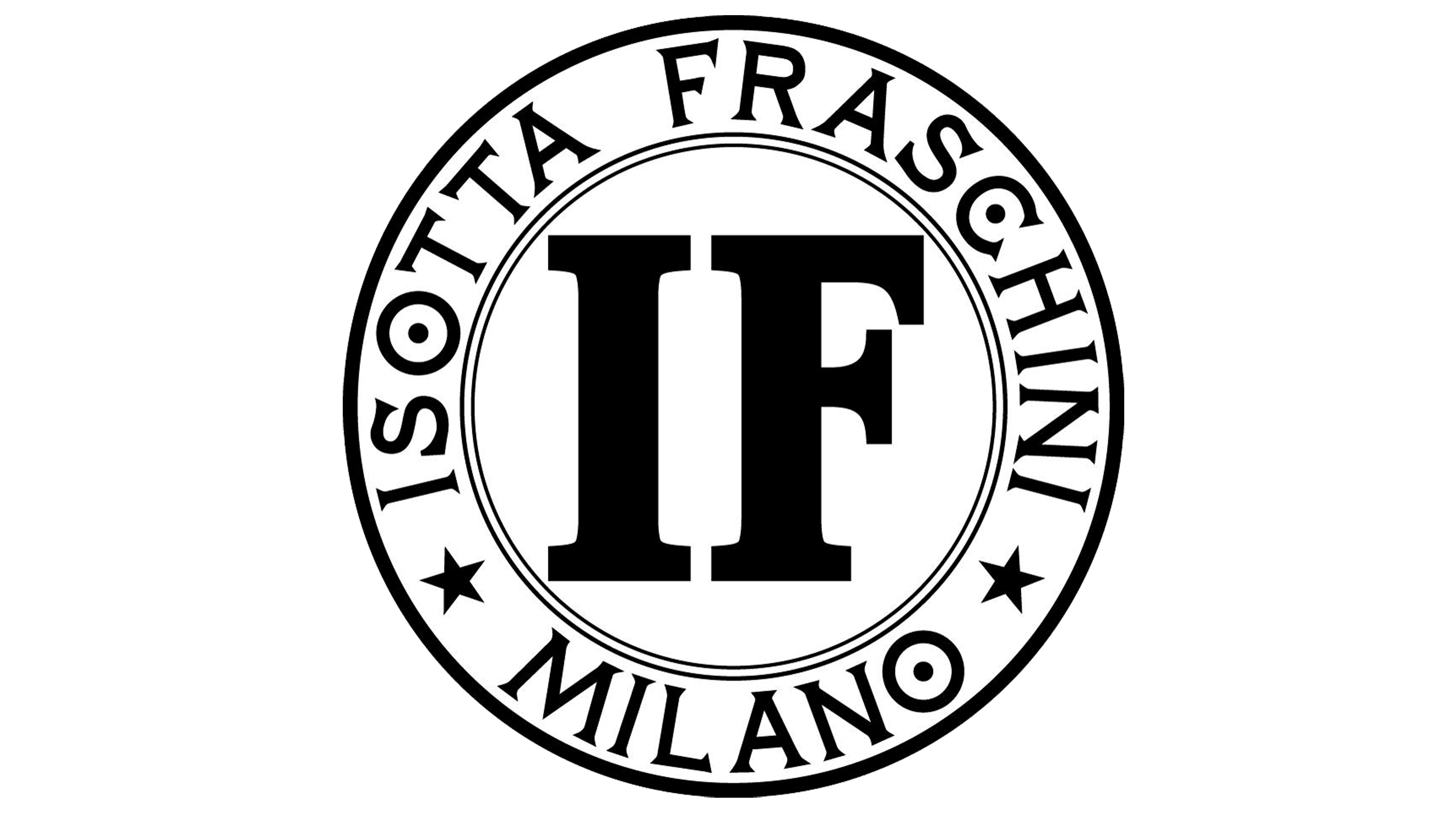
This version of the logo is markedly different from earlier iterations due to its round shape and black-and-white color scheme. However, it retained a familiar element: the two initials printed in the center using the same font as before. The full name and headquarters location were now displayed in a more basic serif font in all uppercase letters, curving around the emblem's border and separated by two stars. This new take on the brand's logo reflects the company's ongoing growth and evolution.
