invicta Logo - History, Design, and Meaning
Company Overview
Like many other carmakers, the British brand Invicta uses stylized wings as its emblem. However, the Invicta logo has a unique style.
Key Information
- Founded: 1925
- Founder(s): Noel Macklin
- Headquarters: Virginia Water, Surrey, United Kingdom
invicta Logo Meaning and History
The company was established by Noel Macklin and Oliver Lyle. From 1925 to 1933, it was based in Cobham, Surrey, England. During the following five years, it operated from Chelsea, London, and from 1946 to 1950, it was located in Virginia Water, Surrey.
Between 2004 and 2012, the brand was revived for the production of the S1 sports car.

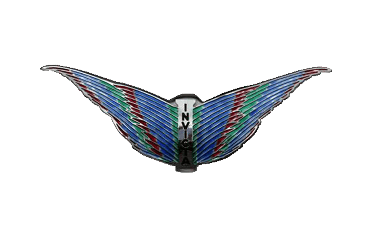
The logo features a pair of wings with the brand name positioned between them. The word 'Invicta' is arranged vertically, with the letters following each other downwards in an unpretentious sans-serif typeface.
What makes the emblem stand out is the detailed 'feathers' created with dimensional effects. These 'feathers' give the wings a more lifelike appearance compared to most other 'winged' car logos. The central part of the design resembles the back of a bird, adding to the logo's realism.
Another unusual aspect of the Invicta logo is its diverse color palette, which, in addition to silver, includes red, blue, and green, making it distinctive for a car badge.
