indian motorcycle Logo - History, Design, and Meaning

Company Overview
Indian Motorcycle is a legendary American motorcycle manufacturer founded in 1901, which paused operations in 1953. At the beginning of the twentieth century, the company was the largest producer of motorcycles in the world.
Key Information
- Founded: 1901
- Founder(s): George M. Hendee and Oscar Hedstrom
- Headquarters: Springfield, Massachusetts, United States
indian motorcycle Logo Meaning and History
Indian Motorcycle, commonly known as Indians, was the first brand in its segment in the USA. It has a long and colorful visual identity history, consistently incorporating the image of a Native American man into every logo.
The brand changed its logo with each new model released, maintaining production until 1953. It was not until 2011 that the label was reborn. Today, it produces contemporary bikes while still using the iconic visual identity concept.

The very first Indian Motorcycle logo was designed in 1901, shortly after the brand's establishment. It featured a wordmark in burgundy, utilizing a unique cursive typeface with bold lines and solid underlining.
Later, the brand began placing the wordmark diagonally and switched to a monochrome color palette. The next stage in Indian's visual identity included adding an emblem to the wordmark, but by the 1970s, the brand returned to a text-based version.
This typeface, known as AZ Indian font, has remained a staple of the brand's identity.
The main element of all Indian Motorcycle logos has been the profile of a Native American man wearing feathers. The first graphical badge was a circle featuring a red and white image, with the wordmark placed below.

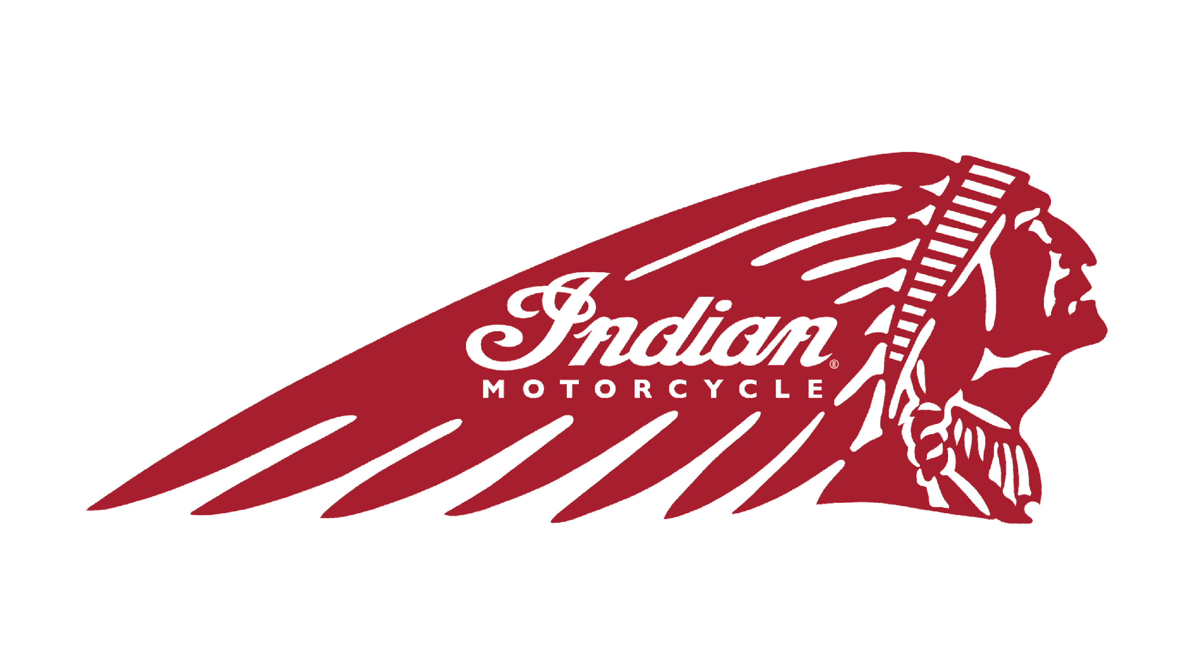
Subsequent designs depicted an Indian man facing right, with the wordmark integrated into the feathers.
The color schemes of the emblems evolved from red and white in the first variant to burgundy with thin white lines and letters, eventually leading to a more detailed colorful version incorporating teal, brown, and white.
Each redesign of the Indian Motorcycle emblem has preserved the essence of the brand, celebrating its heritage and individuality, regardless of the color scheme.
Most logo versions created throughout the company's history are still in use today, as this retro brand places different logos on various motorcycle models.
In 2013, following the acquisition by Polaris, the brand decided to refresh and modernize its iconic visual identity.
To celebrate the legendary brand's rebirth, a new logo was created featuring the iconic Native American profile placed within a circle. The top part of the circle includes the lettering 'Sturgis Motorcycle Rally 2013,' while the bottom features 'A new era begins.'

The 'Indian Motorcycle' wordmark is positioned over the feathers, utilizing the same iconic typeface in a refined version, while the 'Motorcycles' tagline is rendered in all capital letters using a modern, widely spaced sans-serif typeface.
Burgundy remains the primary color of Indian Motorcycle's visual identity, while white has been replaced by light gray, adding a sense of style and elegance.
The Indian Motorcycle logo is instantly recognizable and unique, perfectly reflecting the brand's heritage and individuality. It is bright, strong, and authentic.


