horch Logo - History, Design, and Meaning
Company Overview
Horch was an Audi enterprise founded by August Horch in 1910.
Key Information
- Founded: 1904
- Founder(s): August Horch
- Headquarters: Zwickau, Saxony,
horch Logo Meaning and History

Horch was one of the first German automakers, established by August Horch, who previously worked as an engineer for Mercedes-Benz. The company's first car was the 18/22 PS, equipped with a four-cylinder engine.
Horch was an innovator in the automotive industry, with all innovations tested in the company's first model. Notably, Horch developed a constant mesh gearbox that operated silently. The clutch was encased and positioned between the gearbox and the engine, and a driveshaft was first installed between the rear drive axle and the gearbox.
In early June 1909, Horch left the company and established a new factory in Zwickau, named Audi. After his departure, the original Horch company began to specialize in producing expensive custom-made cars.
In 1932, Horch launched its most successful model, the 600. That same year, the Auto Union AG concern was formed, featuring an emblem of four interconnected circles, symbolizing the union of various car types: the luxury Horch, the large and prestigious Audi, the medium-sized Wanderer, and the small DKW vehicles.
What is Horch?
Horch is the name of one of the historical automakers, which played a really big role in the European car industry history. The brand was one of four companies, which formed the iconic Audi marque, which aims consecrated to be the representation of high class and super quality.

The visual identity of the German carmaker from the 1900s to the 1930s is characterized by elegance and sleekness, with a distinctive art-deco style that makes the logo unique and memorable. The emblem was executed in monochrome, appearing silver on the brand's cars, which gave it a stricter yet more modern and sophisticated look.
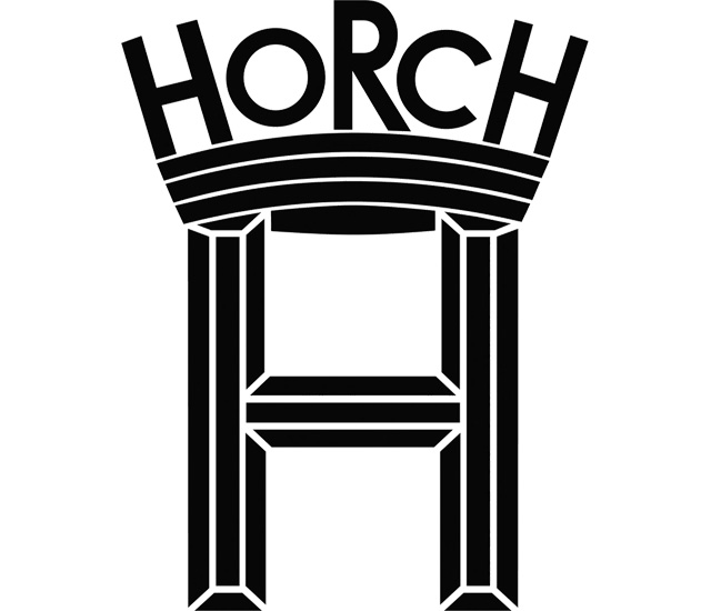
The Horch logo features a bold letter 'H' adorned with a pattern of thin straight lines that add structure and volume. Within the letter, there is a thick black arch featuring the same white striped pattern. The monochrome palette of the emblem renders it timeless and powerful, reflecting the company's professionalism and commitment to style and quality.
Above the black arch, the wordmark is placed, mirroring the architectural shape of the emblem. It is executed in all capital letters in a sans-serif typeface, with the letters 'H,' 'R,' and 'H' enlarged, making the logo playful and recognizable.
When placed on vehicles, the emblem is enclosed in a thin circular frame, rendered in silver. This design gives the badge a crisp and fresh appearance due to the ample space inside the circle and around the emblem.

The bold stylized lettering of the historical Horch badge is set in uppercase using a massive geometric sans-serif typeface, with capital letters of varying sizes. This height difference adds dynamism to the logo. Fonts similar to the one used in the Horch insignia include Heyday Sans and Type Vendor JNL.
The color palette of the Horch visual identity featured two options: a glossy silver badge when it was an independent marque, and dark blue when the company became part of Auto Union. Both shades evoke professionalism and reliability, maintaining their relevance even today.
