hongqi Logo - History, Design, and Meaning
Company Overview
Hongqi, a premium automobile marque, is owned by China's FAW Group. Established in 1958, it was originally created to produce luxury vehicles for high-ranking officials. Over the years, Hongqi has expanded its offerings, and its cars have been featured in parades and diplomatic events. Today, primarily based in China, the brand is making strides to become a global luxury car contender.
Key Information
- Founded: 1958
- Founder(s): China FAW Group
- Headquarters: Changchun, Jilin, China
hongqi Logo Meaning and History

Founded in 1958 by the FAW Group, Hongqi is China's longest-standing luxury car brand, initially aimed at providing elite transportation for high-ranking officials. Throughout its history, Hongqi has gained prominence, often being the vehicle of choice for Chinese military parades and diplomatic events. Recently, the brand has focused on innovation, introducing cutting-edge models and technologies. Currently, Hongqi is solidifying its position in the international luxury car market while maintaining its deep-rooted Chinese legacy.
What is Hongqi?
Hongqi? Hongqi is China's oldest luxury automaker, established in 1958 by the FAW Group. It initially crafted elite cars for dignitaries and has since broadened its range.

The logo created in 1958 has been in use for over half a century, despite the introduction of several alternatives. The only element present is the Chinese version of the name, which translates to 'red flag,' likely influencing the choice of a bright red color for the inscription. Red is a significant color in Chinese culture, symbolizing life-generating energy, success, and prosperity.

The updated emblem lacks any inscription, giving it a more universal appeal. The color palette features red, gold, and black with a silver outline, evoking associations with a country rich in history. The main element is a metallic golden flower with three red petals and three golden points on each petal's side. The black background enhances the logo's sophistication and allows the flower symbol to stand out.

Although it may not have been intentional, this logo draws an association with the Hyundai brand logo created several years earlier. The design features an oval shape, common among many brands, rendered in white and black. A smaller white oval inside is intersected by a black line that resembles a road extending into the horizon, symbolizing movement and future possibilities.

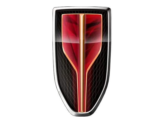
The company continues to utilize powerful red and black colors. The style resembles the logo created in 1964, featuring varying red and black gradients. The new logo takes the shape of a shield with a black background, silver border, and a red shape that narrows toward the bottom, giving it a three-dimensional appearance. The black background features a wire mesh pattern created with thin red lines, resulting in a striking and captivating logo.

The modernized logo consists of a name and an illustration above it. The name is rendered in a geometric, sans-serif font with slits between the strokes, adding a unique touch. This font resembles Perseus Arm Regular. The emblem above features two diagonal lines and two vertical lines that create an abstract illustration resembling a bull's head, though it may also be interpreted as a minimalistic version of the previous shield emblem.
