freightliner Logo - History, Design, and Meaning
Company Overview
Freightliner Trucks, the American truck manufacturer, has maintained a remarkably consistent visual brand identity. At first glance, it may appear that they have never altered their badge. However, a side-by-side comparison of some older models reveals that they feature slightly different versions of the Freightliner logo.
Key Information
- Founded: 1942
- Founder(s): Leland James
- Headquarters: Portland, Oregon, United States
freightliner Logo Meaning and History
Freightliner Trucks was founded in 1929 as a division of Consolidated Freightways and has been a part of Daimler AG since 1981.
The product lineup includes vans, medium-duty trucks, heavy-duty trucks, as well as bare chassis and cutaway chassis.
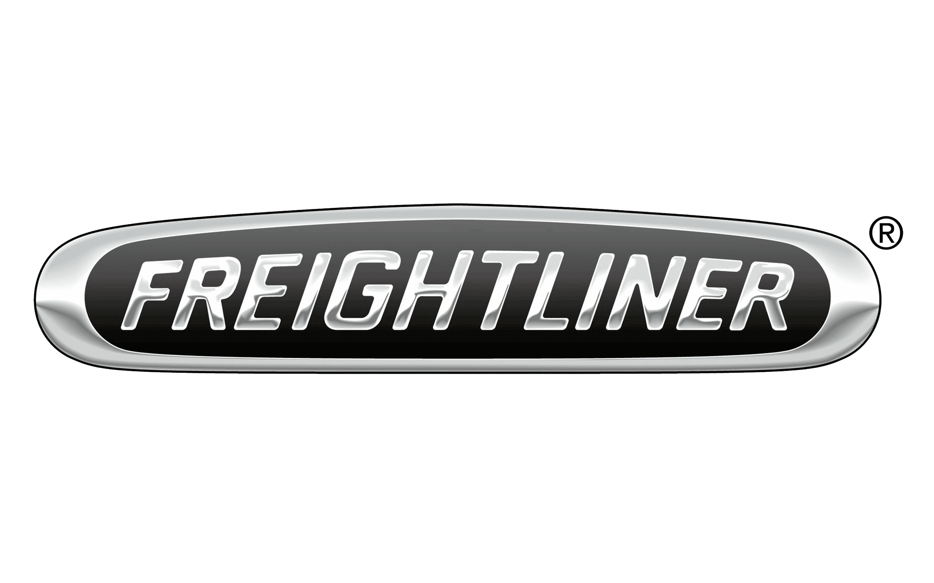
The badge on the vehicles displays the brand name in a plain sans-serif typeface. The letters are slightly italicized, with strokes of nearly identical thickness, giving the wordmark a solid appearance.

Upon closer inspection, one can notice slight variations in the height of the glyphs. The central glyphs are the tallest, while those on the sides are shorter, creating a 3D effect. The interplay of silver and white highlights against a black background also adds volume.
The wordmark is enclosed within a shape that initially resembles an ellipse. However, the shape is more complex due to its asymmetrical top and bottom. Additionally, the line forming the 'ellipse' varies in thickness, enhancing the 3D effect.
There exists a version of the logo where the top of the 'ellipse' appears sharper and taller than the standard version. In this case, the height difference of the glyphs is more pronounced, and the border thickness of the 'ellipse' remains consistent throughout. Furthermore, the silver gradient is replaced with white.
Due to these factors, this version has significantly less depth compared to the primary logo.

In the 1950s, the company began manufacturing trucks in collaboration with White Motor Company of Cleveland, Ohio. These trucks were marketed under the 'White Freightliner' brand and featured a badge based on the standard Freightliner logo.
One version of the logo was white with a red background, and the shape was modified to resemble a combination of a triangle and an ellipse, with the word 'white' added in a handwritten script at the top.
Additionally, there is a version of this emblem where the background is black, and the word 'white' is presented in a standard sans-serif typeface.
