force motors Logo - History, Design, and Meaning
Company Overview
Force Motors Limited is part of the Firodia Group of companies, one of India's industrial houses focused exclusively on the automotive sector. The company introduced brands like Trax and Traveller to India, which have faced criticism for their quality and finish, leading to regular customer complaints. However, due to their high production capacity and quality, they began manufacturing engines for Mercedes and BMW in India. The company is fully vertically integrated, producing its own engines, chassis, gearboxes, axles, and bodies for its entire product range, which includes Small Commercial Vehicles (SCV), Light Commercial Vehicles (LCV), and Agricultural Tractors—products that many believe are outdated and should be in museums.
Key Information
- Founded: 1958
- Founder(s): Dr. Abhay Firodia
- Headquarters: Pune, Maharashtra, India
force motors Logo Meaning and History
Founded by N.K. Firodia in 1958, Force Motors started as a small-scale industry and made significant progress with its versatile off-road vehicles and compact commercial vehicles. It is recognized for its innovation in multi-utility and cross-country vehicles. Today, the company is a key player in India's automotive industry, excelling in both the domestic market and exports.
What is Force Motors?
Force Motors is an Indian multinational, specializing in automotive design, manufacturing, and utility vehicles. It's known for its diversified product line, ranging from multi-utility vehicles to off-road vehicles.

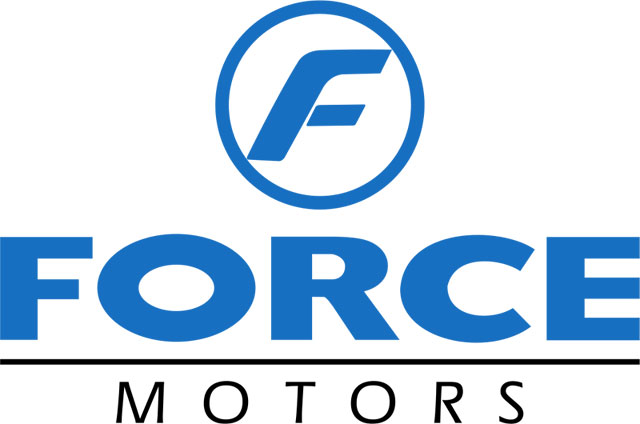
The logo represents Force Motors, an Indian automotive manufacturer known for its commercial and utility vehicles. The design is sleek and modern, reflecting the company's commitment to innovation and quality. At the top of the logo, a stylized letter 'F' is encased within a circular emblem. The 'F' is presented in a bold, italicized font, suggesting motion and forward-thinking. The blue color of the 'F' and the circle conveys reliability and trust, which are key attributes for an automotive brand.
Beneath the circular emblem, the word 'FORCE' is prominently displayed in all capital letters. The typeface is strong and solid, echoing the durability and strength of Force Motors' vehicles. The letters are evenly spaced and bold, ensuring the name stands out clearly. The blue color used for 'FORCE' ties back to the color scheme of the emblem above, maintaining a cohesive visual identity.
Underneath 'FORCE,' the word 'MOTORS' is written in a smaller black font. This text is separated from 'FORCE' by a thin black line, adding a touch of sophistication and delineating the two parts of the company's name. The choice of black for 'MOTORS' adds a classic and timeless element to the logo, complementing the modernity of the blue and providing a balanced contrast.
Overall, the Force Motors logo effectively communicates the brand's values of strength, reliability, and innovation. The clean lines and bold typography ensure that the logo is easily recognizable and memorable, reinforcing the company's identity in the competitive automotive industry. The combination of blue and black in the color scheme conveys professionalism and trust, making the logo appealing to both commercial clients and individual consumers.
