faw Logo - History, Design, and Meaning
Company Overview
FAW Group Corporation is a Chinese state-owned enterprise under SAIC Motor. In 2014, the company ranked third in vehicle output, manufacturing 2.7 million complete vehicles.
Key Information
- Founded: 1953
- Founder(s): Chinese Government
- Headquarters: Changchun, Jilin,
faw Logo Meaning and History

FAW is a brand that values legacy and tradition. Although the company uses a logotype in Latin letters for its visual identity, its emblem, created in 1953 and largely unchanged to this day, is based on the Chinese meaning of the company's name, paying homage to the brand's roots and history.

The original emblem featured a black background with the number '1' at its center, surrounded by thick horizontal lines that created two wing-like structures.
The choice of the number one was intentional, as the name 'FAW' in Chinese combines symbols meaning 'One' and 'Automotive.' The horizontal lines on the badge represent the strokes of the Chinese characters forming the company's name.

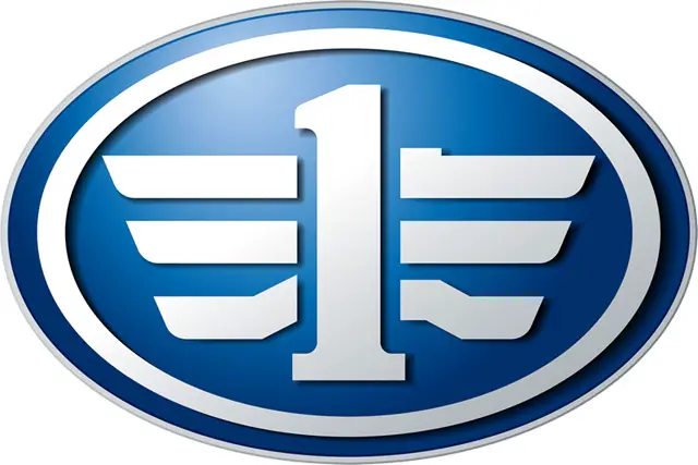
The logo features a solid blue circle as its base, enclosing a complex symbol that conveys strength and modernity. Within the circle, the central element is a stylized '1,' standing tall and bold. Flanking the '1' are mirrored elements resembling wings or stylized industrial parts, suggesting speed and aligning with automotive themes. The 'wings' are divided into three segments on each side, with the central segments being the largest. These segments connect to the '1' via horizontal lines, reinforcing a sense of structure and engineering. The overall design is reminiscent of an emblem typical in the automotive industry, representing movement and forward momentum, symbolizing the company's commitment to advancement and leadership in its field.

The redesign in 2000 preserved the original FAW badge while refining and modernizing it. A bold custom logotype was added beneath the badge, completing the image and balancing the new color palette.
The updated logo features a blue and white color scheme, with gradient shades in the three-dimensional badge and flat blue for the text. The badge is primarily calm blue, with all elements framed in gradient white, which takes on a slight silver hue, turning metallic gray when applied to the brand's vehicles.
The logotype is rendered in uppercase using a custom sans-serif typeface with bold lines and distinctive cuts at the edges of the letters.

The new logo, while retaining similarities to the original in its central motifs, adopts a minimalist approach with a white and blue color scheme that conveys a clean and professional image. It maintains the circular boundary, but unlike the bold blue of the original, this version features a white circle with a thin blue outline, suggesting clarity and focus. The central '1' stands prominently in dark blue, denoting stability and reliability. The flanking elements, resembling wings, are stylized with three segments on each side, simpler than before, connected to the '1' by a single line, symbolizing unity and cohesion. The segments vary in length, with the central ones being the longest, signifying growth or hierarchy. Overall, the impression is of a company that values precision, unity, and progress, hinting at its aspirations to advance in its industry while remaining grounded in its core values.
The smooth yet sharp FAW inscription in all capitals is executed in a custom typeface with sans-serif letters featuring clean and neat contours. The thick lines of the lettering give the logotype a solid and bold appearance, evoking a sense of stability and seriousness. The typeface of the FAW visual identity is similar to fonts such as Sequel Sans BG Display Bold and M Elite Hei HK ExtraBold, but with the 'F' completely customized—its upper right angle rounded and the ends of the horizontal bars cut diagonally.
The blue and white color palette of the FAW logo symbolizes reliability and protection, highlighting qualities of the brand such as loyalty, safety, and resilience.
