eucort Logo - History, Design, and Meaning
Company Overview
Eucort was a Spanish automaker that operated from 1945 to 1953. Owned and managed by Automóviles Utilitarios S. A., the company primarily produced cars and light commercial vehicles. Based in Barcelona, Spain, Eucort focused mainly on the local market, playing a significant role in Spain's post-WWII automotive industry.
Key Information
- Founded: 1945
- Founder(s): Unknown
- Headquarters: Barcelona, Spain
eucort Logo Meaning and History
Established in 1945 by Automóviles Utilitarios S. A. in Barcelona, Spain, Eucort gained recognition for producing reliable cars and light commercial vehicles during its operational years from 1945 to 1953. The company made a significant contribution to Spain's automotive industry in the post-WWII era. Today, Eucort is remembered as an integral part of Spain's early automotive history.
What is Eucort?
Eucort was a Spanish automaker, based in Barcelona and active from 1945 to 1953. The company was known for manufacturing cars and light commercial vehicles.

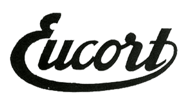
The Eucort logo embodies a sense of classic elegance and historical significance, reflecting the brand's heritage as a Spanish automaker from the mid-20th century. It features the brand name 'Eucort' rendered in a stylish, cursive font that exudes vintage charm. The letters are smoothly connected, with the capital 'E' beginning in a bold, confident stroke that sets the tone for the rest of the word. The flowing script conveys a sense of movement and grace, fitting for a brand associated with automobiles.
The logo's black-and-white color scheme enhances its timeless appeal. Black is often linked to sophistication, strength, and reliability—qualities essential for an automotive brand. The simplicity of the monochrome palette ensures that the logo remains versatile and easily recognizable, whether displayed on a vehicle, in advertising materials, or on promotional items.
A distinctive feature of the Eucort logo is the elongated tail of the letter 't,' which extends beneath the entire word, almost encircling it. This sweeping underline adds a dynamic and cohesive element to the design, suggesting completeness and unity. It also serves as a visual anchor, balancing the cursive letters and enhancing the overall aesthetic harmony of the logo.
Given that Eucort was active between 1945 and 1953, the logo's vintage design serves as a nostalgic reminder of the post-war era's optimism and industrial growth. During this period, many companies, including Eucort, played a crucial role in rebuilding economies and advancing automotive technology. The logo, with its elegant cursive style and classic color scheme, effectively captures the essence of this historic and industrious era, making it a fitting emblem for a brand known for its cars and light commercial vehicles.
