dodge viper Logo - History, Design, and Meaning

Company Overview
The Dodge Viper is a sports car produced by Dodge (SRT for 2013 and 2014), a division of FCA US LLC, from 1992 to 2017, with a brief hiatus from 2010 to 2013. Production of this two-seat sports car began at New Mack Assembly in 1991 and moved to Conner Avenue Assembly in October 1995.
Key Information
- Founded: 1991
- Founder(s): Dodge (Chrysler Corporation)
- Headquarters: Auburn Hills, Michigan, United States
dodge viper Logo Meaning and History

The Dodge Viper, an iconic American sports car, was first envisioned by Chrysler in the late 1980s, with production starting in 1992. Conceived by then Chrysler president Bob Lutz and chief designer Tom Gale, the Viper was a bold statement in automotive design and engineering.
Throughout its production, the Viper was celebrated for its raw power and performance. It achieved notable success by dominating the GT class in international racing and setting numerous track records. Its V10 engine and distinctive body styling have become synonymous with American performance and muscle.
The Dodge Viper ceased production in 2017. Despite this, it remains highly sought after by enthusiasts and collectors, symbolizing a significant era in American automotive history. Its legacy continues to influence modern sports car design and engineering, cementing its status as a classic.

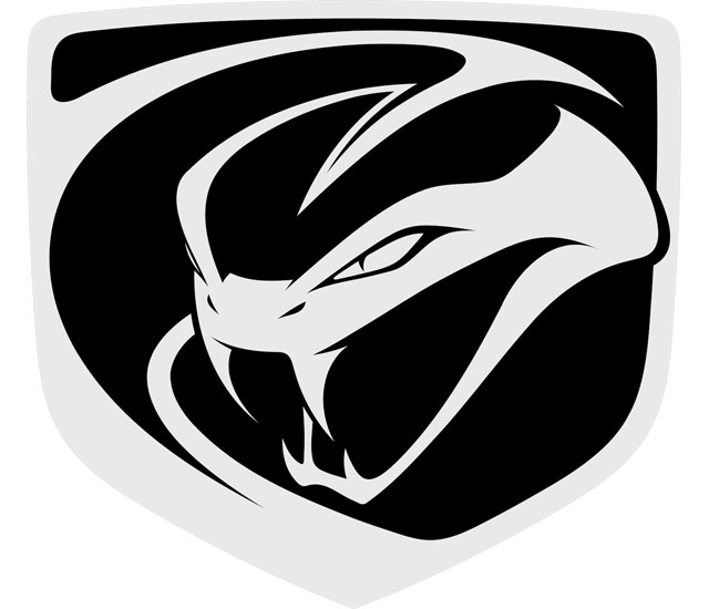
The logo features a highly stylized emblem representing a viper's head. The illustration is simplified, using bold black and white contrasts to convey aggression and power. The viper's head is angular with sharp lines suggesting motion and speed. Its eye is depicted as a simple white triangle, giving it a menacing appearance. The logo is encased in a shield-like shape, adding an element of heraldry and suggesting a storied tradition. The use of negative space is particularly effective, with the viper's open mouth creating a sense of readiness to strike. The overall design conveys strength, precision, and a predatory nature, fitting for a high-performance sports car brand.

This logo portrays a more abstract and menacing viper head, encapsulated within a shield outline, similar to its predecessor but with notable differences. The viper in this rendition has an even more stylized and aggressive look. Its eyes are narrowed to slits, enhancing the sinister aspect. The fangs are prominent and sharply defined, hanging over a pointed chin. Unlike the previous logo, this one uses thicker lines and less negative space, giving it a bolder and more compact feel. The overall design conveys a modern, assertive, and potent identity, reflecting the evolution of the brand into a more contemporary era.

This logo depicts a viper's head in a dynamic, forward-leaning posture, giving it a look of readiness to strike. The design is more detailed than previous versions, with pronounced shading that suggests a three-dimensional form. Its eyes are sharply defined, adding to the sense of liveliness and cunning. The shield backdrop is softened with rounded edges, contrasting the aggressive nature of the viper. This evolution in the logo from its predecessors is marked by a shift towards a more realistic and vibrant depiction of the viper, emphasizing the brand's evolution towards a more sophisticated and modern identity.


