daihatsu Logo - History, Design, and Meaning
Company Overview
Daihatsu Motor Co., Ltd. is a Japanese car manufacturer specializing in compact and small cars, known as "kei jidosha" in Japan. The company also conducts research on hybrid vehicles and two-stroke diesel engines.
Key Information
- Founded: 1907
- Founder(s): Hatsudoki Seizo Co
- Headquarters: Osaka, Japan
daihatsu Logo Meaning and History
The history of Daihatsu's visual identity began in the 1950s. Before that, the company, then called Hatsudoki Seizo, used a rounded emblem symbolizing a wheel with the letter 'E' in the center, representing 'engines,' which was the manufacturer's main focus during its first four decades. After the war, the brand replaced the 'E' with Japanese characters, reflecting its patriotism and tribute to its country.
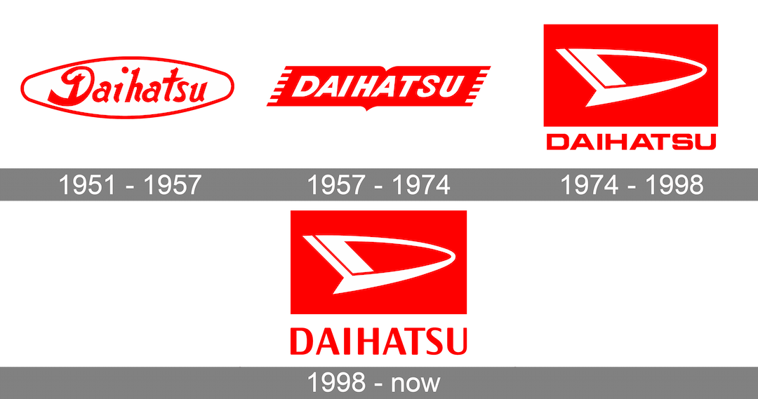
In 1951, after the company's name and specialization changed, the first Daihatsu logo was introduced. It featured a horizontally stretched oval frame with bold lettering inside. The title case inscription was written with thick, smooth lines reminiscent of Japanese characters. The red and white color palette was sometimes switched to red and blue, offering a calmer and more elegant look, while the original combination conveyed power and confidence.

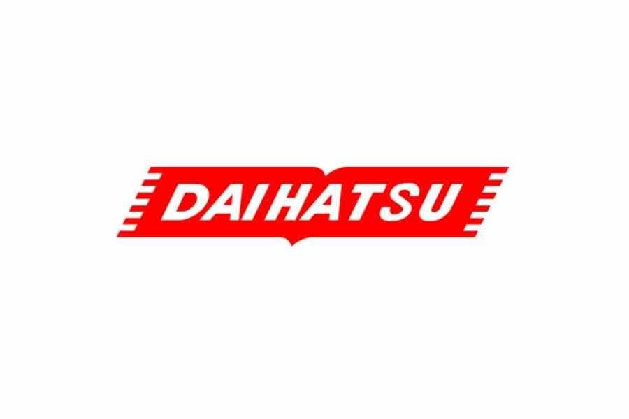
The red and white color palette used for the first Daihatsu logo remained unchanged after the visual identity redesign in 1957. The white capitalized wordmark in a traditional italicized sans-serif typeface with thick clean lines was placed on a red horizontal banner with striped sides.
The iconic Daihatsu symbol we recognize today was created in 1974. It is a stylized letter 'D' with its right rounded part extended and slightly narrowed, and its vertical left bar composed of two bold lines. The symbol resembles a flying rocket, representing speed, progress, and power.

Executed in white and placed on a red rectangle, the 'D' was complemented by a red wordmark below the emblem. It was written in a solid sans-serif font, with all capital letters featuring bold lines and clean contours.
The redesign in 1998 only changed the wordmark, leaving the emblem and color palette untouched, as they perfectly represent the brand's purpose and values.
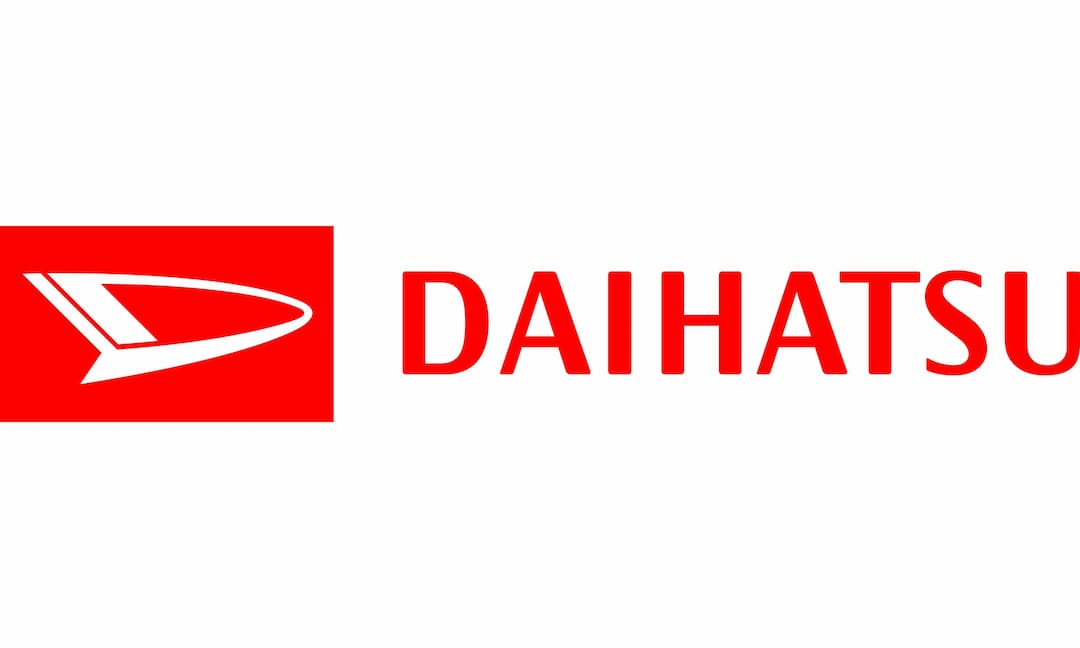
After the 1998 redesign, the Daihatsu lettering adopted a new style. It remains in a simple sans-serif font, but with narrowed letters and softened angles. The typeface of the inscription closely resembles 19-PRA Demi and Artigua Semi Bold fonts.
After the redesign of 1998, the Daihatsu lettering gained a new style. It is still written in a simple sans-serif, but with its letters narrowed and angles softened. The typeface of the inscription is very similar to 19-PRA Demi and Artigua Semi Bold fonts.