daewoo Logo - History, Design, and Meaning
Company Overview
Daewoo Motors was a South Korean automobile manufacturer that became a subsidiary of General Motors after experiencing financial difficulties. In 2011, it was replaced by GM Korea.
Key Information
- Founded: 1982
- Founder(s): Kim Woo-jung
- Headquarters: Bupyeong-gu, Incheon, South Korea
daewoo Logo Meaning and History

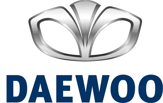
Despite its apparent simplicity, the Daewoo logo is rich in meaning. The South Korean brand based its logo on the structure of the Universe, with the brand name in Korean meaning 'The Great Universe.'
The company adopted a stylized seashell as its main symbol, as in Asian philosophy, a seashell represents the beginning and end of everything.


The logo was redesigned in 1994, gaining new shapes and styles. The shell was horizontally stretched to resemble a flower, while the wordmark was updated with a modern sans-serif typeface with softened letter angles, and the 'A' mirrored the shape of a triangle with an open contour. This logo appeared modest yet progressive and elegant.

The resemblance of the shell to a flower was enhanced in 2002 when the middle part of the badge was slightly elongated and rounded. The color palette was changed to silver and blue, with silver used for a three-dimensional emblem and blue for flat lettering.
The shell appeared luxurious and sophisticated in the new palette with a glossy metallic surface, and the addition of a strict geometric sans-serif wordmark made the entire logo balanced.

In its last decade, the company opted for a more minimalist and simple typeface, choosing a bold straight sans-serif similar to fonts like FF Meta Headline Pro Bold, Thrifty Black, and Vista Sans Black.
The silver and blue color palette of the Daewoo logo was an excellent choice to represent the brand's philosophy and legacy. Blue symbolizes the universe and peace, while silver adds a sense of loyalty, unity, and reliability. Logos in this color palette always look professional and convey the right values of the brands.
