cupra Logo - History, Design, and Meaning

Company Overview
Cupra is a brand of motorcycles and roadsters created by SEAT in 1985. It is one of the most renowned luxury road car manufacturers in Europe and the largest in Spain. Cupra has won numerous awards in prestigious championships throughout its history.
Key Information
- Founded: 2018
- Founder(s): SEAT (Volkswagen Group)
- Headquarters: Martorell, Spain
cupra Logo Meaning and History



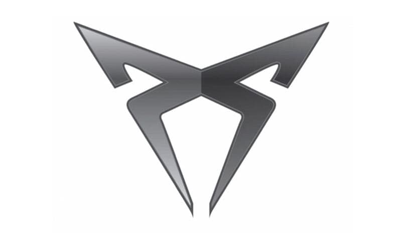
Cupra is known for its high-performance cars, which have earned many titles over the years. The Cupra logo consists of a wordmark and an emblem above it.
The wordmark, in all capital letters, is designed in a futuristic sans-serif font that is slightly flattened. The wide, bold lettering of the nameplate conveys a sense of strength and stability. The rounded angles create an impression of confidence and power.
The Cupra emblem complements the smooth, sleek lines of the wordmark. It features a sharp X-shaped symbol with elongated lower tails and folded, pointed upper angles.
The symbol resembles a spider, albeit with fewer legs, projecting a strong and masculine image that highlights the brand's influence and energy. The sharp lines add a sense of power and dynamism.
The monochrome color palette of the Cupra logo changes to silver when placed on the cars, appearing luxurious and elegant in metallic gray.
What is Cupra?
Cupra is the name of the Spanish Seat subdivision, specialized in the production of high-performance sports cars. Today the brand is owned by the Volkswagen Group and is known for its race cars, and a few new city models were added to the portfolio in the 2010s.
