chrysler Logo - History, Design, and Meaning
Company Overview
Chrysler is a legendary American car brand, established in 1925, and merged with Fiat in 2014. It is one of the largest automobile manufacturers in the USA.
Key Information
- Founded: 1925
- Founder(s): Walter Chrysler
- Headquarters: Auburn Hills, Michigan, United States
chrysler Logo Meaning and History
The company, named after its founder, Walter Chrysler, is an icon and one of the 'Big Three' of the American automobile industry.
Throughout its history, the brand has been part of the Daimler group, operated as an independent company, and is now part of the Fiat Chrysler international group.
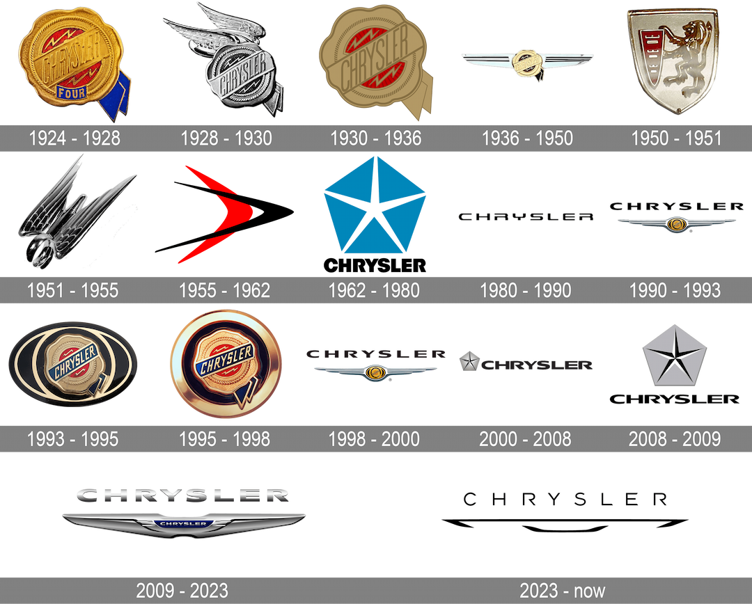
The brand's visual identity has evolved more frequently than its ownership timeline, with the Chrysler logo undergoing more than ten redesigns over the years.
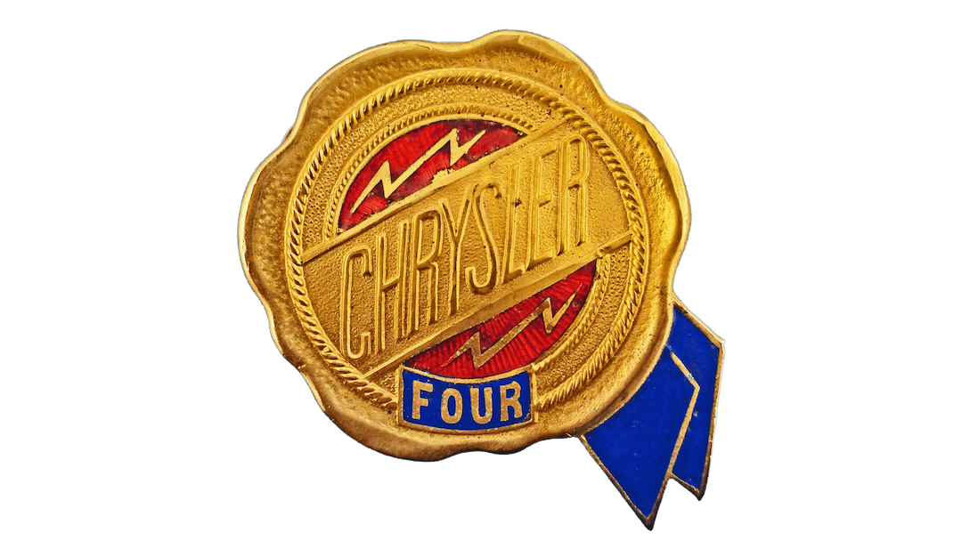
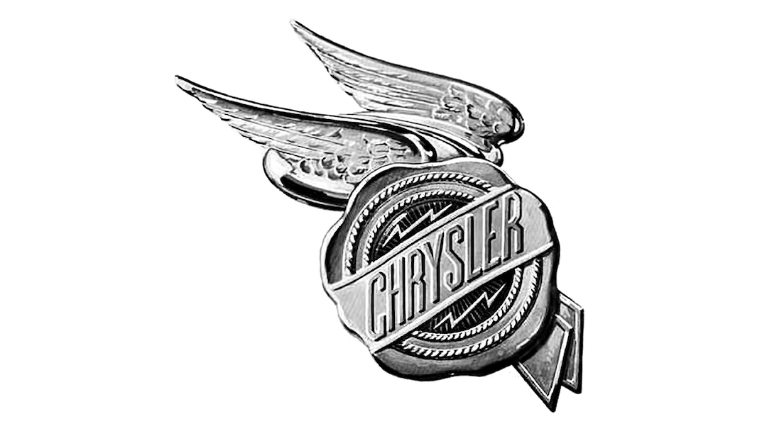
The original Chrysler logo was designed by Oliver Clark, inspired by Roman myths. It featured a wax seal with two wings, symbolizing speed, representing the quality mark of the Chrysler brand.

In 1930, the wings were removed, leaving just a seal with a burgundy and gold color palette, reflecting luxury and quality.
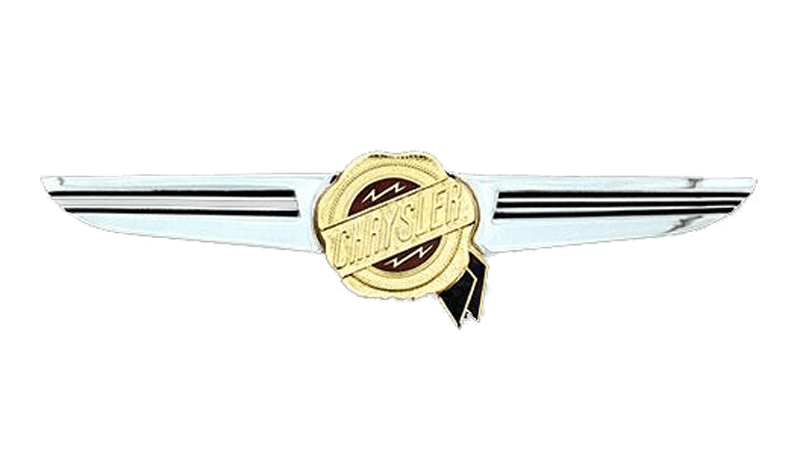
New, more structured wings were added to the seal, featuring a silver color with black horizontal stripes.
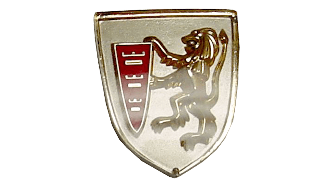
In the 1950s, the Chrysler logo was dramatically changed to a black shield with a gold lion rampant holding a red crest, but this design lasted only a year.
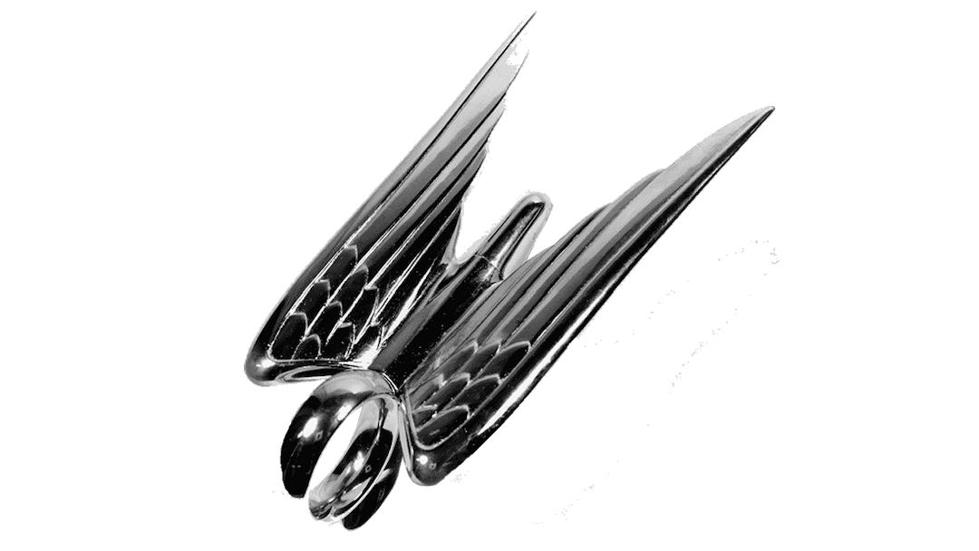
In 1951, a new emblem featuring a three-dimensional bird symbolizing speed and progress was introduced, but it was only used for four years.


In the 1980s, Chrysler used a text-based logo with a modern wordmark in all capital letters, featuring futuristic lines and rounded letters. The open 'R's added individuality to the brand's visual identity.
In 1990, the winged seal returned to the Chrysler logo, with the seal shape changed to an oval and the wings refined and elongated, creating a sleek and stylish emblem.
In 1993, the brand returned to its roots with the original seal logo, slightly modifying the color palette with a blue nameplate ribbon.
In the 2000s, Chrysler began using the Pentastar emblem, positioned to the left of the wordmark, which adopted a more traditional typeface with bolder lines.
In 2008, the Pentastar became larger and more central, with the nameplate underneath it.
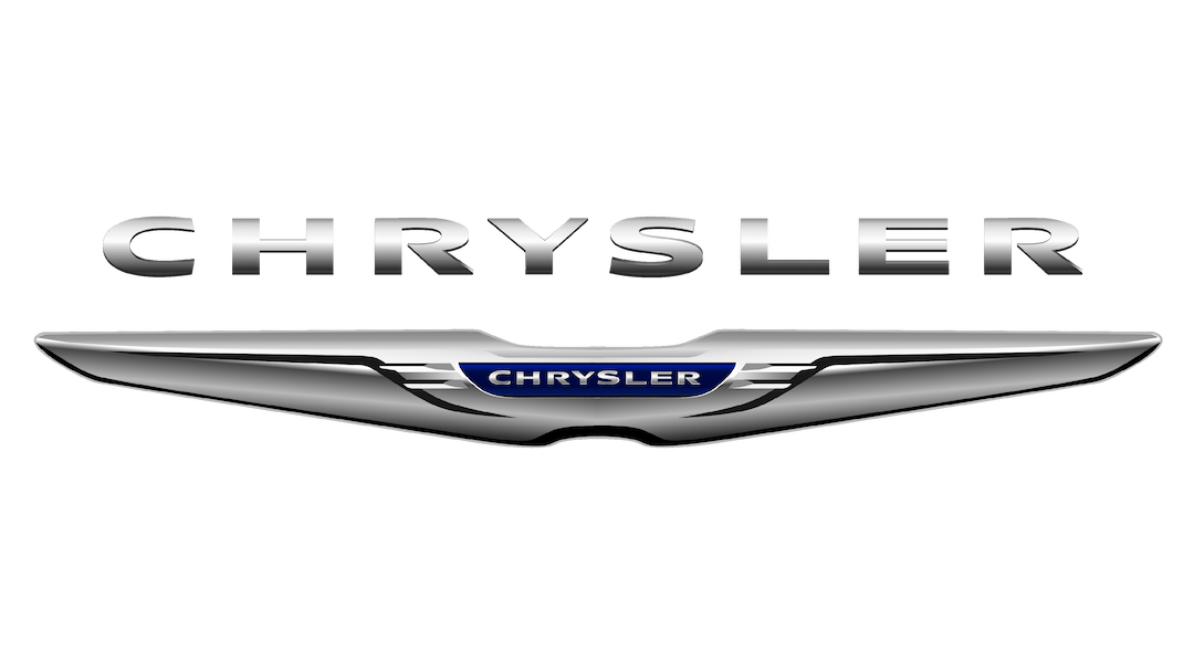
The 2009 Chrysler logo was a chic and elegant interpretation of its winged emblems, with the seal replaced by a blue line with a wordmark, and the three-dimensional wings having smoother, fuller lines.
The blue and silver palette of the Chrysler logo reflects a professional approach, longevity, and stability.

Why did Chrysler change their logo?
Chrysler is a company, which is not afraid of experimenting with its visual identity design. The American automaker has had a dozen badges created for it throughout the years. The latest redesign, held by the brand in 2009, was supposed to elevate the look of the company to a new level and to reflect the progressive and modern approach of Chrysler.
What is the Chrysler logo?
The Chrysler badge, designed in 2009, boasts a sleek and recognizable emblem with two elongated smooth wings on the horizontally-stretched composition with a small blue banner in the center. The silver uppercase logotype is written across the blue banner and supported by a larger three-dimensional silver lettering, written above the emblem.
Is Chrysler a luxury?
Chrysler is a famous American automaker, which has a wide range of cars in its portfolio: from simple affordable models to luxury ones. Overall, as a part of FCA (Fiat Chrysler Corporation), Chrysler is considered a luxury brand.
When did the new Chrysler logo come out?
The latest Chrysler badge was created in 2009, and replaced the iconic Pentastar, showing the new style and mood of the company. The smooth sleek wings represent the new approach of the American automaker and show its ability to move and change.
