chery Logo - History, Design, and Meaning
Company Overview
Chery Automobile Co., Ltd., known as Chery and sometimes referred to by its Chinese name Qirui (奇瑞), is a Chinese automobile manufacturer headquartered in Wuhu, Anhui Province, China. Founded by the Chinese government in 1997, it is a state-owned corporation. Chery's main products include passenger cars, minivans, and SUVs, sold under the Chery brand, and commercial vehicles under the Karry brand. As of 2012, Chery was the tenth-largest automaker in China, with an output of approximately 590,000 units.
Key Information
- Founded: 1997
- Founder(s): Yin Tongyue
- Headquarters: Wuhu, Anhui, China
chery Logo Meaning and History

Chery was founded in 1997 at the initiative of Wuhu city in Anhui Province, with several state-owned companies and small investors as shareholders. The company's first car, a licensed Seat Toledo, was released two years later. In 2001, Chery used the SAIC license to sell its vehicles throughout China. By 2003, Chery had established its R&D department. In August 2007, the millionth Chery car rolled off the assembly line. At the start of 2012, Chery was included in the 'Top 10 Innovative Enterprises in China.' Today, Chery is one of the leading automakers from China, offering more than twenty models.

The first logo was created in 1997 for the company's prelaunch, featuring a black-and-white emblem with a bold 'A'-like element within a horizontally oriented oval frame. The central figure's straight lines crossed the bottom of the frame.
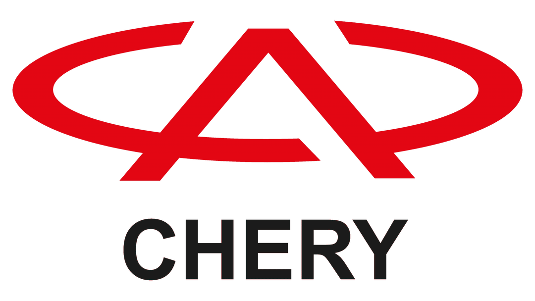
A few months later, the Chery logo was updated with a new red-and-white color palette, thinner emblem lines, and the company's name in uppercase sans-serif typeface below the emblem. The emblem also had cut-outs on the sides of the triangular element, adding airiness to the design.
Chery is a prominent name in the Asian automobile industry, serving as a regional representative of the Jaguar Land Rover Group and being one of the largest car manufacturers in China.
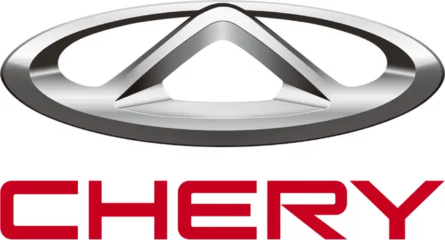
The Chery logo is traditional for the industry, consisting of a wordmark and an emblem above it.
The wordmark is in dark red, all capital letters, using a modern sans-serif font with a unique enlarged upper part of the letter 'R'.
The Chery emblem, which is three-dimensional, features a silver palette that adds volume and dynamics to the logo. It consists of a bold oval with a stylized letter 'A' without its horizontal bar.
The logo was redesigned in 2013, featuring smoother and sleeker lines compared to the 1993 version, where the oval was open and the 'A' symbol had thinner lines.
The Chery logo exemplifies simple classics, reflecting a brand focused on progress and quality.
The 2023 redesign introduced a more progressive and minimalistic Chery logo, maintaining the previous concept but using flat black lines. The typeface was also changed, with diagonal cuts on the bar ends and a vertical cut-out on the 'R'.
