cadillac Logo - History, Design, and Meaning
Company Overview
Cadillac is a luxury car brand from the United States, established in 1902. It is currently fully owned and operated by GMC. Known as one of the leading high-end car manufacturers globally, Cadillac sells approximately 350,000 vehicles annually.
Key Information
- Founded: 1902
- Founder(s): Henry Leland
- Headquarters: Warren, Michigan, USA
cadillac Logo Meaning and History

The luxury brand Cadillac was named after Antoine de la Mothe Cadillac, the founder of Detroit, which is known as the car manufacturing capital of the USA. From its inception, Cadillac has aimed to deliver excellence in design and quality.
What is Cadillac?
Cadillac is the name of the iconic American automobile manufacturer, which is known for its huge luxury cars, loved by celebrities and billionaires from all over the globe. Cadillac is synonymous with chic and luxury.
The iconic Cadillac logo is instantly recognizable and is still based on the original design from 1906, although it has been redesigned around 30 times throughout its history.

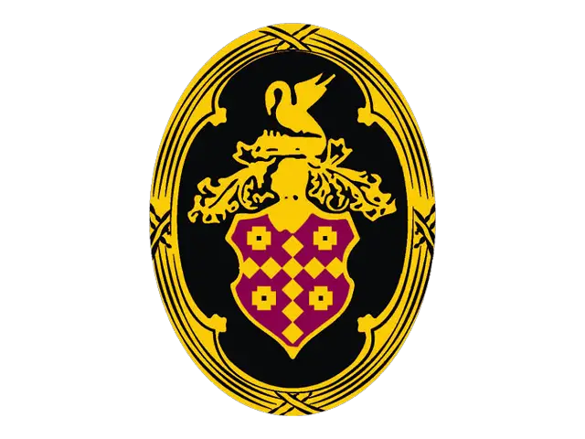
The first Cadillac logo, designed in 1902, featured a crest with swans and parallel lines, topped with a crown and encircled by an ornate frame. This design was inspired by the coat of arms of Detroit's founder. The wordmark 'La Mothe Cadillac' appeared at the bottom of the logo, which was registered as a trademark in 1906.

The 1905 Cadillac logo retained the crest from the previous version but was stylized and redrawn with circular shapes. It was a lighter version featuring ducks and checkers, enclosed in a thin rounded frame with a stylized crown on top and floral ornaments on the sides, all placed on a larger white circle with a black frame.

The 1906 redesign returned to the original composition, refining the contours and cleaning up the background. The crest was enlarged for better visibility of its details. The lettering, arched at the bottom, was set in a medium-weight sans-serif typeface with modern character contours.

In 1908, the Cadillac logo became more graphical and bold. The frame featured clean lines, the nameplate used a thicker typeface, and it was positioned at the top of the emblem, above the crown. The tagline 'Standard of The World' was added at the bottom.

The 1914 logo slightly altered the 1908 version. The 'Cadillac' lettering was replaced by a large, elegant crown, and the additional arched lettering at the bottom was replaced by a sophisticated laurel wreath. The circular medallion was flanked by wing-like elements composed of elongated leaves.

In 1915, Cadillac reverted to the 1908 badge design, featuring the iconic crest surrounded by strong, bold black lettering in a classy serif typeface. The uppercase 'Cadillac' was slightly enlarged and arched above the crest, while 'Standard of the World' was in smaller letters, arched along the bottom of the medallion.

The lettering was removed from the Cadillac logo in 1920. The ornate tulip ring from the original emblem was added, and the crown was slightly modified to feature seven points. The crest itself remained largely unchanged, with minor refinements.

The 1925 badge was an experimental design used for less than a year. It featured a circular medallion on a solid octagon, accompanied by 'Cadillac' lettering on top and 'Standard of the World' at the bottom.

In 1926, the circular shape was removed from Cadillac's visual identity. The crest was placed on a larger crest with elongated lines and sharp corners, creating a sleek and powerful look that remained for four years.

The 1930 redesign altered the badge shape again, enlarging the main crest and placing it on a transparent background without additional framing. It was slightly extended, with a straight upper border and rounded sides leading to a sharp middle.

In 1932, Cadillac introduced an experimental badge version, featuring a small crest between two stylized wings on a solid black circular medallion with a thick silver frame. This design was used for only a few months.

The 1933 redesign introduced a modern, sharp badge. The legendary crest was redrawn in darker shades and set between two stylized wings, executed in wide, sharp lines spread far to the sides. The wings were white with thin black accents. Seven small elements symbolizing the crown were placed on the crest's upper line.

An interesting geometric version of the Cadillac logo was created in 1939. The iconic coat of arms was set on the upper part of a sharp, narrow triangle with an elongated peak pointing down. The triangle featured a geometric monochrome pattern of rectangles in rows, separated by thick white lines. The crown was more traditional, with a rounded contour above the crest.

The 1942 Cadillac logo exemplifies Art Deco style in logo design. The crest was placed on a wider one with smooth sides and a pointed bottom. Two stylized white wings spread upward from the larger gray crest, forming an elongated top resembling a feathery crown. This unique design lasted five years.

In 1947, Cadillac's logo underwent significant changes, featuring sharp angles and straight lines of a V-shaped symbol beneath the crest.

The 1949 logo was executed in gold, red, white, and black, featuring a sharp, bold tick extended horizontally under the enlarged Cadillac crest.

The 1952 redesign made both badge elements smaller, placing them on a plain white medallion with a thin circular outline. The badge was accompanied by 'Golden Anniversary' lettering and a date mark on the sides of the crest.

The Cadillac badge was redesigned in 1953, featuring an enlarged golden crest on a white background. Despite its simplicity, this powerful crest effectively represented the brand's prestige.

In 1957, the V-logo was modified to be wider and more luxurious, with changes to the crest and crown. The swans became less distinct, and the shield's frame was made bolder and sleeker.

The 1960 redesign introduced a new badge, merging the crest with a V-shaped element. This silver emblem featured elongated and sharpened bars, with the crest's body horizontally stretched.

The most iconic Cadillac emblem, created in 1963, remained with the brand for over 40 years. It featured a colorful crest framed by a silver wreath, incorporating yellow, fuchsia, and blue with white and black details, giving it a creative and modern look.

In 1964, Cadillac returned to the 1953 design concept, but the crest was executed in silver, with all elements in a single color engraved on the shield. This minimalistic badge was very stylish.

The 1965 logo reintroduced the V-shape, thinner and sharper, with gold and silver bars and a small elegant crest in the same palette, adding red and white.

The 1971 redesign placed the silver Cadillac crest under a vertically extended geometric element resembling wings, with a triangular top border. This badge was used for nearly a decade and was a departure from typical designs.

In 1989, the badge was redesigned with gold, red, and black added to an enlarged silver crest on a transparent background, enclosed in a leafy wreath with an open top. This sleek and elegant version lasted five years.

The 1985 redesign brought back the golden color palette, replacing silver shades. The geometry and concept remained largely unchanged, but the gold added delicacy to the elements.

In 1995, the emblem was drawn in two-dimensional lines above large cursive 'Cadillac' lettering in a smooth custom typeface, with rounded title case characters in a deep blue shade.

The 2000s logo was refined with a slightly altered color palette, reflecting the brand's high-end segment and confidence with a modern and sophisticated look.
The early 2010s badge retained the previous version's design but with refined contours and darker shades, enhancing the crest's lines and the wreath framing.

In 2014, Cadillac removed the wreath from its logo, creating a modernized crest with an elegant cursive wordmark underneath. The smooth lettering balanced the crest's sharp shape.

The Cadillac logo is a strong and instantly recognizable example in the automotive industry, using colors to create an interesting and creative three-dimensional emblem. The varying crest line thicknesses resemble a mosaic, celebrating the brand's legacy.
The 2021 redesign removed the cursive wordmark and switched the crest's color palette to black-and-white, making the logo minimalistic and powerful, evoking professionalism and excellence.

The redesign of 2021 has removed the cursive wordmark from the primary badge, and switched the color palette of the crest to black-and-white, making the logo of Cadillac extremely minimalistic and powerful. The new logo is sharp and brutal, evoking a sense of professionalism and excellence.
What does the Cadillac logo mean?
The Cadillac logo depicts a modernized version of the Antoine Laumet de La Mothe Cadillac coat of arms, as a sign of honor and celebration of the brand's founder. The crest is a representation of the company's value of its root, and respect for its historical heritage, along with the progressive and innovative approach to design and production.
When did Cadillac change its logo?
Cadillac has had more than two dozen redesigns of its logo throughout the years, with the last update made in 2021. The latest redesign has switched the color palette of the iconic badge to black-and-white, and removed the lettering from the primary version of the logo, creating a powerful minimalistic image.
Is there any Cadillac in India?
Even though Cadillac has never had an official sales office in India, you can see the Cadillac cars on the streets of some cities in India, like anywhere else in the world. Cadillac is an internationally famous brand, which is synonymous with luxury, so everyone eats to own it, whether it is a European, American, or Indian citizen.
Is Cadillac a luxury car?
Cadillac is considered to be a luxury American automaking brand, however, it is not as chic and expensive as some of the European marques, such as Roll-Royce, Ferrari, or Bentley. Cadillac's fanciest model is the Cadillac Escalade, which you can see in the music videos of American rap musicians.
