brilliance Logo - History, Design, and Meaning
Company Overview
Brilliance Auto Group (officially Huachen Automotive Group Holdings Co. Ltd.) is a Chinese multinational automobile manufacturer holding company headquartered in Shenyang. It produces automobiles, microvans, and automotive components. The company is known for its joint venture with BMW, called BMW Brilliance Automotive Ltd.
Key Information
- Founded: 1992
- Founder(s): Yang Rong
- Headquarters: Shenyang, Liaoning, China
brilliance Logo Meaning and History

Brilliance Auto Group was founded in 1991 and became one of the leading Chinese makers of minibuses. It was the first Chinese automotive company to be listed on the New York Stock Exchange.
The company comprises multiple subsidiaries and listed companies, including Brilliance China Automotive Holdings, Shenyang Jinbei Automotive, and others. It has over 160 wholly-owned, holding, and shareholding companies.
Brilliance Auto Group has been among the top Chinese automakers, ranking between the 7th and 8th largest in China from 2009 to 2012.
What is Brilliance?
Brilliance is the Chinese automobile brand, which doesn't have a long history, but only in a few years of its existence, managed to become one of the most powerful automaking groups in the world. Today Brilliance manufactures vehicles under its own brand, and also several different smaller ones.


The company has a significant joint venture with BMW, called BMW Brilliance Automotive Ltd., which produces, distributes, and sells BMW vehicles in mainland China.
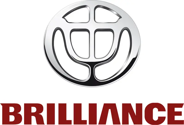
Brilliance Auto Group's logo features a rounded silver symbol with an abstract smooth figure enclosed, resembling a cup or grail. The emblem is often accompanied by the 'Brilliance' wordmark in red.
The company has faced financial difficulties in recent years. As of 2022, BMW has acquired full ownership of Brilliance Motor and 75% of BMW-Brilliance, controlling the majority of production capacity under Brilliance.
Despite challenges, Brilliance Auto Group has contributed significantly to China's automotive industry, with a focus on both domestic and international markets.
The intense red color of the inscription balanced the calm silver and represents the Brilliance brand as the one that values energy and dynamics, along with design and style.
The bold uppercase lettering from the primary Brilliance badge is set in a custom typeface, based on a heavy geometric sans-serif, with some interesting modifications in the “B”, “A” and the “E”. The closest font to the one, used in the Brilliance insignia, is, probably, Dilemma Sans Black XP.
As for the color palette of the Brilliance visual identity, it is based on a combination of black and burgundy, a very chic and elegant mix, which looks Royal and expensive, evoking a sense of style, precision, and excellence. The black here is glossy and voluminous, while the burgundy elements are set in flat plain shade, balancing the sparkling emblem and supporting the seriousness of the badge.
