bogdan motors Logo - History, Design, and Meaning
Company Overview
Bogdan Motors, founded in 1993 post-Soviet Union, began as a vehicle distributor, eventually producing its own buses and trucks in Ukraine. Initially focusing on Russian vehicles, it expanded to Korean and Chinese models, diversifying into buses, trolleys, and even military vehicles. The company's growth reflects a commitment to meet the dynamic needs of both civilian transport and defense sectors within and beyond Ukraine.
Key Information
- Founded: 1992
- Founder(s): Ukrainian government
- Headquarters: Cherkasy, Ukraine
bogdan motors Logo Meaning and History

Bogdan Motors, established in 1993 in Ukraine, quickly shifted from distributing Russian vehicles to manufacturing its own, notably under the Bogdan brand. It acquired the Cherkasy plant, expanding into bus production, and later Lutsk's LuAZ, producing cars based on AvtoVAZ. The company explored various partnerships, including with Hyundai, Isuzu, and Great Wall, diversifying into different vehicle types. Despite financial challenges, Bogdan Motors has supplied vehicles to the Ukrainian military and expanded into joint ventures and educational collaborations, reflecting a resilient adaptation to the industry's demands.
What is Bogdan Motors?
Bogdan Motors, a Ukrainian auto manufacturer, crafts diverse vehicles, including public transport and military units. It symbolizes Ukraine's industrial evolution post-Soviet Union.

The logo features a bold, stylized representation of the Cyrillic letters 'ЛуАЗ,' crafted with sharp angles and dynamic swoops. Encased in an oval track, the design conveys a sense of speed and precision, suggestive of the brand's automotive nature. The black and white color scheme imparts a classic, timeless feel, ensuring the emblem stands out with striking contrast and simplicity.

The logo features a three-dimensional rendering of the Cyrillic characters 'ЛуАЗ' (LuAZ), suggesting solidity and depth. The gradient gives a modern touch to the emblem, with angular lines suggesting technical skill. The logo's bold, clear style speaks to automotive robustness and creativity. The logo's stark monochrome palette enhances its visual impact, ensuring memorability and distinction.

The emblem showcases two symmetrical shapes, intertwined, creating a sense of unity and interconnection. The design exudes a metallic sheen, giving it a contemporary and sleek look. These figures, set against an elliptical backdrop, convey movement and harmony, reflecting the brand's synergy and precision in engineering. The textual part 'ЛуАЗ' beneath mirrors the logo's essence with its clean, metallic finish and modern typeface, emphasizing the brand's identity in a subtle yet pronounced manner.

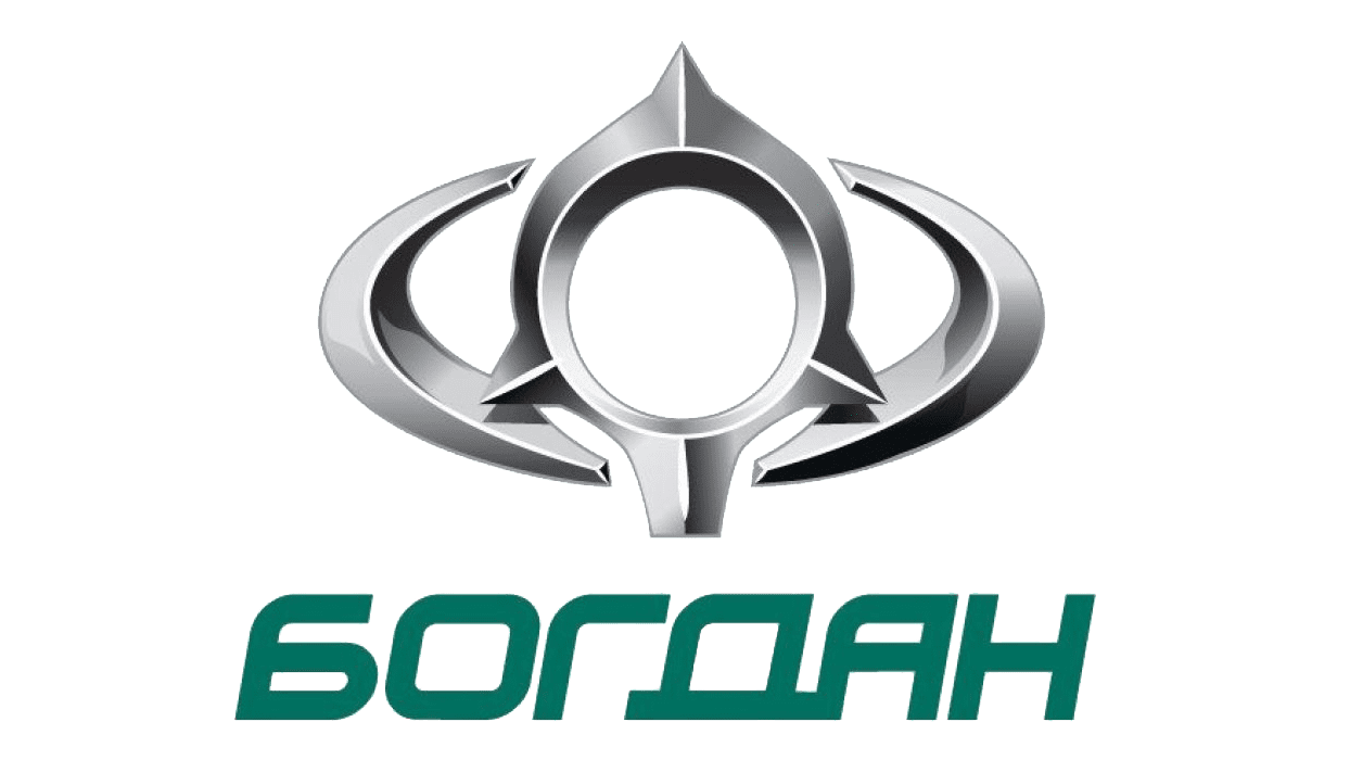
The emblem portrays an intricate, metallic symbol reminiscent of a stylized automotive component, merging elegance with engineering precision. Its design, with sharp angles and a circular nexus, evokes the precision of automotive craftsmanship. Below, the name 'Богдан' appears in a solid, green font, providing a visual anchor and a contrast to the emblem's metallic sheen. This logo captures the essence of the Bogdan Motors brand, symbolizing a blend of technical prowess and bold, modern design.
