bmw m Logo - History, Design, and Meaning
Company Overview
BMW M GmbH (previously: BMW Motorsport GmbH) is a subsidiary of German car manufacturer BMW AG established in May 1972 with just eight employees. BMW M, also known as M-Technik or just 'M' (for Motorsport), was initially created to facilitate BMW's racing program, which was very successful in the 1960s and 1970s.
Key Information
- Founded: 1972
- Founder(s): BMW Group
- Headquarters: Munich, Germany
bmw m Logo Meaning and History
BMW M was established in 1972, 56 years after the foundation of its parent company, which means there was a lot of experience gained by the automaker by that time, and they knew what they were doing. Under the name BMW Motorsport, the subdivision existed for more than twenty years and got officially renamed into its shortened version only in 1993.
In 1972, the German concern decided to form a separate division to support the development of motorsport under the leadership of Jochen Neerpasch. The first racing car of BMW Motorsport was the BMW 3.0 CSL, based on the E9 coupe, and it saw the light in 1973.
Today, the company manufactures M1, M3, M5, and M6 models with BMW Motorsport engines. These cars are marked with emblems corresponding to the name of the model and boast super-powerful engines with characteristics completely different from the standard BMW package. Other differences of the M series are a lower and stiffer suspension, plastic spoilers and sill plates, and a sporty interior — seats, steering wheel, gearshift knob.
More often, you can see cars with the M emblem but without any numbers following it. This is how BMW marks the cars which received just a small part of the BMW Motorsport tuning pack. For example, in the 1980s, this M could be seen on all BMW cars with the Motronic system. Later, Motronic became standard for all cars of the German brand with a sports suspension and interior or just one of these features.
There is also a list of 'sport' BMW cars, which have a lot in common with the M series, for example, the E28, 535iS, and E30. They can have all of the M cars' features, but not the engine.
What is BMW M?
BMW M is the subdivision of the famous German automaker BMW, which specializes in the production of powerful engines for motorsport cars and the sport tuning of the BMW cars.
In terms of visual identity, the motorsport subdivision of the German automaker has been pretty conservative and keeps using the emblem designed for it in 1972, with only minor alterations.

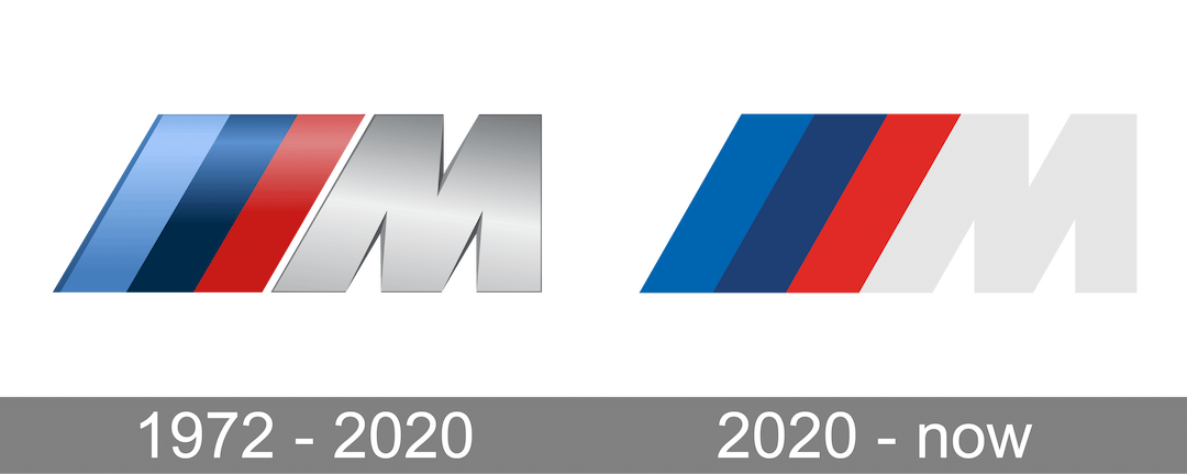
The original BMW Motorsport logo was introduced in 1972 but got placed on the car only in 1973. It was the first car of the subdivision, created on the base of the E9 coupe. That was a bold silver letter M in the uppercase with the right vertical bar straight, and the left one diagonal. In parallel with the diagonal bar of the 'M', on the left from it, there was a simple geometric banner with three stripes placed. The stripes were set in purple, blue, and red. The emblem was set in gradients and looked voluminous and sleek.

The redesign of 2020 simplified and flattened the BMW M logo, making it in tune with current design trends. The silver 'M' turned white, while the striped banner moved closer to the letter and got glued to its diagonal bar. The colors of the diagonal stripe became deep and dark, and without a space between the 'M' and the geometric part of the logo, the contrast became stronger and brighter.

For the BMW M3 model, the iconic M tricolor is accompanied by a massive geometric 'M3' lettering with the left bar of the 'M' diagonal, in parallel with the colorful stripes of the banner. The addition can be seen in both light gray and black and also can be flat or three-dimensional. When placed on a car, the blue, purple, and red tricolor is complemented by a glossy silver 'M3'.

For the M4 model of BMW Motorsport, the bold geometric 'M' is glued to the banner and has its left bar parallel to the stripes, set in a line of the same thickness, making up a flag of four stripes. The '4' is heavy and stable, with sharp edges, which evoke a sense of masculinity and power.

The BMW M5 logo usually features a black 'M' glued to the diagonal tricolor, and a wide geometric '5', also in black. The contours of the digit are slightly extended, making it look like a capital 'S' in a square shape with straight angles and cuts of the bars. The logo looks very stylish and even futuristic, representing progress and motion.

BMW XM is the newest model of the German automaker, a powerful hybrid crossover. And it is also the first car to introduce the new BMW M logo concept. Starting in 2022, all new M Series models will be marked with a black logo with a titanium bronze border instead of the previous tricolor. The XM logo also has a slightly different composition — here the banner is placed in between the letters, so the 'X' is placed on the left, at a distance from the three diagonal stripes glued to the 'M'.
In 2021, to celebrate 50 years of BMW M's existence, the subdivision released several cars with the new emblem on their bonnets. It is a rethought iconic BMW roundel in a colorful framing, with the circular lines repeating the shades of the diagonal stripes — blue, purple, and red.
The iconic BMW M tricolor was changed a bit with the redesign of 2020 when its original purple hue was switched to dark blue, but the overall composition remained the same, and that slight shift was left almost unnoticed. So what is the meaning behind the colors in the simple yet powerful and bold BMW Motorsport parallelogram?
The middle blue is taken from the corporate BMW visual identity, standing for the roots of the company — the Bavarian region. The scarlet red, which is a bit lighter in the anniversary badge, is a tribute to Texaco, the American oil corporation, which was sponsoring the first years of the BMW Motorsport team. As for the purple, or dark blue, it is just a mix of the shades of two other stripes in the logo — if you take medium-blue and overlap it with red, you get the purple.