bentley Logo - History, Design, and Meaning
Company Overview
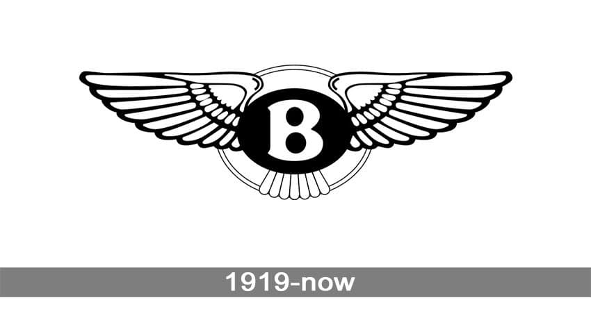
For Bentley, the wings on their logo symbolize a true legend, or, figuratively speaking, the wings of the celestial. The brand that unites cars designed for the most discerning audience is simply bound to strive for constant improvement.
Key Information
- Founded: 1919
- Founder(s): Walter Owen Bentley
- Headquarters: Crewe, England, United Kingdom
bentley Logo Meaning and History
Bentley, created by Walter Owen Bentley, initially specialized in creating spare parts for the aircraft industry. However, after World War II, the car market appeared to be the most promising one. Luxury was in demand, although limited demand for cars of this class almost led the brand to bankruptcy.
The first Bentley cars actually failed in the market due to their high price. However, the promotion of 'price as a confirmation of technical excellence' and the exceptional potential of these luxury cars did its job. In the 1980s, after a certain period of 'wide popularity in narrow segments,' Bentley faced a second wave of popularity, which continues to this day.
It is also interesting to note that the number of feathers in the right and left wing in most logos varies. Different models have 10/11 or 13/14 versions of feathers. However, there are also models decorated with 10/10 logos – usually, these are the 'simplest' models, while asymmetry is more common for racing vehicles – this is supposed to bring good luck.

The central element of Bentley's symbol is the capital letter 'B'. To emphasize the elitism of Bentley cars, the letter is decorated with wings, which explicitly refer to the unearthly potential of this brand. Therefore, the symbolism of the logo is concentrated precisely in its 'winged' part and can be perceived as arrogance and victorious charisma. On the other hand, it is also a reference to the brand's origins – the aviation industry and dreams of the skies of Walter Bentley himself.

It is important to mention that the Bentley emblem was created by professional artist Frederick Gordon Crosby. He perfectly accomplished the task of creating a luxurious logo for luxury cars. Later, the Bentley logo was used as an example and role model for another brand – Aston Martin.
The first logo depicted the letter B, crowned with a laurel wreath. However, it was precisely the wings that turned out to become a lucky image for this luxury brand.
It is interesting to mention that the history of the Bentley brand began in 1919 with the aircraft industry, and only in 1945 did the world see the first cars decorated with the very first Bentley logo. By the way, the idea was 'borrowed' from its close competitor Rolls-Royce, which positioned its vehicles as 'cars with a personal driver', whereas Bentley originally supposed not to trust their luxury cars into other people's hands.

Surprisingly, the font in the Bentley logo has not changed in almost a century of its history. This is how the brand emphasizes respect for its traditions. Replacement of the laurel wreath with the wings retained the main element – the letter 'B' – intact ('This is Bentley, no more, but no less').

It is interesting to note that the logo for racing and 'regular' vehicles (as far as we can call an elite car a regular one) have different colors. For instance, the oval between the wings and the letter for the exclusive class cars is red, while for the racing cars it is painted green. The most powerful cars for private customers are sold with the logo where the oval is painted black. Thus, a potential customer can learn the purpose of the model even without a detailed study of the technical characteristics of a car. The first signs of this distinction became visible in 1931, and later this feature was preserved. Today, Bentley is the only brand with a logo enabling the definition of the class of a particular model.