ashok leyland Logo - History, Design, and Meaning
Company Overview
Ashok Leyland is an Indian automobile manufacturing company headquartered in Chennai, India. Founded in 1948, it is one of the largest commercial vehicle manufacturers in India and a subsidiary of the Hinduja Group. The company specializes in buses, trucks, defense vehicles, and other commercial vehicles.
Key Information
- Founded: 1948
- Founder(s): Raghunandan Saran
- Headquarters: Chennai, Tamil Nadu, India
ashok leyland Logo Meaning and History

Ashok Motors was founded in 1948 by Raghunandan Saran, an Indian independence campaigner from Punjab, initially to assemble and manufacture Austin cars from England.

In 1955, the company's name was changed from Ashok Motors Ltd. to Ashok Leyland Ltd., following a collaboration with Leyland Motors of the UK.

The company's logo has evolved over time, reflecting its changing partnerships and identity:
The original Ashok Motors wordmark featured a light all-caps type with wide 'O's based on a circle.

After collaboration with Leyland, the logo incorporated elements from Leyland Motors, including an oval shape with the brand name along the border.
A later version featured the word 'Leyland' in an elegant type with distinctive serifs and an extended 'y' forming a loop.

Following mergers between British Motors and Leyland Motors, a new emblem was introduced featuring a stylized spinning wheel housing the letter 'L', placed inside a square with the words 'British' and 'Leyland' above and below.
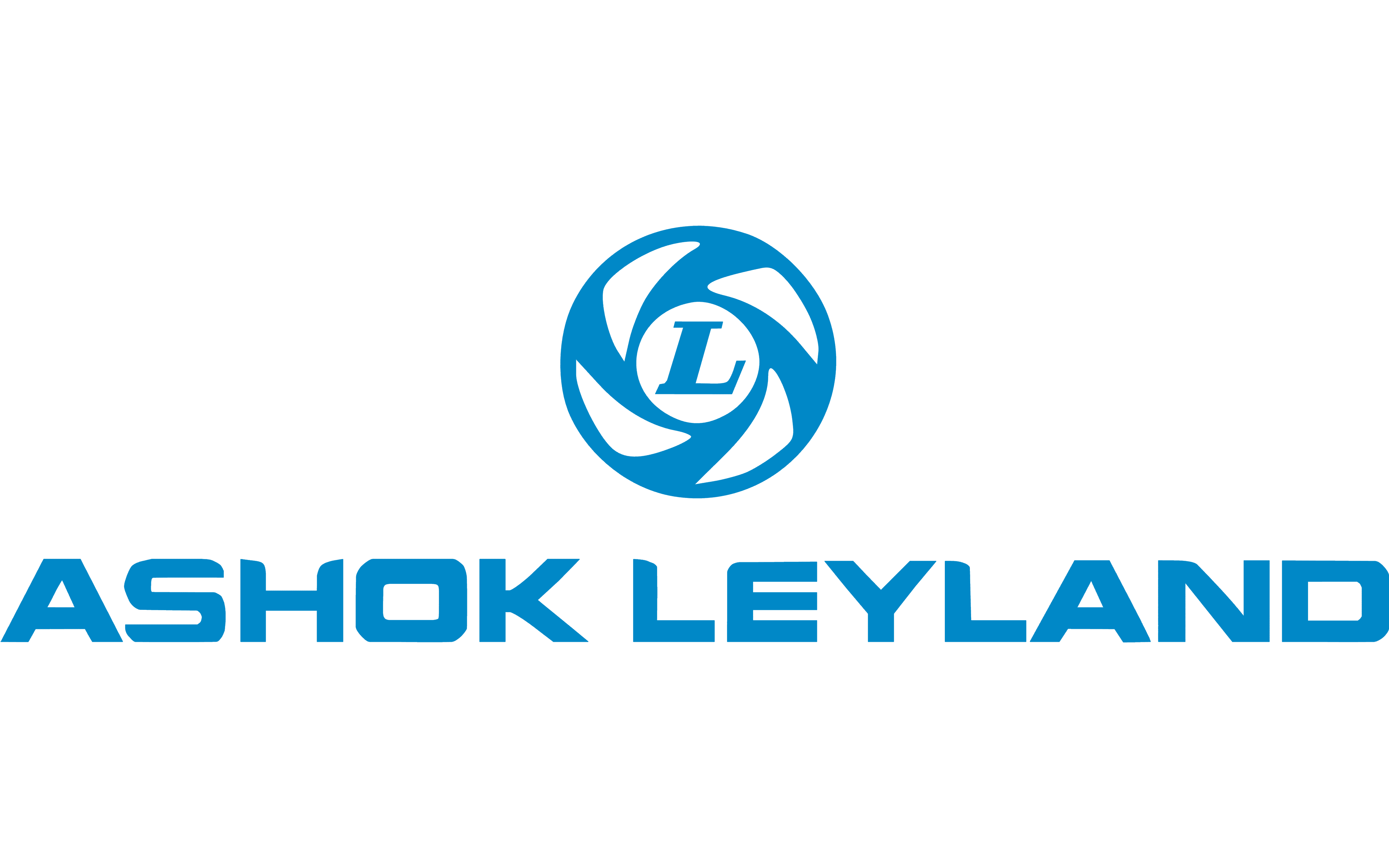
The current Ashok Leyland logo retains the spinning wheel with the 'L' but places the company name below in a single line. The typeface has been customized for better legibility and brand identity.
Ashok Leyland has grown to become a major player in the commercial vehicle sector, offering a wide range of products including buses, trucks, defense vehicles, and engines for various applications.
The company has expanded internationally, with manufacturing facilities in several countries and a significant presence in the global commercial vehicle market.
The “L” in the center of the wheel, though, belongs to a different type. It has pronounced serifs and is italicized. The fact it's italicized creates an illusion of motion, which supports the motion implied by the spinning wheel.

The current Ashok Leyland logo is dominated by the same spinning wheel housing the capital “L.” The name of the company can be seen below. It's given in a single line.

The typeface appears pretty much the same. Yet, if you take a closer look, you'll notice it has been customized (note, for instance, the streamlined shape of the “L” and the rounded top left angle of the “E”). Also, the wordmark is slightly bolder, which offers better legibility.

