apollo Logo - History, Design, and Meaning

Company Overview
Apollo Automobil GmbH (formerly Gumpert Sportwagenmanufaktur) is a German sports car manufacturer based in Denkendorf. Founded in 2004 by Roland Gumpert, ex-director of Audi Sport, the company specializes in producing high-performance sports cars and hypercars. In 2016, Apollo underwent significant restructuring and rebranding.
Key Information
- Founded: 2004
- Founder(s): Roland Gumpert
- Headquarters: Denkendorf, Bavaria, Germany
apollo Logo Meaning and History

The company was established in 2004 as 'GMG Sportwagenmanufaktur Altenburg GmbH' by Roland Gumpert, who had a distinguished career at Audi Sport, leading the company to 25 World Rally Championship victories and four World Rally Championship titles.

Gumpert's original logo, used from 2004 to 2016, featured a traditional shield design with a red background, gold border, and a white griffin. The griffin symbolized a blend of strength and agility, reflecting the company's design philosophy.
In 2016, Hong Kong consortium Ideal Team Venture acquired the company, rebranding it as Apollo Automobil GmbH. This transition brought about a new visual identity and logo design.
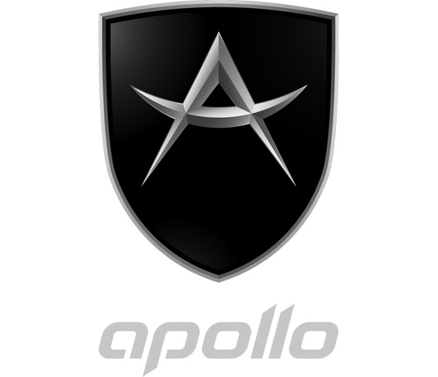
The new Apollo logo incorporates a stylized 'A' within a shield shape. It comes in two variants: one with a matte black background and another featuring a gradient 'flame' design in red and orange, symbolizing the brand's power and passion.
The Apollo wordmark sometimes accompanies the shield logo, using a custom sans-serif font with diagonally cut vertical bars, giving it a modern and dynamic appearance.

Apollo's visual identity primarily uses a color palette of black and silver, occasionally incorporating the flame gradient. This combination represents luxury, precision, and high performance.
Apollo Automobil's mission is to create emotionally engaging, high-performance vehicles that combine cutting-edge technology with passionate design, aiming to preserve the essence of automotive enthusiasm for current and future generations.
The company has produced several notable models, including the Apollo Intensa Emozione (IE), a limited-production hypercar featuring a naturally-aspirated V12 engine and advanced aerodynamics inspired by nature and insects.

The Apollo crest with the stylized “A” on it is sometimes accompanied by a logotype, which color depends on the crest — with the black background the logotype is usually executed in light gray, and with the “Flame” one — in black. Though the typeface of the lowercase inscription stays untouched — it is always written in bold custom sans-serifs with the vertical bars of the letters diagonally cut and pointed. The Apollo italicized typeface with open contours I had something in common with such fonts as Atures and Logic, but with the lines modified and contours softened.
The color palette of the Apollo visual identity is built around a combination of black and silver, which is sometimes accompanied by the gradient flame scheme, consisting of yellow, orange, and red shades, going darker from bottom to top and finishing with black. This palette represents the passion, speed, and power of the brand and its cars, it also looks very stylish and modern, and with the sharp silver elements — sleek and luxurious. The timeless black and gray combo is a sign of precision and elegance, which will always be actual and trendy.


